
When we talk with clients about their website projects these days, “mobile” is an important part of the conversation. But a “mobile site” can mean different things to different people, and is usually a confusing and sometimes frustrating subject. What’s the difference between a “mobile optimized” site, a “responsive site”, and a “mobile app”? Which one is the right solution for your needs? Why? In the following article, let’s discuss each option, outline the differences, the pros and cons, and best uses.
How it all started: Websites
Until fairly recently, we only designed websites for viewing on computer screens. As designers, our job was to make sure that visitors to your site could navigate easily and intuitively find what they were looking for in one or two clicks. That job remains the same today. Over time, tools have been added to help us do an even better job. For example, we can analyze your site’s statistics to see which pages are hit most often, the flow from page to page, where visitors most often leave your site, etc. Data like this helps us improve the user experience, making visitors happier and hopefully more engaged with your content. At least, while viewing your website on their computer . . .
Enter: The Mobile Phone
Then along came the mobile phone, and things started to change. At first, everyone was really happy if their website looked the same on a mobile phone as it did on their computer. No one minded that it was a tiny screen, and hard to read . . . we were just glad that it worked. Back then, people were mostly using their phones to actually call people. 😉 But as phones got faster and faster, capable of doing more and more, they have become (and for many have replaced) our main personal computing devices.
From the end of 2011 through the end of 2012, mobile website traffic has nearly doubled, jumping from 10% to 18%. During the same time period total mobile traffic was up 139%. Soon people will visit websites from a mobile device more often than a desktop computer. Now, making the mobile site mirror the desktop site, is not good enough. We must consider the mobile experience for exactly what it is, and design accordingly.
Mobile Optimized Websites
If your website is “mobile optimized”, here’s basically what happens: When Joe Visitor goes to your website on his smartphone, the server (where your website “lives”) checks to see what kind of device Joe is coming from (desktop computer, iPhone, Android, tablet, etc.) and delivers Joe that specific optimized version. What’s great about mobile optimization is that we can decide exactly what content to deliver to Joe. For example, by analyzing past data from your site, we may know that mobile visitors like Joe don’t want to see your home page, they really just want your contact page. This is typical if you are a service business and people need your address or phone number from the road. For our law firm clients, finding an attorney’s email address is a high priority for mobile visitors. Rather than make Joe click through pages of content he really doesn’t want, mobile optimization allows us to only show Joe what he needs. Since WiFi is often not available to mobile users, mobile optimization really speeds up the experience since the content that’s delivered can be limited to what’s most important. By adding a “view full site” link to mobile optimized sites, users can see the full desktop version mirrored on their phone when they need to.
When we design a mobile optimized site, we decide what content we want to deliver, and we create completely new page designs for that content. The size of text is bigger, phone numbers are clickable, navigation can be done with a finger, bandwidth-heavy graphics and animation is eliminated, etc.
The biggest downside to mobile optimized sites is that they tend to be device-specific, meaning you need to define exactly which devices you are going to optimize for. Typically, the most popular three or four are chosen, since a site can’t be optimized for every phone and tablet out there. As newer versions of the devices come to market, the site may need to be upgraded.
The cost to design and develop a mobile optimized site depends on the design complexity, the number of pages and the number of devices you want to optimize for.
Responsive Design
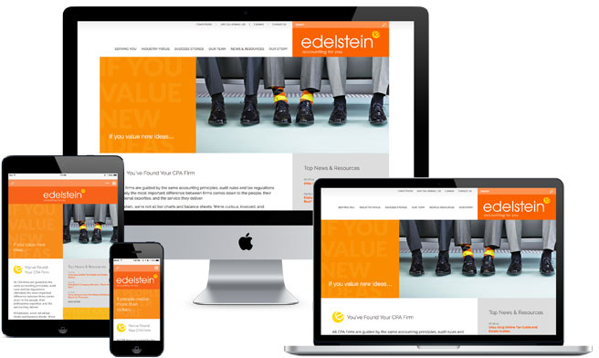
Unlike mobile optimization, with responsive design the whole process of the server checking the visitor’s device goes away. Instead, when Joe Visitor goes to your website, the site responds to the screen size of Joe’s browser window. So, if Joe’s screen size is typical for a desktop or laptop, he sees that version, if it’s tablet sized, he sees that version, if it’s phone sized, that one. As designers, we create different templates with “breaking points” that trigger which version the user will see based on screen resolution.
To see if a site is responsive, bring it up on your desktop computer, grab the corner of your browser window and make it smaller. If the site design changes when your window gets to about tablet or cellphone size, then it’s responsive. For example, looking at cdgi.com and you’ll see how the main navigation across the top of the desktop version (ABOUT, INDUSTRIES, OUR WORK, etc.) gets replaced with the icon-based menu button (three stacked gray lines) when you reduce the screen to tablet and phone size. This allows for much easier navigation form those devices. Also, you’ll see how the three thumbnail photos on the desktop version go away altogether at the smaller screen sizes, while the contact info and social media buttons get much larger, for easier reading and poking.
While we can limit some of the information we deliver via responsive, we don’t have the control we do when we optimize for mobile. For the most part, all of your content will get sent to the mobile device which can be a disadvantage if the load time is slow and visitors get frustrated trying to find what they need.
The cost to design and develop a responsive site depends on the number of screen sizes you want and the complexity of the design changes for each.
Mobile Apps
By nature, a mobile application serves a very different purpose than a website. If you think you want a mobile app, our first question is always “why?”. Even if your app will be free, why would someone take the time to download it? And more importantly, if they do download it, why will they continue to use it and not delete it when they want more space for music or photos or other apps? In order for an app to be successful, it must offer one of these three things: (1) practical content that people need regularly, like weather information or a calorie counter or a to-do list, (2) fun content that is entertaining, like a game or an e-reader or social media like Facebook (3) functionality that is only available using native phone technology, like a QR code reader or a compass or a camera.
If your goal is to simply make your website content mobile friendly, an app is usually not the way to go. But if you have an idea that is specifically geared to an app’s benefits, it may be worthwhile to build one. If you want to make an app that is a profit generator, keep in mind that advertising your app so people find it and buy it is often the most difficult part of the ROI.
“Native” mobile apps are quite a bit more costly to design and develop than mobile optimized or responsive sites. Native apps are real, true applications that live on your phone, and often can be used even if you do not have WiFi or a cell connection. Native apps can make use of the phone’s full functionality, as mentioned in #3 above. If you are requesting bids on a mobile app project, be aware that some companies may propose an “app” that is not native. Although they may seem like an app, and can be downloaded like one, they are actually just web sites that rely on an internet connection to deliver the content, and like a website, they can not utilize the phone’s native functionality. Apple has started looking more closely at these apps, and not accepting them as readily into their app store.
To Summarize
- Being able to view your website on a mobile device has become critical.
- Mobile Optimization is a good solution when you want to make it easy for visitors to find specific content on your website quickly.
- Responsive design is a good solution when you need all of your website’s content accessible on mobile and tablet devices.
- Developing a custom application makes sense when you have a specific reason to build one, not as a means of making your website mobile-friendly.
About The Author