
We are excited to announce the launch of a cohesive, new brand for our client, Peak Financial Management!
Peak is a boutique, fee-only wealth management firm. Peak needed a completely new brand to differentiate them from competitors, resonate with existing and potential clients, and consistently position the firm across all forms of marketing.
 Website:
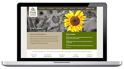
When Peak came to us, their website was very outdated and generic. The site’s imagery, like many of their competitors’, relied on cliched photos (families, retired couples, clients talking with an adviser, calculators, and the like.) After getting to know the people at Peak and their core values, we created messaging and visuals that are unique to the firm and memorable to their audience. The homepage animation uses photos from nature that fade from full color to black and white (leaving one item in color) illustrating the tagline, “We see the difference.” Peak’s new website is engaging and elegant with an approachable, down-to-earth feel. It is appealing to sophisticated visitors such as college faculty, physicians, entrepreneurs, business owners, and C-level executives.
![]() Logo:
Logo:
Peak wanted a clean, modern logo with a graphic element that implied their name, but was not a literal interpretation. The new logo, with interlocking triangles, conveys mountain peaks as well as the firm’s strength working together with clients.
Messaging:
We developed all the messaging for the new website and brochure. The tagline, “We see the difference” expresses Peak’s personal relationships with clients and their holistic and individualistic consultative approach. We also made recommendations about the type of content that should be on the new site, which resulted in developing and adding pages for client experience and client stories.
 Printed Marketing Collateral:
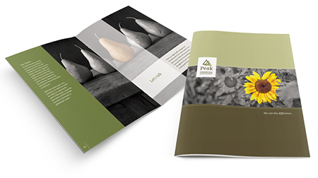
The brochure, pocket folder, and team booklet use the same nature photography from the website for consistent branding. The brochure interior includes a vellum fly-sheet, mimicking the animation effect on the homepage. The pocket folder is designed to hold the overview brochure as well as the team booklet in the left slit and a business card in the right slit.
 Stationery:
To complete the full rebranding we designed and printed a full stationery set with the new logo and firm colors, including business cards, letterhead, envelopes, mailing labels, and note cards.
We are delighted that the Peak team loves their new brand and has received wonderful feedback from their clients.
About The Author