Did you know?

Checking email is the #1 reported activity on smart phones.
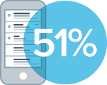
51% of all email gets opened on a mobile device.
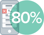
80% of people will delete an email if it doesn’t look good on mobile.
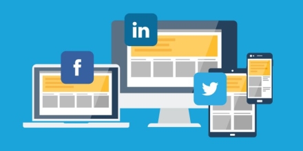
Responsive email templates are the key to creating beautiful email campaigns that work great all the time. That means whether your readers open your marketing emails on their desktops, tablets or smartphones, responsive templates will adjust on the fly to fit their screen perfectly. Whether you use Constant Contact, MailChimp, Emma or any other email marketing platform, it’s imperative that you think about how your marketing emails look in your clients inbox.
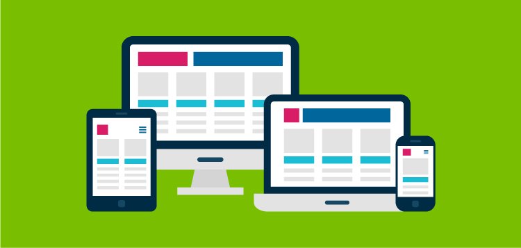
Some of the benefits of responsive email templates include:
- Larger font sizes for easy reading on mobile devices
- Sidebars and horizontal content stacked in a single column
- Increased email click-through-rates
- Fewer email list opt-outs
At Clockwork we recommend the Emma Email Marketing system. It’s easy to use, inexpensive, and fully customizable. As an agency partner we’d be happy to help you to get up and running sending out beautiful and functional emails. Give us a call at 781-938-0006 or shoot us a message here for more information.
About The Author