When it comes to the colors you can add to the Swatches panel in InDesign, the variety is fairly impressive. But it’s important you choose the right color type for the project you’re working on. Luckily, InDesign’s Swatches panel has all the info you need – you just have to know what you’re looking at.
Take this simple Swatches panel, for instance. I’ve added these three colors for this tip:
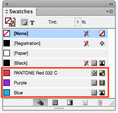
Each of the three colors have two pieces of important information… and one false flag. Can you guess the one you shouldn’t rely on? If you said “the color name,” you get the prize. You should never rely on the name of the color to give you true information, because a user can name a color anything they want. In this example, I named the second and third colors “purple” and “blue” for clarity’s sake, so any real information about the color type can’t accurately be gleaned from the name itself.
Now let’s take a look at the remaining two pieces of information you can actually rely on. They’re the groups of two icons to the right of the color name:
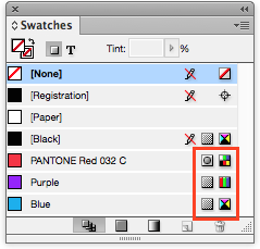
The left column of icons indicates whether your color is a spot color or not. The first color with the little circle in the grey box (think “spot”… get it?) is a spot color. The second and third are not:
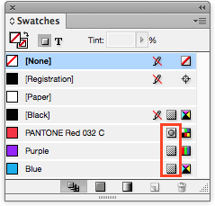
The right column of icons indicates whether your color is comprised of a Pantone, RGB, or CMYK values:
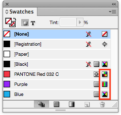
The first one, which looks like a whole bunch of individual colors, was chosen from the Pantone Matching System (PMS) – so the icon represents a single, solid color as opposed to a color created by mixing three (RGB) of four (CMYK) basic colors. That said, the second and third colors become obvious with their icons made of bars of Red, Green, & Blue, and triangles of Cyan, Magenta, Yellow, & blacK respectively. So, to sum it up: the first color is a spot Pantone, the second is not a spot and RGB, and the third is not a spot CMYK color (“four-color process”).
If you missed those links in the text above and need a refresher on some of the terms I’ve used, check out my post, Know Your Process, Spot, and RGB Colors.
And if you’d like even more information about print and web terms, please head over to our Contact page and select our Tips, Tricks & Tidbits booklet in the Request a Document drop-down menu. We’ll email you one in no time.
About The Author