
As I was booking a flight recently, I suddenly realized something that kind of surprised me. I am willing to pay MORE to fly on JetBlue.
Being the inquisitive marketer that I am, this got me thinking. What, exactly, would cause me to pay more for a service? And how, then, can I apply those findings to the legal, financial, and A/E/C firms that I help market? Here’s what I found:
1. Deliver a Better Experience
At the heart of my decision was, of course, my experience flying on a JetBlue plane. It has been good, or at least much better, than other airlines I’ve flown. The planes are clean. The seats are a bit more comfortable and seem to have a little more legroom. They give some snacks for free. They have TV screens in every seat-back. But most significant, the employees at the ticket counters, the flight attendants and even the pilots, all interact with customers in a relaxed, friendly, welcoming way.
2. Create a Cohesive Design
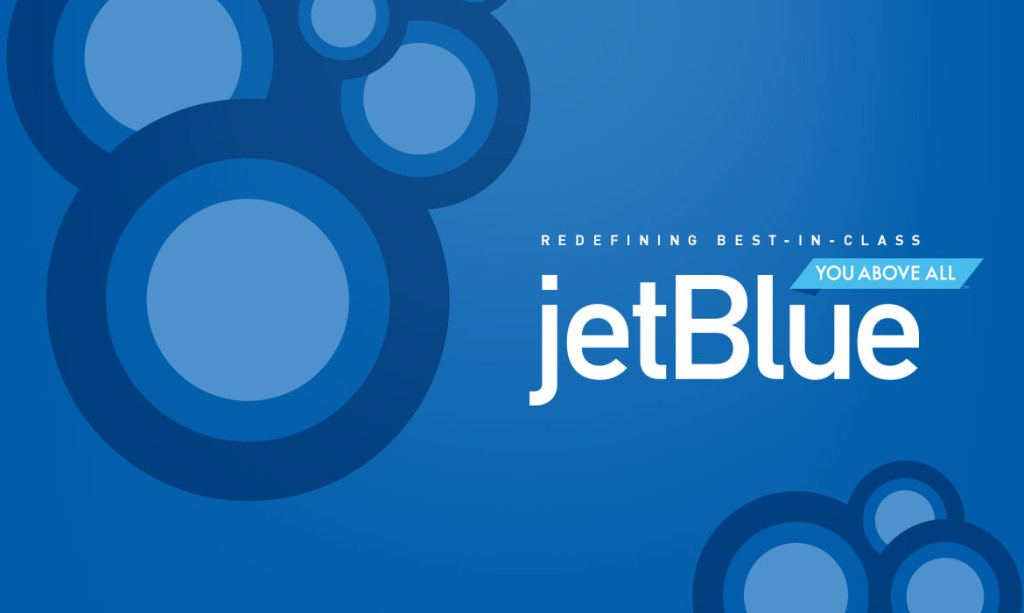
Looking at the website, billboards, terminal graphics, seat pocket brochures, TV and print ads, even the planes themselves, JetBlue has a truly consistent look. They use simple, graphic patterns that are visually fun and playful. The jet’s tailfin patterns, for example, include these designs, which play through all of their marketing:
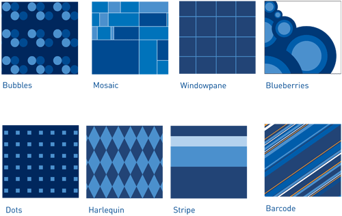
(See and read more about the tailfins at the bottom of this page.)
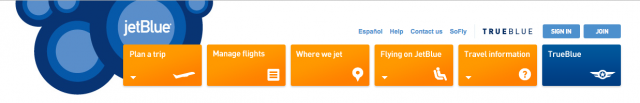
Look at the happy and welcoming website main navigation design:
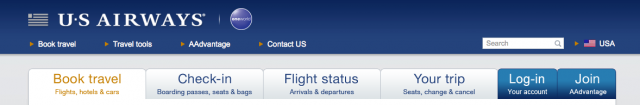
And compare that with US Air’s boring, staid design:
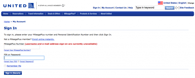
And United’s busy, cluttered, hard to read navigation:

You immediately get a sense of JetBlue’s friendly personality, whereas US Air and United seem cold and uninviting.
3. Build a Brand Voice
The words and phrases JetBlue uses reflect their brand style. They speak colloquially, not stuffy and corporate-like. At the top of the website homepage, for example, the two largest words are:

On the TrueBlue membership page, the copy is simple, with often single-word sentences:
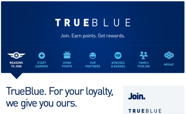
On an interior page of the TrueBlue section, they say “We treat loyalty like royalty!” How nice is that? On the TrueBlue login page, above where you enter your email and password, the headline reads: “It’s nice to see you again.” Which of these pages would you rather log into?:
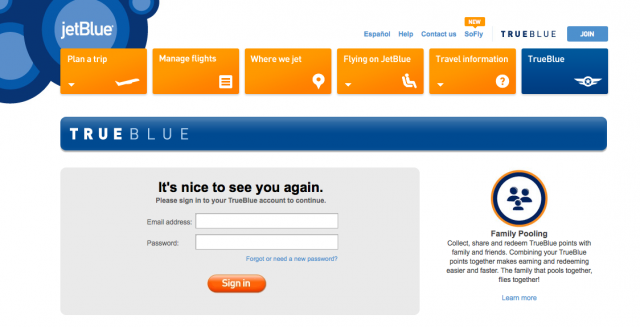
Or:
4. Avoid the Obvious and Clichéd
Take a look at the visuals on American’s homepage:
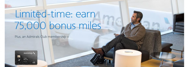
What do we see? People sitting in airports. How obvious. The woman in the second photo is probably thinking, “I hope this dorky guy doesn’t end up in the seat next to me.” But back to my point. These visuals are generic. There is nothing memorable about them. They give me no sense of American’s style, differentiate them, or move me to want to fly their airline for any reason.
5. Define a Brand Persona
When we think of people we like, we immediately (although often subconsciously) have an emotional response. We feel good thinking about that person. JetBlue’s playful graphic patterns, natural and relaxed messaging style, resistance to using clichéd visuals, and consistency of branding all contribute to their powerful persona. When I think of JetBlue, I feel good. Certainly, the clean planes and nice attendants contribute to that feeling. But even if I had never flown them before, and my experience was not a factor in the equation, the fun brand JetBlue has created might influence my buying decision.
Applying JetBlue’s Branding Success to Your Marketing
As professional service firm marketers, we need to begin by looking at our customers’ experience. What are the adjectives your customers use to describe your firm? Are they “fun”, “friendly”, “relaxed”, and “casual”, like I used to describe JetBlue? If you are not sure, then you need to talk to clients and do some analysis. If your marketing visuals and messaging are not reflective of the actual experience you are delivering, your brand will feel inauthentic. It’s the job of marketers to create a brand that reflects the experience, not the other way around.
Too many A/E/C website homepages rely on scrolling pictures of completed projects. Although examples of work are important, they do not help express the experience of working with your firm. Too many law firm websites showcase skylines, handshakes, and business people in meetings. How do those photos set you apart?
I hear the same words again and again throughout many of the marketing materials I read, like “reliable”, “responsive”, and “customer focused”. These words apply to every company (or at least those that want to stay in business). To differentiate, you need to dive a little deeper.
Too often, I see firms suffer the same fate as US Air, United and American. They are unsure about their persona, they want to be everything to everyone, and end up with no brand at all. I’m glad US Air and American are merging, I could never tell them apart anyway.
Vanessa’s article first appeared in SMPS Boston’s Outlook, .
About The Author