
What Should Your Logo Look Like, and Why?
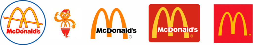
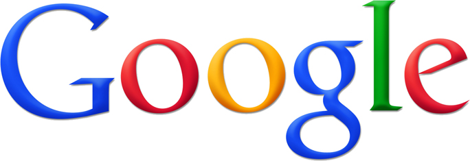
Logos are important visual elements that serve to connect consumers with a brand. Done well they become iconic. Most people can immediately visualize the logos of such well-known organizations as Nike, McDonald’s or Google.
Unfortunately, not all logos are as effective and there are a number of things to consider when designing a logo. The first thing you want to find is the right design firm to fit your needs. There are many agency online resources available.
As President and Creative director of Clockwork Design Group, Inc I have a lot of experience with logo design and much of that experience involves working with clients to help them understand what a logo is intended to do, and what it’s not intended to do.
Many clients, especially very technical or literal thinkers, want their logos to tell their entire story. But, logos are not meant to do that. Logos should be suggestive, not descriptive. They should entice people to want to learn more.
Many people think their “brand” is simply their logo. But a logo is just one part of a brand. The logo element rarely drives a brand, but it must be closely tied to a firm’s brand pillars. A logo should:
- Entice people to want to work with you
- Be clear and easy to read
- Appeal to human emotions
- Be conceptual rather than literal; allow room for each viewer’s interpretation
- Add value to your brand
Here are some examples of logos that Clockwork has designed:

A radical and lively new brand for Edelstein, a CPA firm, began with a formal brand analysis. Our findings pointed to a style of work that was evident when we first met the Edelstein team — they truly enjoy what they do, and their clients enjoy working with them. In fact, the word “fun” came up many times. Clockwork repositioned the firm’s brand to emphasize and align with their true personality. Now, the style of the firm really comes through and the consistent implementation across all marketing media is what drives this brand home. The new modernized logo uses warm and engaging colors, adds a lively, lighthearted, tilted “e” icon as well as a client-focused tagline, “accounting for you.”
![]()
The new Smith Duggan logo uses a classic font treatment and a creative design that merges the H in Smith and the D in Duggan. The merging of the names is also integrated into the favicon element that appears in a browser tab, abstractly joining the S and D. Although the letters are modified, the firm name is still immediately readable, even from a distance. The final integration adds a modern element to a strong, classic design.
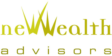
New Wealth Advisors helps recent high net worth individuals plan and manage for the future. Their logo uses fresh, modern colors and stylized typography to convey “growth.”
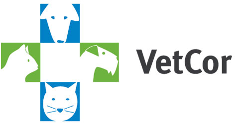
VetCor is a national chain of veterinary hospitals. Their logo helps to convey a friendly image to engage new hospitals and appeal to end customers. The animal images provide a quick, relevant tie to the name, while also creating the iconic hospital cross shape.
Logos have been around for centuries. Many companies’ logos have evolved over time sometimes dramatically, sometimes quite subtly. The very familiar golden arches of the McDonald’s logo, for instance, were introduced in 1960, but the way they have been depicted has transformed over time—from being an element of a larger image, to standing on their own.
Google recently introduced a logo change, a modification to the typeface used in its primary color text treatment identifier. The new logo uses a simple, sans-serif font with “flat” colors, no 3-D effects or shadows.
As both of these companies illustrate, great logos become an immediate, visual representation and reminder of the company’s brand. They are subjective, not literal, representations. And, simple is best. Ultimately, though, your logo is a reflection of your organization or product; it should quickly, cleanly and clearly send a message to your audience of “this is who we are.”
Vanessa’s article first appeared in SMPS Boston’s Outlook, .
About The Author