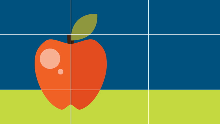
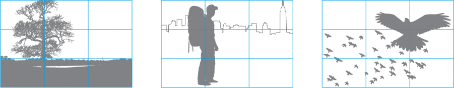
Often applied in the world of photography, the “rule of thirds” works by splitting an image into thirds, so you end up with 9 equal sections. It’s most effective when your main subject is placed where the lines intersect. Aligning a subject with these points creates more tension, energy and interest in the composition than simply centering the subject. It’s not limited to photography, it can also be applied to graphic design layouts. When composing your ad, website, or other marketing material try to think of the “rule of thirds” principle.
Website Examples:
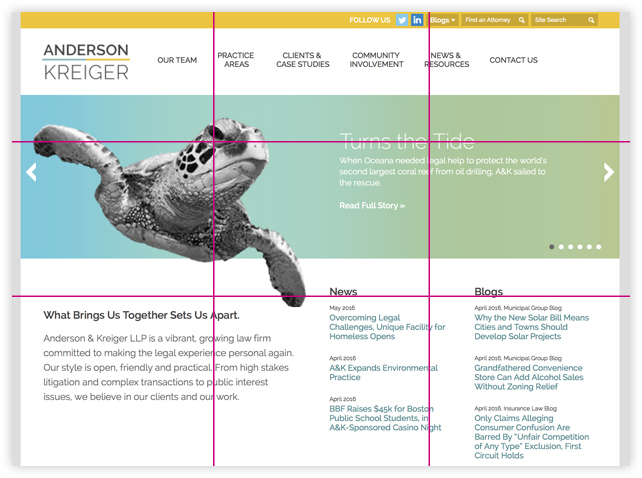
Anderson Kreiger’s homepage features a large graphic on the left with secondary copy on the right side. The turtle is positioned on the left side of the page aligning with the left vertical line. News & Blog headers align with the bottom horizontal line.
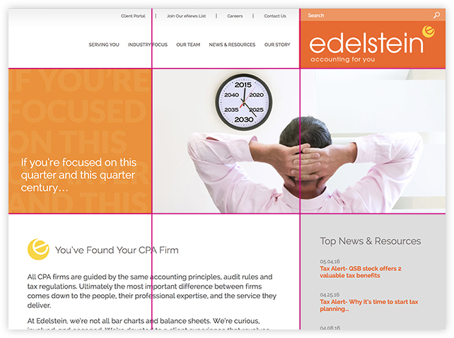
Edelstein’s homepage features a large orange square graphic on the left with photography on the right. The main subject of the photo is aligned with the right vertical line. Sections below are aligned with the bottom horizontal line.
eMarketing Examples:
The following examples are of static graphics that are embedded into e-marketing campaigns. These examples just happen to be for holiday e-cards, but the principle applies to any e-marketing headers.
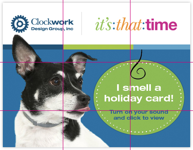
For the Clockwork Design Group holiday card we placed Fanny the pup on the left side of the page aligning with the left vertical line since she was the star of our e-blast. The call-to-action text aligns right along the intersection of the right vertical and bottom horizontal line.
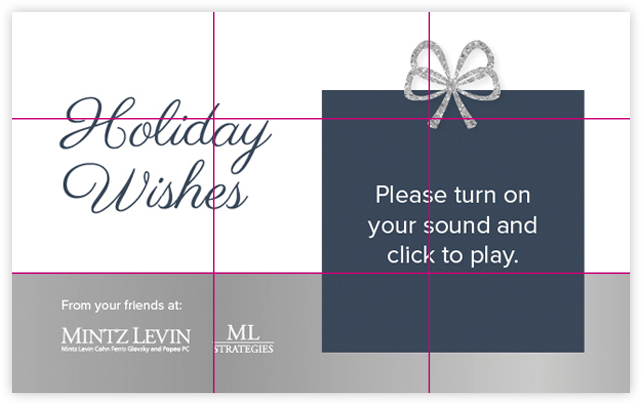
For the Mintz Levin holiday card we placed the “Holiday Wishes” headline along the intersection of the top horizontal line and left vertical line. The gift box on the right side of the page aligned with the right vertical line. The call-to-action text aligns right along the intersection of the right vertical and bottom horizontal line.
Keep in mind that these are just some very basic guidelines to help you understand the way that layouts can be created. They are by no means a one-size-fits-all solution. Be creative and continue to try different compositions. Happy designing! 🙂
Additional Resources
http://www.designersinsights.com/designer-resources/using-layout-grids-effectively
http://www.webdesignerdepot.com/2014/10/the-secret-of-grid-layouts-and-the-mistake-youre-probably-making/
Photography: 15 Great Examples of the Rule of Thirds in Action
About The Author