This is the second post in a series focusing on the basic building blocks of design. With each new post, we’ll feature a different principle that will help you understand how designers do what they do. If you’re ever tasked with creating something yourself, these principles can help you make good design decisions too!
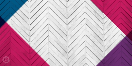
Emphasis: The dominance of one or more particular elements that creates a focal point in website design. It is where your eyes instinctively go when you first view the page. Often, a focal point is larger, more colorful, or has more contrast than other elements on the page. Once you’ve established a focal point, try to complement it with other features such as color, form, and texture to guide the viewer throughout the rest of the page. (See our article on Balance)
HOW TO CREATE EMPHASIS:
- Size – As you would expect, larger elements carry more weight
- Color – It’s not fully understood why, but some colors are perceived as weighing more than others. Red seems to be heaviest while yellow seems to be lightest.
- Density – Packing more elements into a given space gives more weight to that space
- Value – A darker object will have more weight than a lighter object
- Whitespace – Positive space weighs more than negative space or whitespace
THERE ARE 3 LEVELS OF DOMINANCE:
Dominant
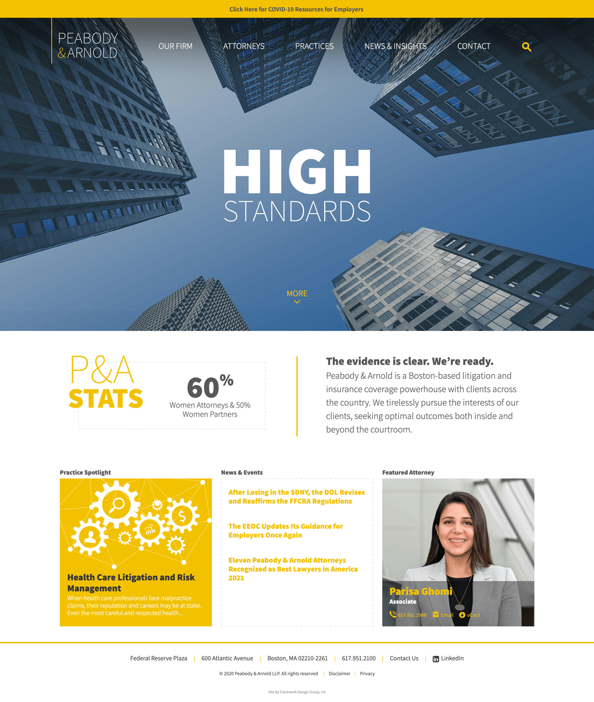
The element on the page that is given the most visual weight. In the Peabody Arnold website example below the words “High Standards” are the dominant element. The size of the typography in relation to everything else on the page grabs your attention first and foremost because its larger and bolder than anything else on the page.
Sub-dominant
The elements on the page that become the middle ground of the composition. In the example below the darker blue-toned images, the logo, and the yellow alert band are the sub-dominant elements. These elements are smaller than the focal point “High Standards” and have less weight because they are significantly smaller.
Subordinate
The elements on the page that are given the least visual weight. In the example below the main navigation, search icon, and the more arrow are the subordinate elements. The text is much smaller and the font is a lighter weight, setting it further back in space than the larger bolder type in the foreground.
VISUAL HIERARCHY, KEY TAKEAWAYS:
Remember: creating emphasis in web design requires a hierarchy of elements on the page. If everything is on the same level, viewers won’t know where to look first. You need to guide your audience throughout the design, making sure that they can easily get to the information they’re looking for. We know people like to scan for information quickly. Long gone are the days of reading giant chunks of text. Think magazine layout rather than a novel when designing and writing copy for the web. You can read our post all about visual hierarchy in web design here.
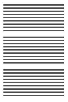
NO VISUAL HIERARCHY
Almost impossible for the viewer to review the information quickly and identify specific important elements.
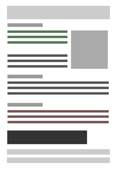
CLEAR VISUAL HIERARCHY
Headers, different type sizes and colors, and spacing create a much easier way for the viewer to find the specific information they are looking for.
If you have any questions about design principles or the projects mentioned above, shoot us an email and we’ll be happy to help.
Additional resources:
Smashing Magazine – Applying Interior Design Principles to the Web
About The Author