A picture is worth a thousand words —so it’s important to choose the images on your website thoughtfully. For example, how do you select an image for industries like waste services and make it attractive? Or show non-profit work, but no faces? Use the tips below as a guide the next time you select images for your site.
Quality Images
You may consider hiring a photographer to take custom photographs, utilize stock photos, or a combination. Either way, you always want professional, high-quality images. Screen resolutions on monitors and mobile devices are getting much higher, so make sure the photos you shoot or download are large enough so they look sharp on modern screens.
Relevant Photos
Images help your user navigate your website. Users will “read” the photography before they read the text on the page. So, you need the photographs to help you describe the purpose of the page the user has landed on. When choosing photos, think “main message” rather than focusing on the technical details of your subject matter.
The Power of People
Faces of people are a way to immediately connect with your readers, so be sure to utilize people who reflect your target audience. Studies show that users relate and respond to faces (of people as well as animals).
Consistency in Imagery
You are telling a story to your readers and you want a consistent story from the home page and beyond. Be sure the choice and treatment of the photos is uniform. Are you using black and white photos? Then use them exclusively. The same is true for the color, cropping, style, and orientation of your photos.
Thematic Imagery for BBK
Here is an example of a client’s website that illustrates how we leveraged photographs to create a powerful, consistent brand:
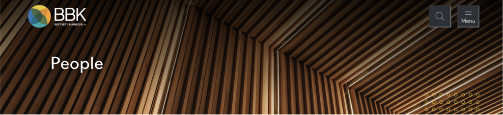
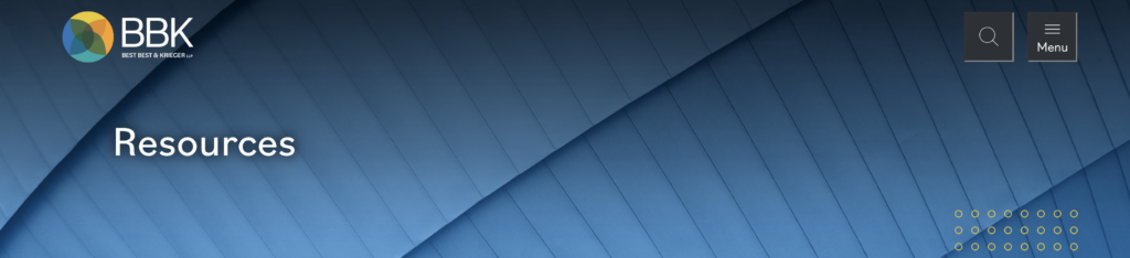
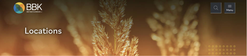
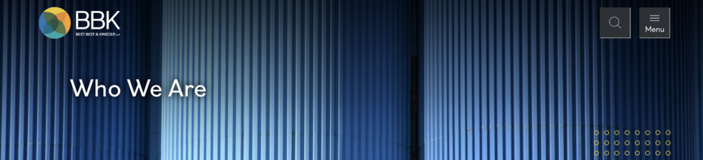
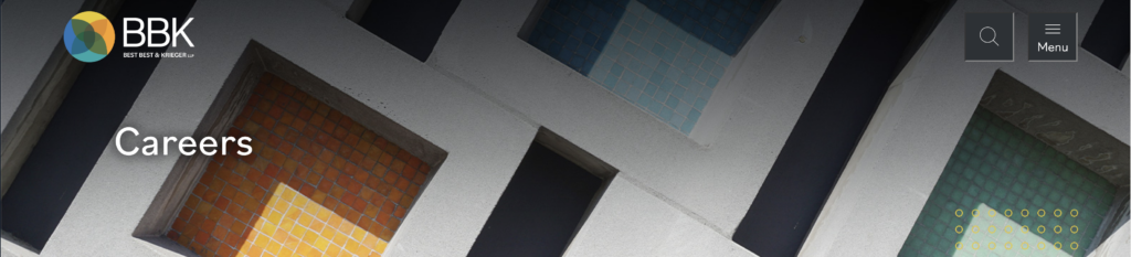
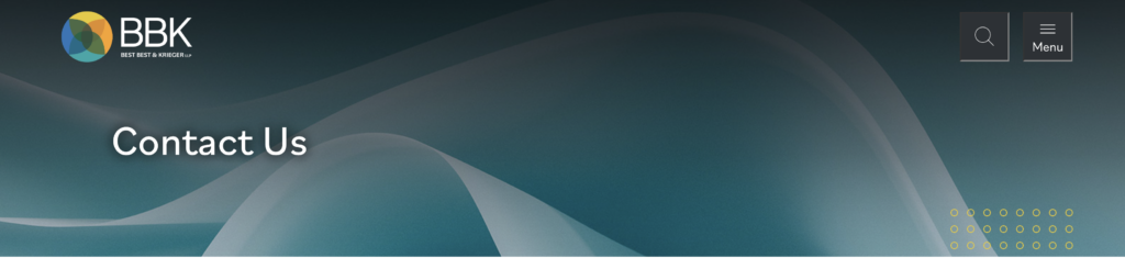
Do you notice the theme? On the BBK banners (above) they are all abstract, close-up, textures that focus on colors from BBK’s palette.
Another good example is on BBK’s locations page (video above). Notice how each location uses an image that’s stylistically similar to one another. They are colorful, scenic shots, without any people. Each image also overlaps the light gray frame that holds the office information text beside it. This style of overlapping is a branding element for BBK.
Ready to test your skills? 🤓
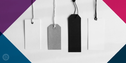
Round 1
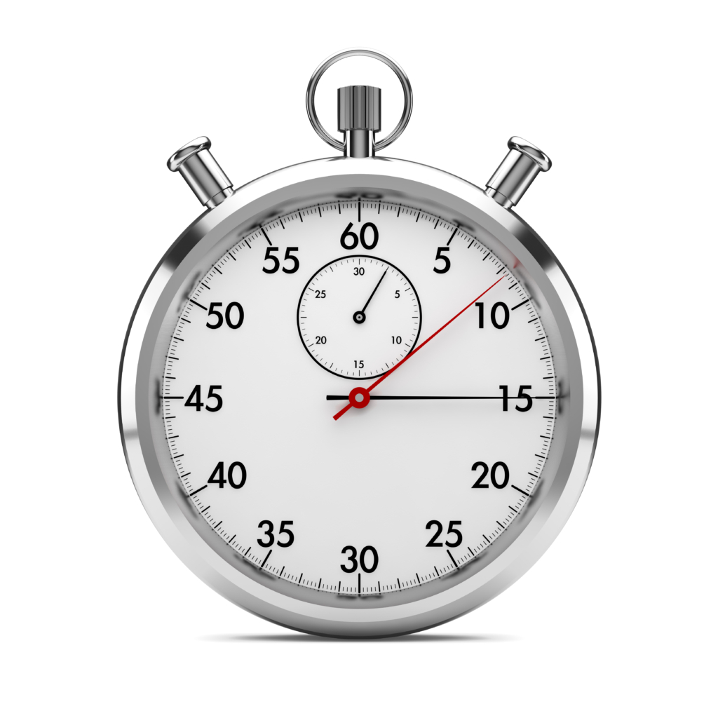
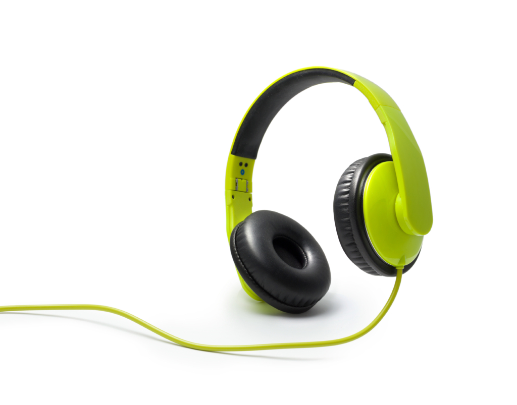
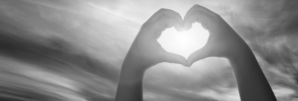
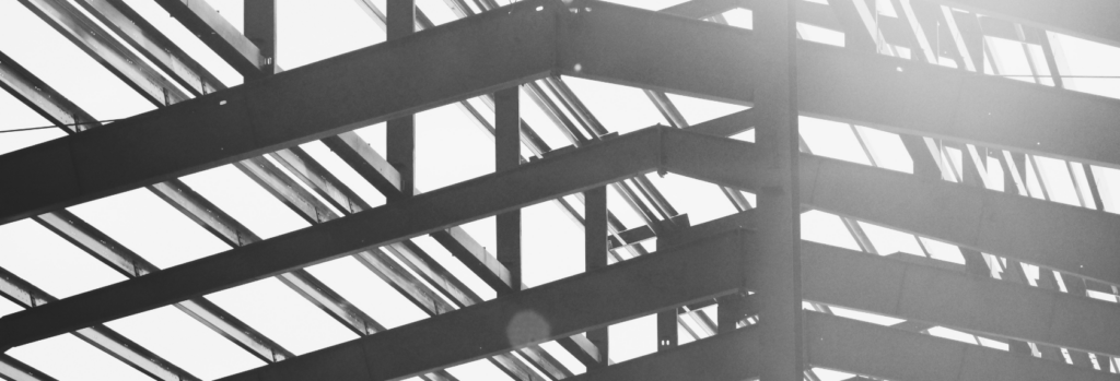
In each group of four images below, there is one photo that doesn’t fit in. Can you figure out which photo doesn’t belong?


Reveal the answer here
D!
Although all of these images show objects, D is a square-up, while the other three photos are silhouetted. Option D, therefore is inconsistent with the overall style.
Round 2
Three of the banners below are from Critchfield’s website, a law firm with deep roots in Northeast Ohio, while one banner is not. Which one do you think doesn’t match?


Reveal the answer here
B!
In this lineup, B is the photo that doesn’t fit. This is because even though B is black and white, like the others, it has much less contrast.
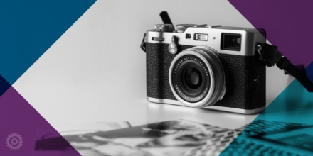
Round 3
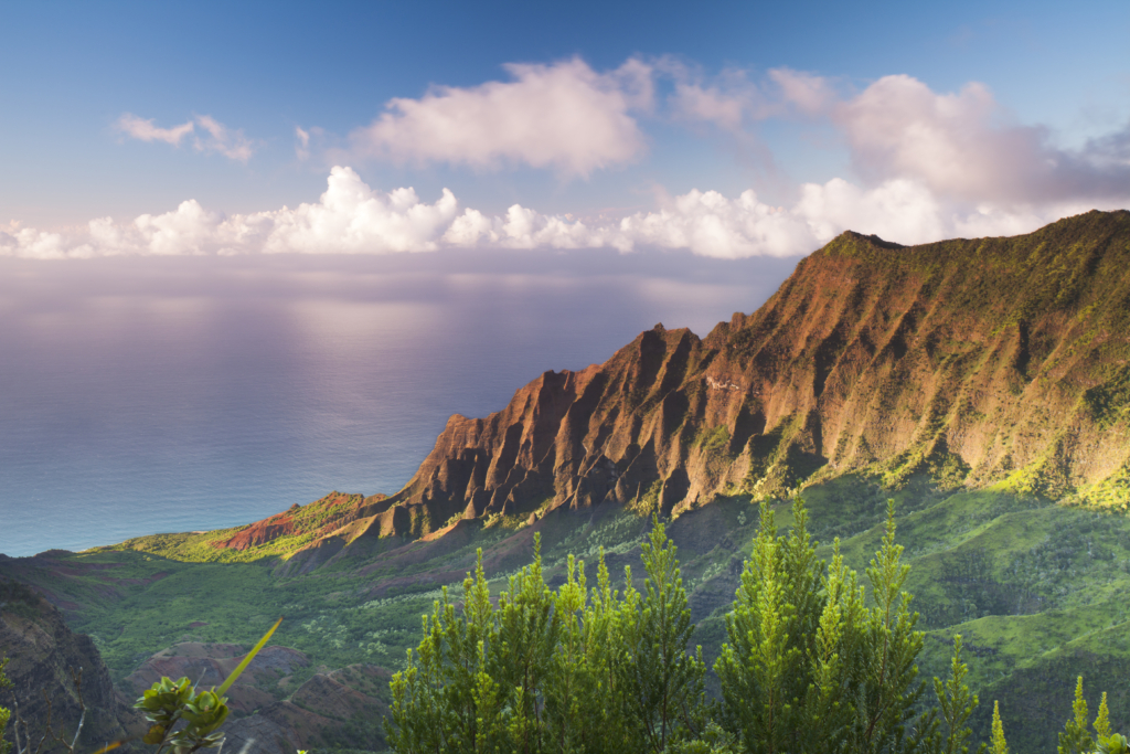
The next test is a little harder. Three of the photos below were used for the hero area on the Grimes & Company website. Can you tell which photo looks out of place?


Reveal the answer here
C!
Even though all the images above are of nature, C is the only one that doesn’t coordinate with the others because of the multi-color style. Grimes uses soft monochromatic imagery, which means that each photo focuses on a single color.
We hope these tips and the quick quiz have empowered you with the knowledge to make thoughtful photo choices, ensuring that the images on your website effectively convey your brand’s message and captivate your audience.
Related Posts:
Where to Find Great Stock Photos
Design Lesson: What is Depth of Field?
About The Author