As web designers, we can incorporate all kinds of unique functionality and significantly more customizations than we could in the past. Now, dark and light mode options offer even more flexibility. But what are the pros and cons? Let’s dive in!
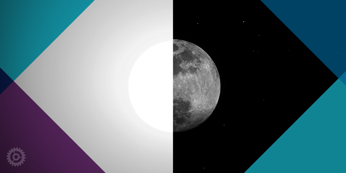
What is Dark and Light mode?
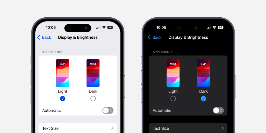
Have you ever borrowed a friend’s phone or tablet and found the interface darker? That’s dark mode! Devices often offer light and dark modes that adjust the UI. Light mode usually defaults to a white or gray background and dark mode to a charcoal background with white text. Each has its pros and cons depending on the user’s preference.
Note: Individual websites typically remain unaffected by a user’s device preferences. There are exceptions to this, however, with major sites/apps such as Google and Instagram automatically adjusting to reflect the selected option.
How Can Dark and Light Mode Shape Brand Identity?
Dark mode
Dark mode can significantly influence brand identity, overall messaging, and tone in a few ways. Firstly, it can portray a sleek and modern aesthetic that can convey sophistication and exclusivity, helping you to stand out in a bright digital landscape. It can also evoke specific emotions and personalities that can align well with certain brand personalities. Additionally, dark mode can accentuate vibrant colors and imagery providing lots of contrast to help make things “pop.”
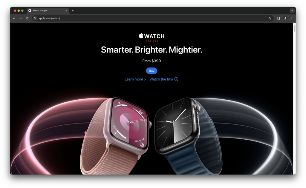
The Apple Watch landing page uses a pure black background, making the product feel exclusive and high-end.
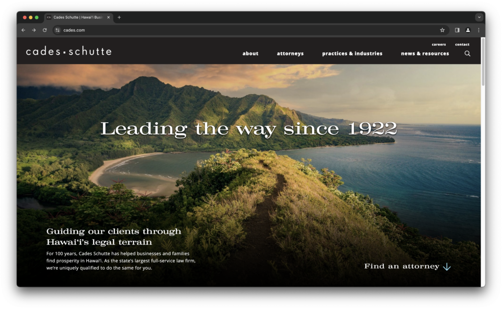
Clockwork designed the Cades Schutte site with a sophisticated approach using dark charcoal and evocative imagery.
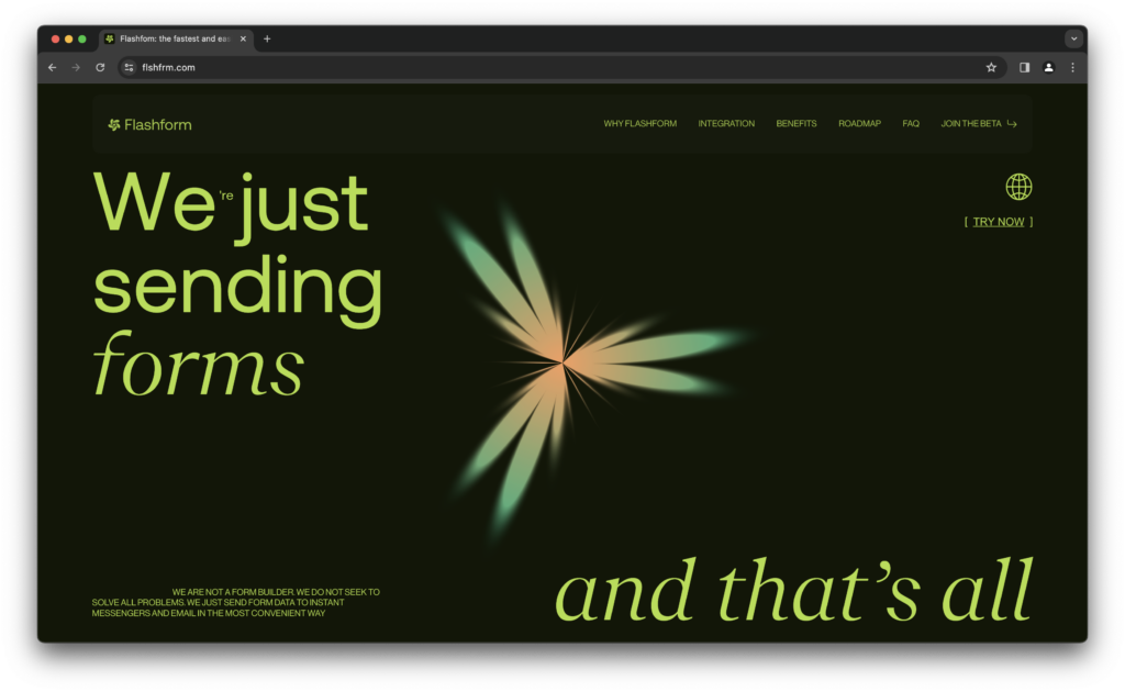
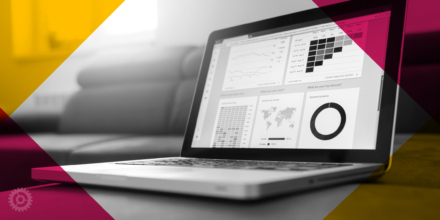
Dark mode doesn’t require that backgrounds only be fields of black. Check out this site we happened upon while surfing the web.
Light mode
Light mode can often portray a sense of clarity, simplicity, and accessibility, which can align well with brands aiming for a friendly and approachable aesthetic. Despite being more of the norm for websites, it’s a classic for a reason. The lighter backgrounds have a more visually comfortable appearance for most users.
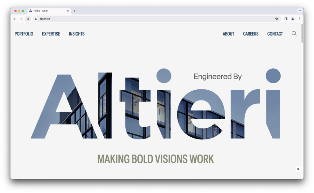
When we worked with Altieri, we employed lots of white space and minimal colors, to convey a friendly and innovative look.
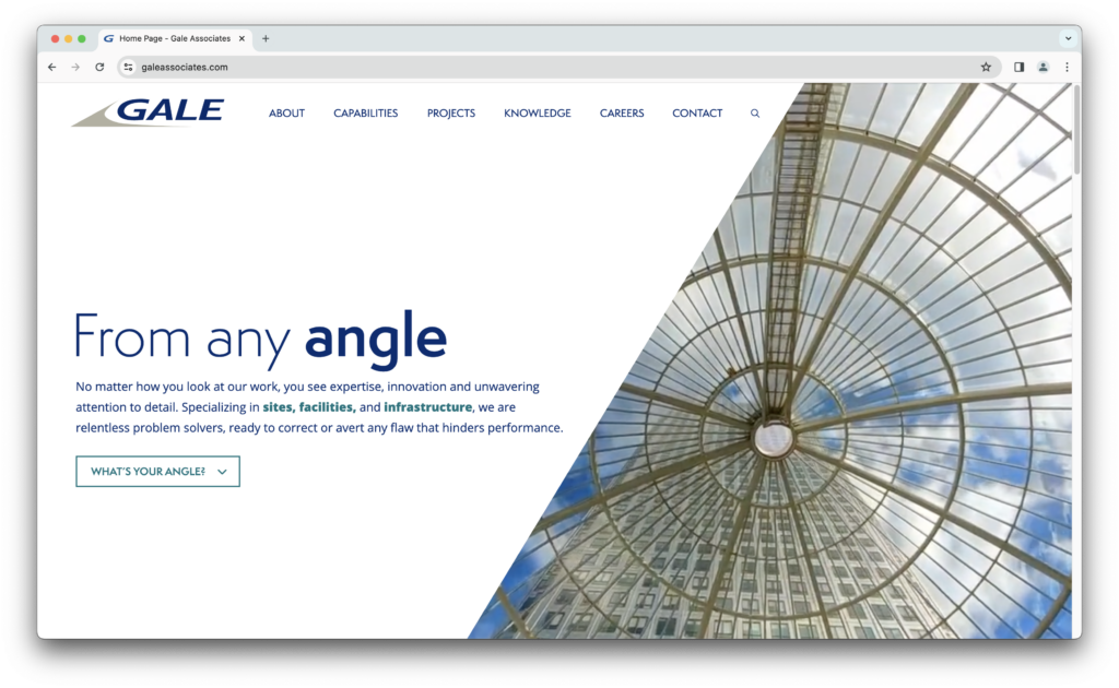
We crafted the headline “From any angle” for the Gale homepage, and paired that with a strong, diagonal area of whitespace.
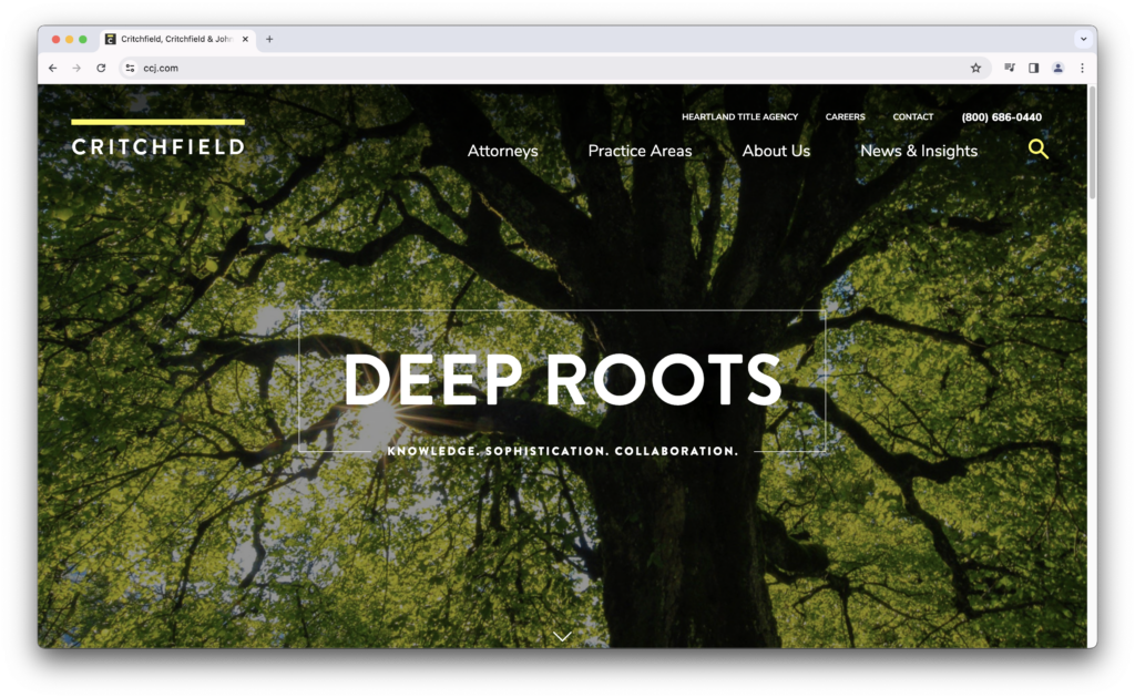
Websites can also be designed with a balance of light and dark mode. For example, we designed Critchfield’s website with a large, dark hero image paired with bands of yellow and white as you scroll down the page.
Extra Credit: Toggling
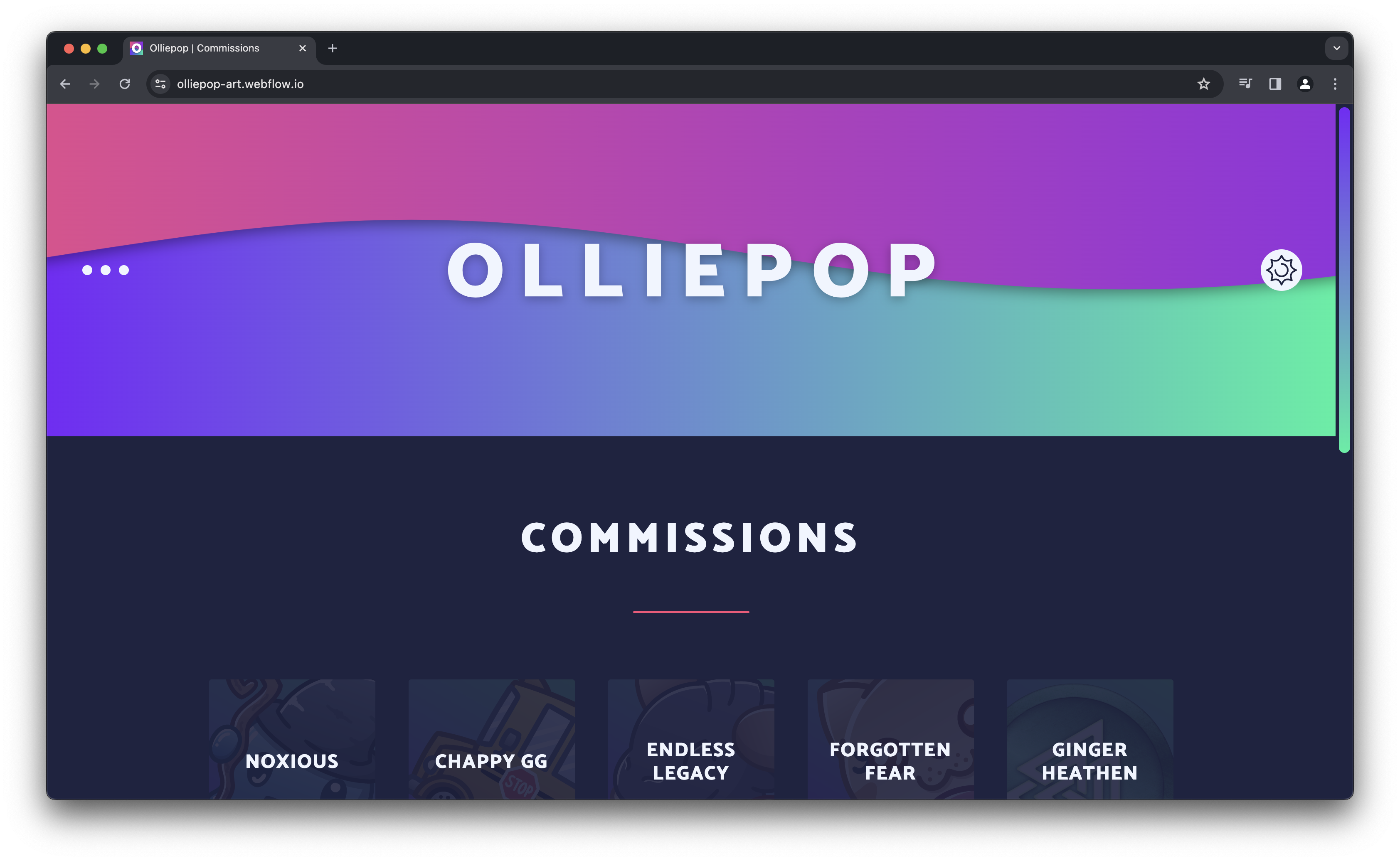
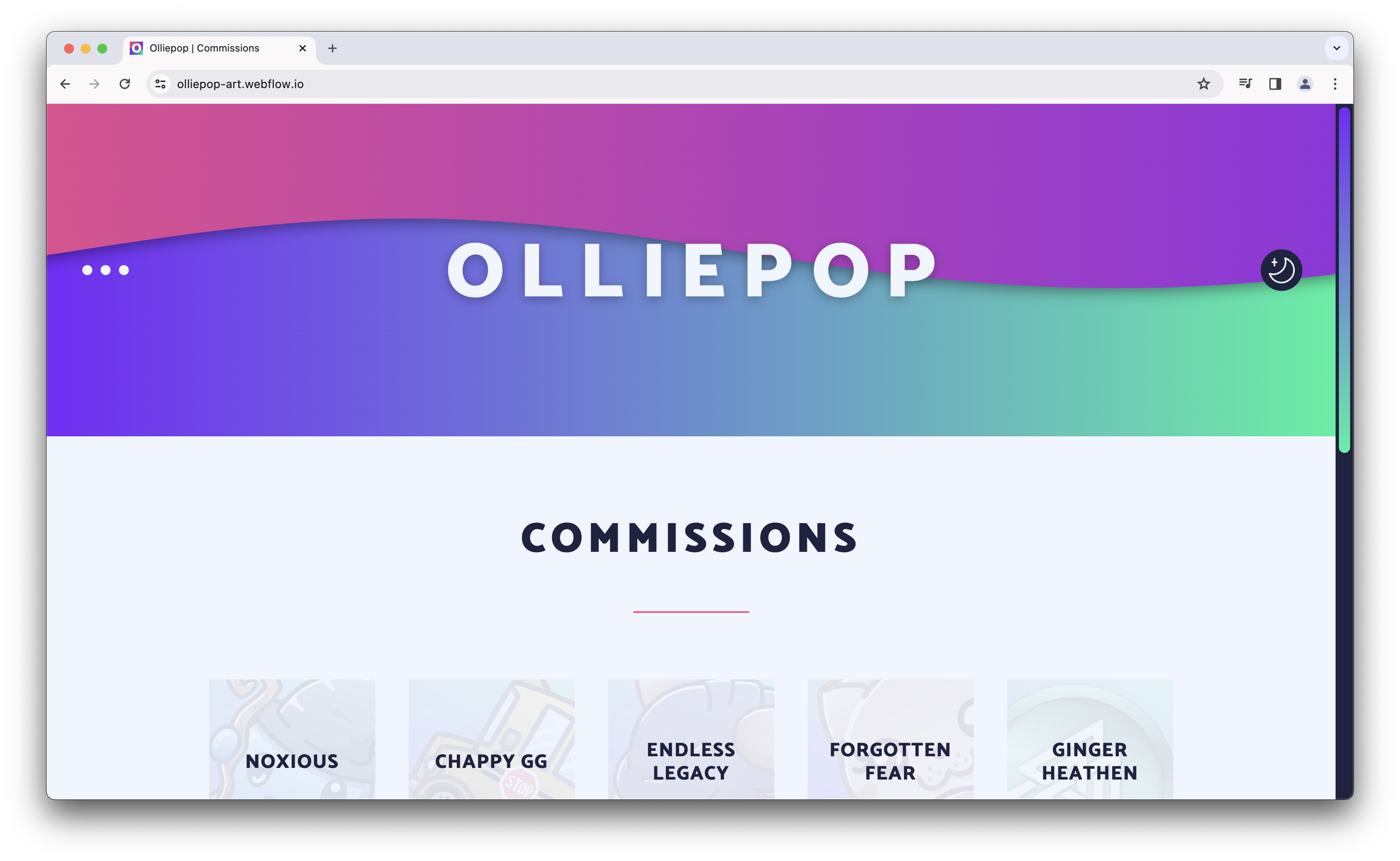
This site offers an optional toggle in its menu to allow swapping between light and dark mode designs.
As you navigate the web, consider the impact of dark and light modes on your browsing experience. Which mode resonates with you? Share your insights and experiences with us!
About The Author