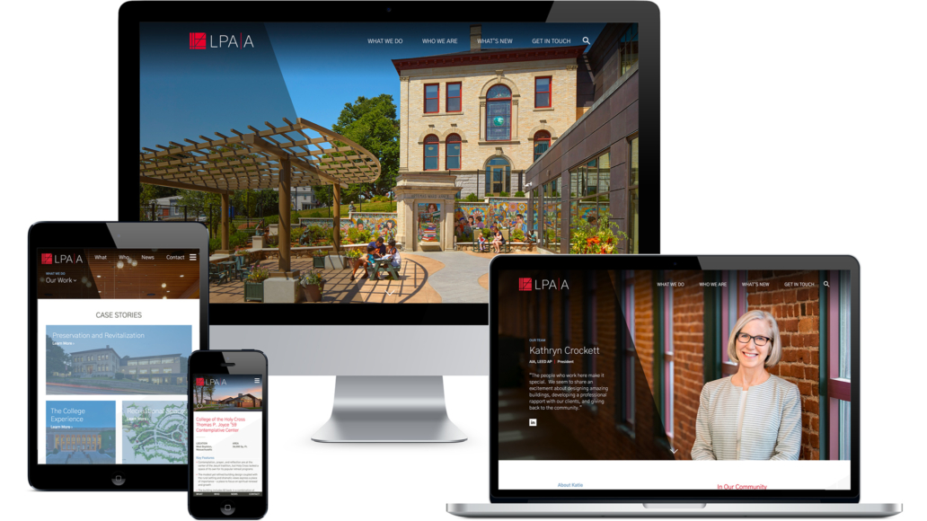
LPA|A
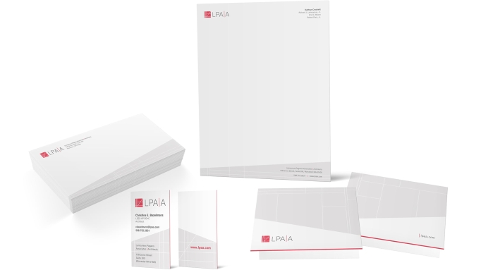
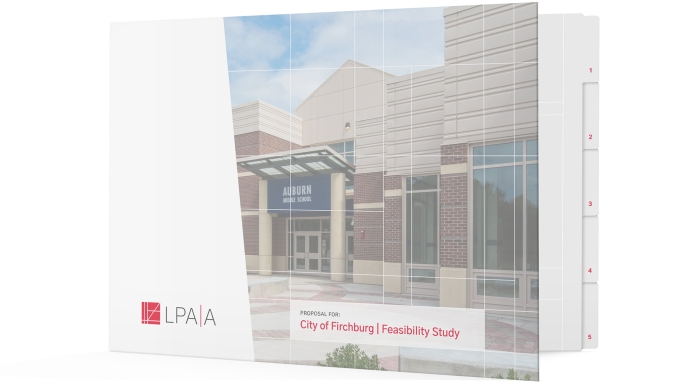
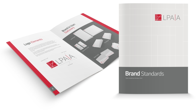
Lamoureux Pagano Associates | Architects is recognized for its design of educational, cultural and corporate buildings, as well as its work in historic preservation and sustainable design. We worked closely with the LPA|A team to understand and redefine their brand. The new logo is in keeping with the firm’s design aesthetic and pays homage to the Arts & Crafts movement and Art Deco motifs found within their work. The flexible, adaptable layouts on the web pages reflect their organic design philosophy. The full name of the firm, Lamoureux Pagano Associates Architects, was difficult to spell and find online. Now shortened to LPA|A, the URL was also changed to reflect the concise name.
Advanced Features
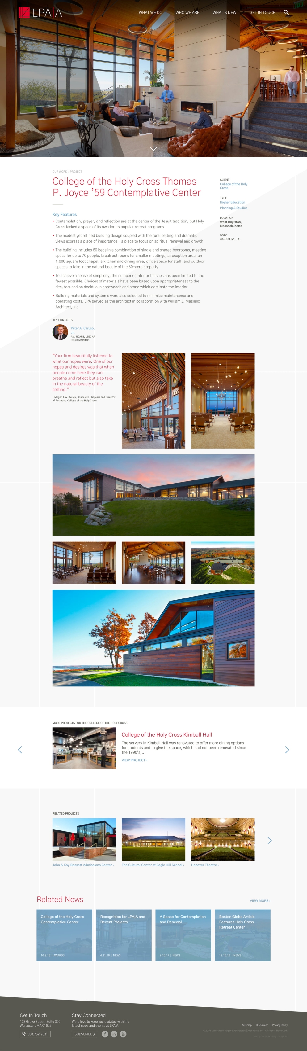
Project Pages
Project portfolio pages use flexible, organic grids so photos can be vertical, horizontal, or square, and text and images can be laid out in configurations that best showcase each project. Other projects for the same client are featured in a slider, and related projects and news are dynamically crosslinked to keep visitors exploring the site.
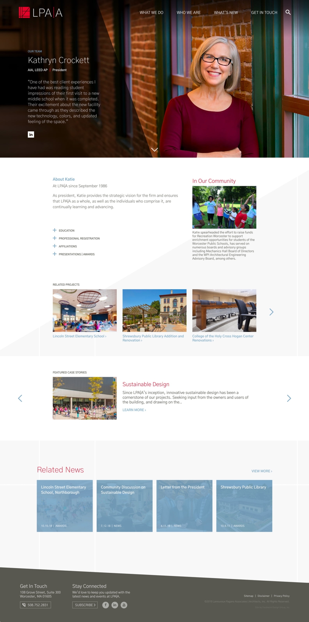
Team Member Bios
Every employee at the firm has a personal bio page. Engaging portrait photos were taken for consistent style and lighting. A prominent, personal quote allows the individual to express what working at LPA|A means to them. Each bio includes "In Our Community" where the individual's community involvement is noted. Bios showcase links to related projects and news posts specific to the individual, as well as case stories, when applicable.