
In the endless sea of advertising, it can be hard to stand out from the crowd. In this post, we’re going to talk about some best practices for designing ads for professional service firms that are both eye-catching and successful. Although the examples included are for ads in printed publications, the principles apply to digital mediums as well. Without further ado, here are a few tips for making your ads more effective.
WHICH OF THESE DESIGNS DO YOU PREFER?
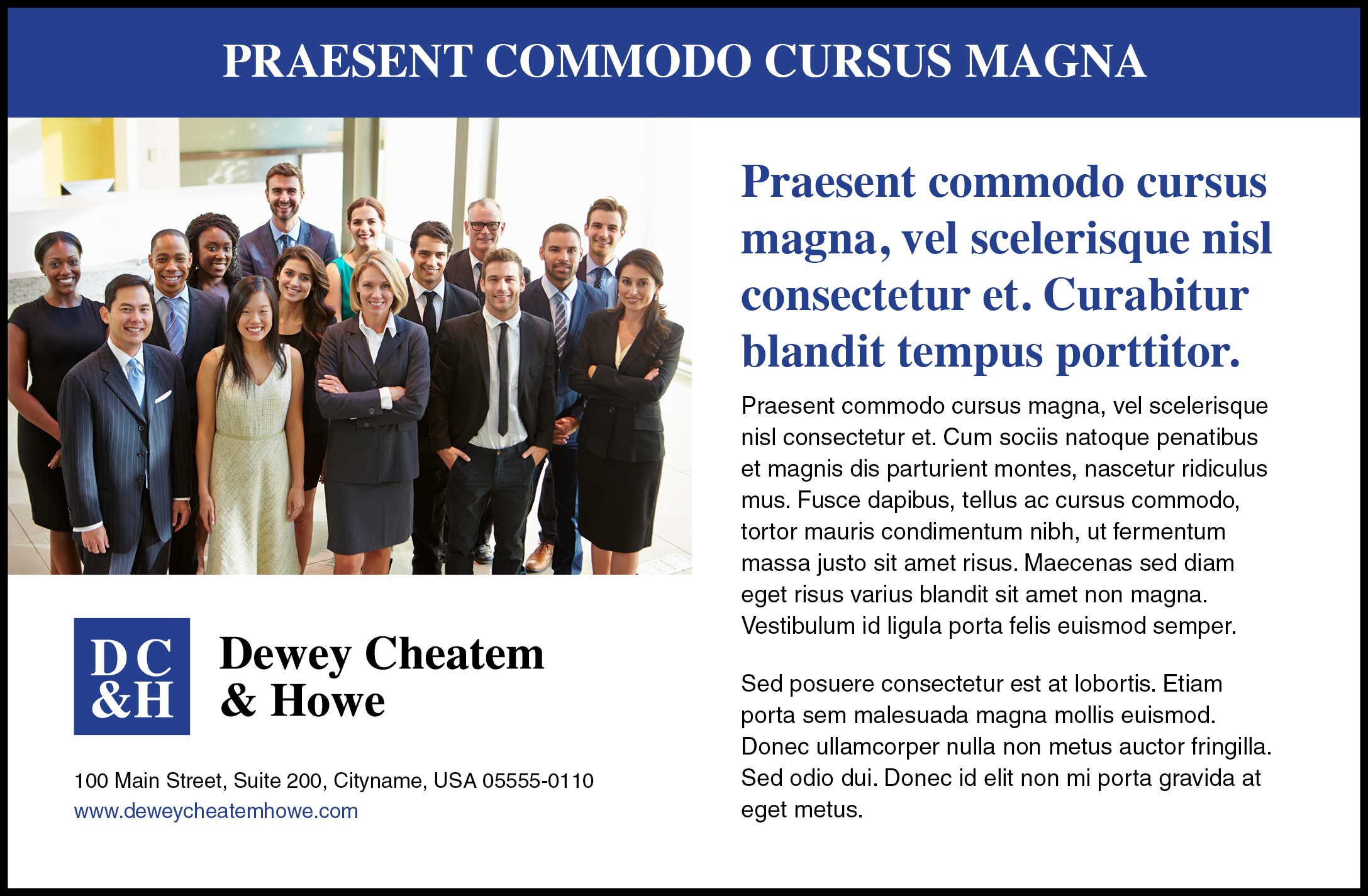
Design A
![]()
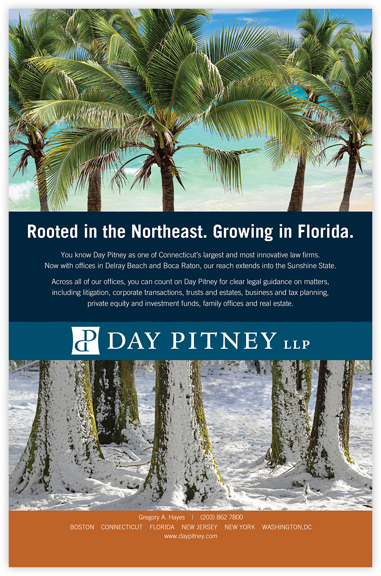
Design B
![]()

Did you pick A or B? Why? Design A is the safe choice. It isn’t necessarily a bad ad, but it’s also not unique. There’s an abundance of text to read and the photo isn’t very interesting or eye-catching. Design B, on the other hand, limits the amount of text and cleans up the grid so that you’re focusing on the photo and headline pair. The editorial style photography helps to convey a feeling and tell the story in a more authentic way. Here are a few tips for making your ads more effective.
![]()
Keep it Short, Sweet & Clever
Limit the amount of text to only the most relevant 2-3 sentences. It’s important to remember that your ad will be looked at for at most 1-3 seconds. Make it clear to your viewer what your message is. Target your audience before you start designing your ad. Avoid broad, vague differentiators that other competitors can easily say. Copy always drives design.
Define Your Visual Hierarchy
Present your information in a clear hierarchy. Make sure your headline and body copy are clearly distinct. Limit to one headline wherever possible. Define a clear call to action, if it’s a URL make sure its easy to spot and is simple enough to key in.
Generously Use Whitespace
Allow your content to breath with lots of whitespace around it. Allow the viewer a place to rest their eyes. This doesn’t necessarily have to be white, use color to break up the grid.
Use Photos to Tell a Story
Avoid generic imagery. Use photography to play off the headline. For example, if you’re designing a sponsorship ad for a golf tournament, don’t be afraid to show some imagery of a golf course etc. Avoid trying to include group photos or a grid with a number of small faces.
Be Consistent Across Platforms
Cohesion is also important across mediums. If your website has a set style of photography and a number of colors in the palette, carry these over to printed ads, web banner ads, and any other marketing collateral. Your tone of voice, messaging and visuals should always align with your brand’s values, promises and aesthetic.
Dare to Be Different
Advertising is a key component of any successful brand. It’s imperative that you stand out from the crowd.
A Few Projects
Here at Clockwork, we love to help professional service firms differentiate themselves from their competition. It’s what makes us tick. We’d be happy to work with you to define your firm’s brand in a creative way.
About The Author