
When designing for the web, some of the most important decisions we, as designers, have to make concern visual hierarchy. What does that mean, exactly? Visual hierarchy refers to the arrangement or presentation of elements in a way that implies importance. In other words, visual hierarchy influences the order in which the human eye perceives what it sees. This order is created by the visual contrast between images, typography, and whitespace. We’ll explain.
In reality, we only have 3-5 seconds to make a first impression. That’s why your homepage needs to have a clear message. What do you want your visitors to do? Contact your firm? Reach out to individuals? Sign up for emails and follow your thought leadership? Visit your location? Once you determine the most important goals you want your site to achieve we can begin to organize the design to achieve these goals. Emphasizing key components can be done in many different ways. You can play with the color, size, location, pairing with photography, graphic elements etc.
Most people understand and expect to see certain elements in certain places on a website. For example, your logo typically resides in the same place on all pages of your site, often in the upper-left corner. It serves two functions up there. First, people will know that they’re on your site, which reinforces your brand. Second, it acts as a button to get back to the homepage from anywhere on the site. Other elements you have more flexibility with.
The key to remember is this: When everything is on the same visual level, you overload and confuse the viewer. People should be able to scan your site and quickly grasp what you do and they should know what they should do next. Here are a few examples.
Use Size to Your Advantage
Enlarging the dimensions of an object and the size in relation to other objects is a highly effective way to give your design visual hierarchy and organization.
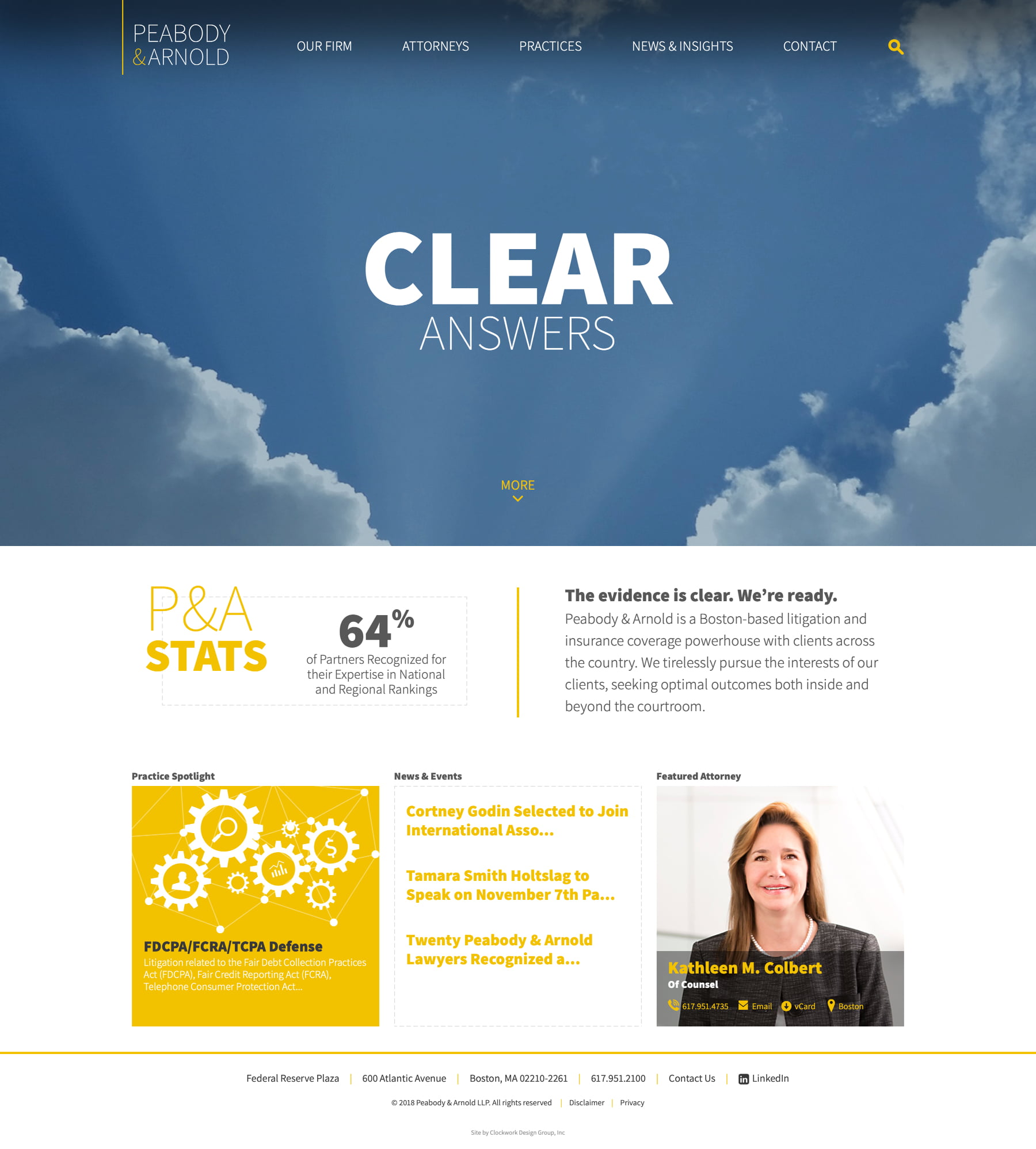
Peabody & Arnold has a modern, full-frame photo with bold typography animating on the top of the photo. Adjusting the size of the type to be larger than everything on the page encourages the user to focus on it first. From there the flow of the site is easy to understand: the logo is in the obvious top left position, search can be found in the upper-right corner, key firm stats rotate in a visually interesting way, and introductory copy easily conveys the firms’ focus. As you scroll down, you find a row of spotlights, highlighting a practice area, recent news posts, and a rotating attorney profile as a tertiary set of information to interact with.
Use Color and Space for Wayfinding
Color can be an excellent way to organize and guide your visitors. Choose a primary link color, as well as hover states to indicate that something is clickable. Changing the style of a link to bold or a button can further emphasize elements. In the example below, we used orange as an indicator of the most important elements. Don’t be afraid of whitespace which allows your visitors’ eyes to rest. Space out elements so they can easily focus on one item at a time.
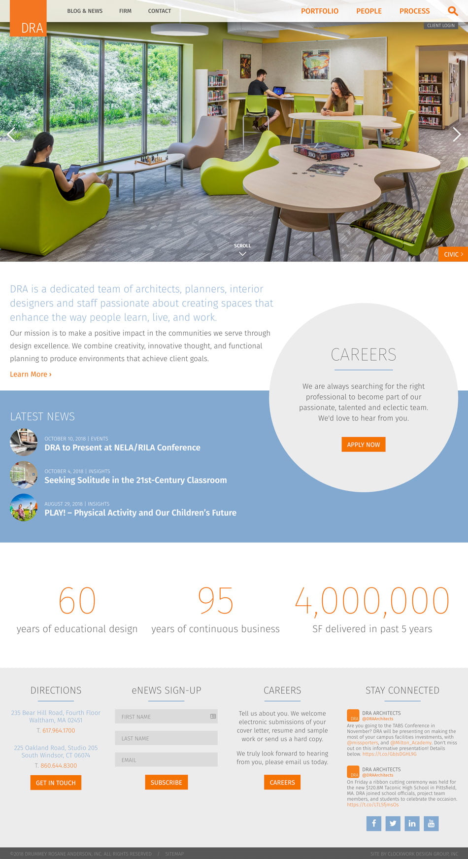
For DRA, a growing architecture firm just outside of Boston, sharing their warm company culture, as well as their growing thought leadership was very important. High-quality photography was crucial to the success of the site. We chose imagery carefully and took custom portraits of their architects in black and white. The contrast between full-color project photos and the classic black and white portraiture helps to grab the attention of visitors. Recruiting is also a goal they had expressed prior to project start. We helped to guide visitors to the careers section of the site by placing a prominent orange ‘apply now’ button in the gray circle to the right. In the blue band, they show the latest news and thought leadership posts to encourage visitors to read more on their active blog. Just below that, they have animated stats that show the breadth of work they’re doing in the Boston area, as well as their long history in the region.
Copy, Type, and Imagery Work Together
Just like when you’re organizing your closet, sometimes you need to purge things that are less important. It’s a similar concept for visual hierarchy. Knowing what you’re trying to say is the first step. Once you know what your primary message is and who you’re trying to say it to, you can make informed decisions in building your website.
Understanding what you’re trying to say is vital. Think like your primary visitor, and write with them in mind. Choosing fonts and imagery to reflect your target audience is essential to creating a successful brand. If your audience is conservative, serious and mature, the tone of voice, choice in graphics and type of font should reflect that. Alternatively, if your audiences are youthful, fun and modern, your choice in design elements will differ. Pairing fonts, choosing photography, and writing for the web are all part of building a successful brand.
About The Author