
Challenge
Rebrand Sherin and Lodgen. The firm’s marketing materials were extremely dated both stylistically and functionally, and were completely haphazard and inconsistent.
- Portray the firm as client-focused, offering personal attention while being cost-conscious.
- Design a new website that includes the full scope of industries and practice areas the firm services, while highlighting corporate real estate, life sciences, and retail/shopping centers.
- Create additional marketing components consistent with the new brand standards.
Solution
- Offer several new homepage designs, all focusing on core industries.
- Create a new logo, stacking “Sherin” on top of “Lodgen” in a fresh, legible typeface. Craft a memorable tagline for the firm.
- Implement a new color palette that is modern and engaging, and not typically found in law firm branding.
- Plan a year of intense profile building, including creatively announcing the rebranding and new website to all firm contacts.
Before & After
Drag the below divider right for “before” and left for “after”
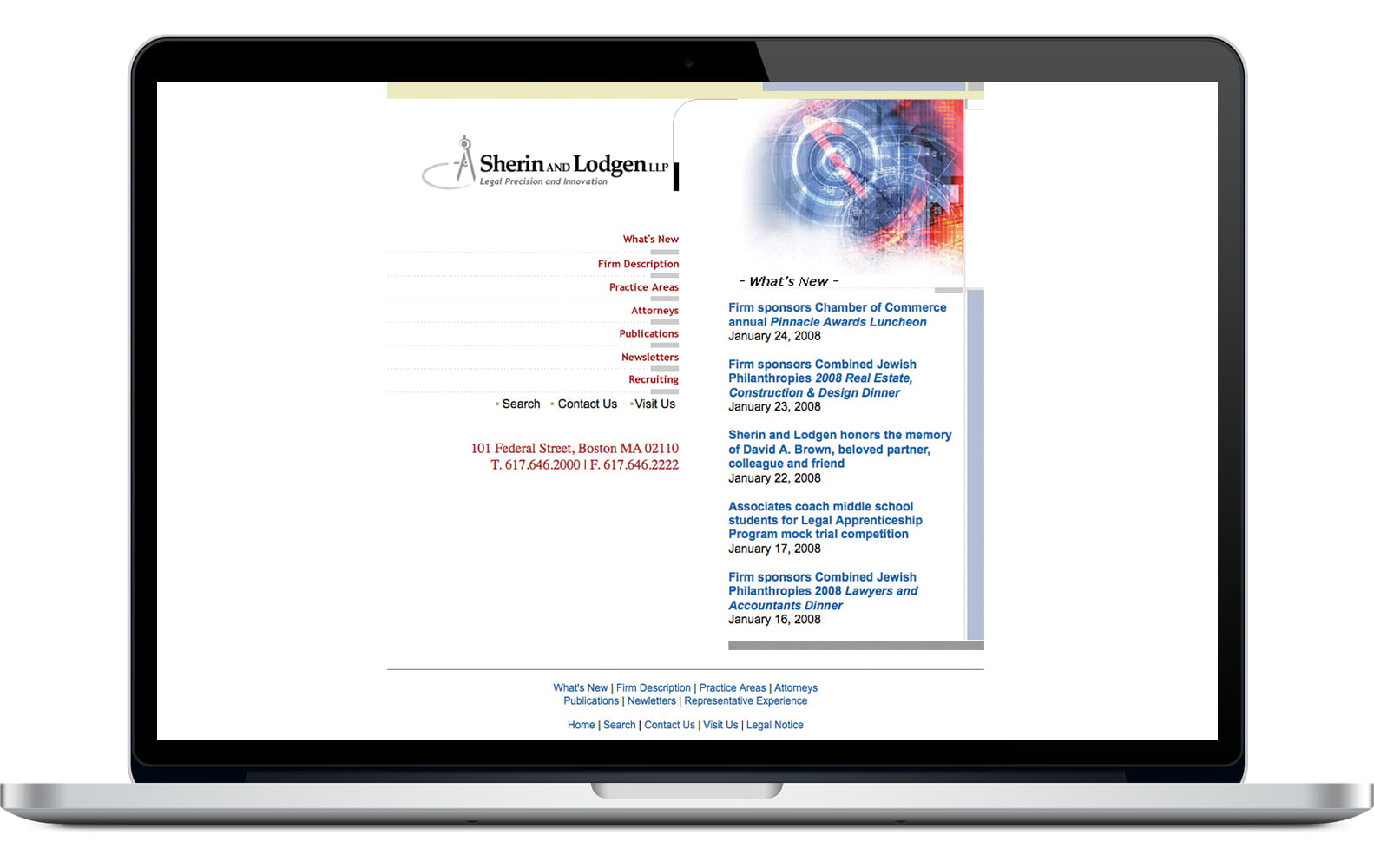
The existing logo depicted a compass which emphasized its real estate and construction work exclusively. The website was extremely dated both stylistically and functionally.
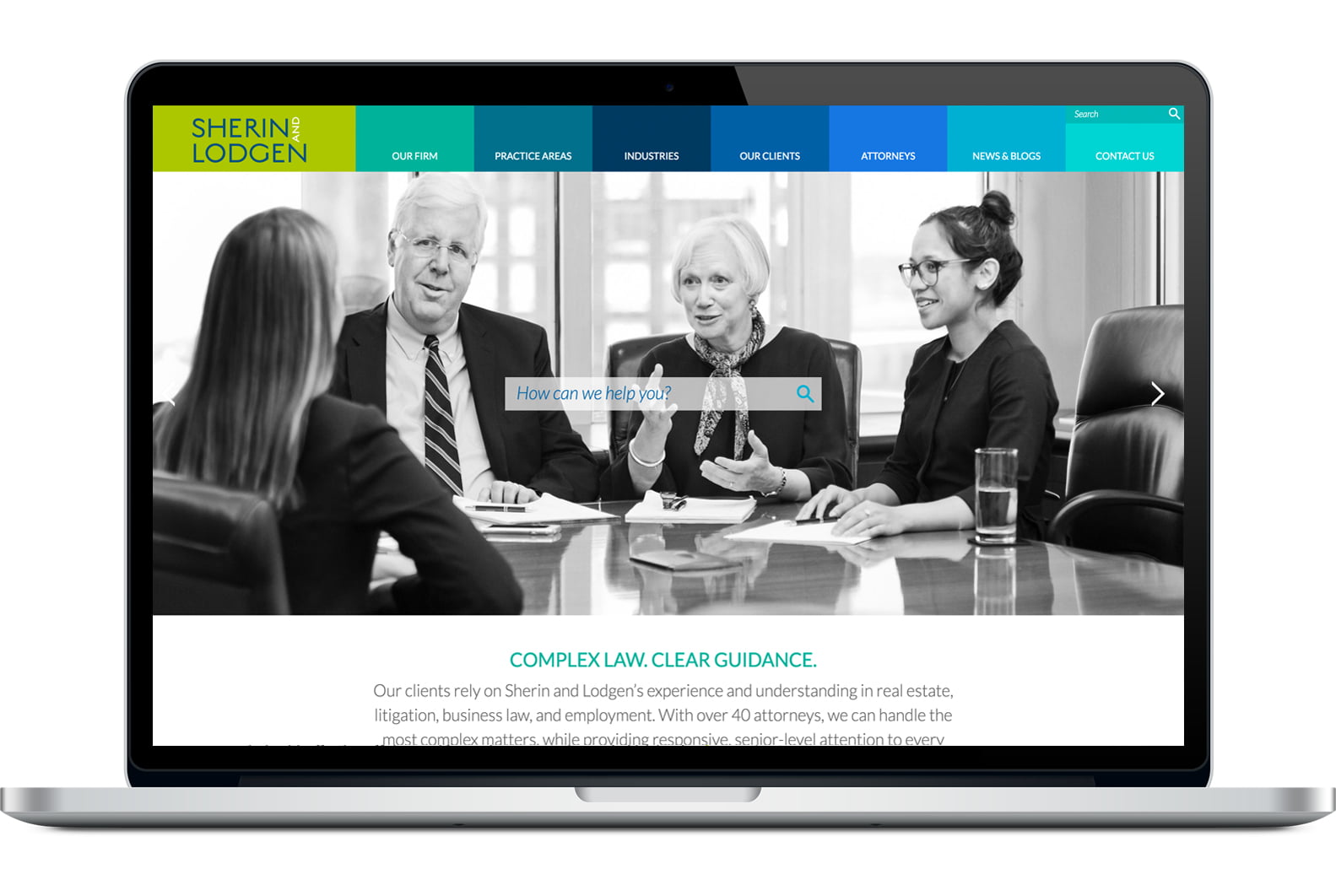
The new logo is modern and not industry-specific. The new website includes the full scope of industries and practice areas the firm services, while highlighting core industries.
Results
- After the first year, the firm saw a marked increase in website traffic and brand recognition.
- The marketing department and firm leadership noticed increased attorney confidence, business development activity, and pride in the firm.
About The Author