
Website styles change over time. As a designer, I constantly keep an eye out for new trends in design, functionality, and marketing emphasis. Here are a few changes that I see becoming more prevalent for professional service firms:
- The Power of Branding
In years past, many firms thought of their website as a separate entity from other marketing components. Firms did not consider how their website would convey their brand. In fact, many firms did not even have a defined brand, other than their logo and logo colors. Thus, service firm websites all tended to look similar— law firms used stock photos of courtrooms, gavels, skylines, handshakes, while architecture and construction firms used images of completed projects. A visitor to these websites learned about the work you do, but nothing about how you do it, your style, personality, and other differentiators. Now, we often start a website project with a formal brand analysis. We conduct interviews with partners, employees, and clients. We do competitive research. Once all data is analyzed, a formal findings report defines brand pillars and core messaging that sets standards for the website design and all future marketing. - The Importance of Mobile
More and more of your website’s traffic now comes from mobile devices. If your visitors need to “pinch and zoom” to see your website on their phone, your site is not mobile-friendly. And if your site is not mobile-friendly, your visitors will leave and go elsewhere (like to your competitor’s site). Relatively new technology called “responsive design” allows web designers, like myself, to create alternate layouts for your web pages so visitors can easily read text, click buttons, and navigate menus from smartphones and tablets, without pinching and zooming. Websites with responsive design almost always see improved statistics for length of visits, number of pages visited, reduced bounce rates, and overall site traffic. Additionally, there is evidence that Google may rank sites with responsive design higher for organic search results. - Improved Functionality for Ease of Use
With mobile use on the rise, it is crucial that your site is easy to use, from any device. On a basic level, this means making sure your site map is well structured so navigation is intuitive. Link and hover states should be consistently colored throughout the site. We now see many advances in search functionality, including mega-menus, multi-criteria search (by practice area or project type, industry, geography, team members, etc.), and improvements in the way search results are presented. Help visitors find what they are looking for, then keep them interested by providing cross-links to related content. For example, on a practice area or project page, offer links to bio pages of related team members, industries, news stories, case studies, etc. - Content Marketing & Social Media
Keeping your website’s content relevant and current means creating content that is educational to your audience, and posting regularly. Most of the sites we build for service firms now include a News area and/or Blog. A blog format lets your visitors filter content by category, such as News, Author, Events, Industry, Project type (office, lab, academic), Community, etc. We encourage our clients to repurpose blog content via appropriate social media. For example, a blog post regarding a newly completed project or deal should be reposted to your firm’s LinkedIn, Facebook, and Twitter pages. A post about your firm’s annual holiday party should be reposted to your Facebook page. Video is becoming more prevalent on professional service firm sites. Consider adding client video testimonials and/or case study videos. We recommend using YouTube to create a “channel” for your firm, posting your videos there but embedding them on your website. - Design with Mobile in Mind
Mobile use has also influenced website design trends. In the past, we tended to design homepages to avoid scrolling. We tried to keep all content “above the fold”, assuming that visitors had a set height to their monitor screens and might miss information that wasn’t immediately viewable. Now, we are so used to scrolling on our smartphones and tablets, it’s second nature. In fact, we’d rather scroll than click. Thus, “single page “ websites and vertical scrolling homepage design are trends that are here to stay (for a while, at least). Big, full-screen “fluid” images have become very popular too. Other design trends include “sticky” navigation, impactful web fonts, inclusion of videos, and a continuance of “flat” design.
Here are a few examples, from a variety of professional service industries:
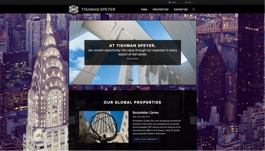 http://www.tishmanspeyer.com/
This example uses a scrolling homepage design and full-screen fluid background.
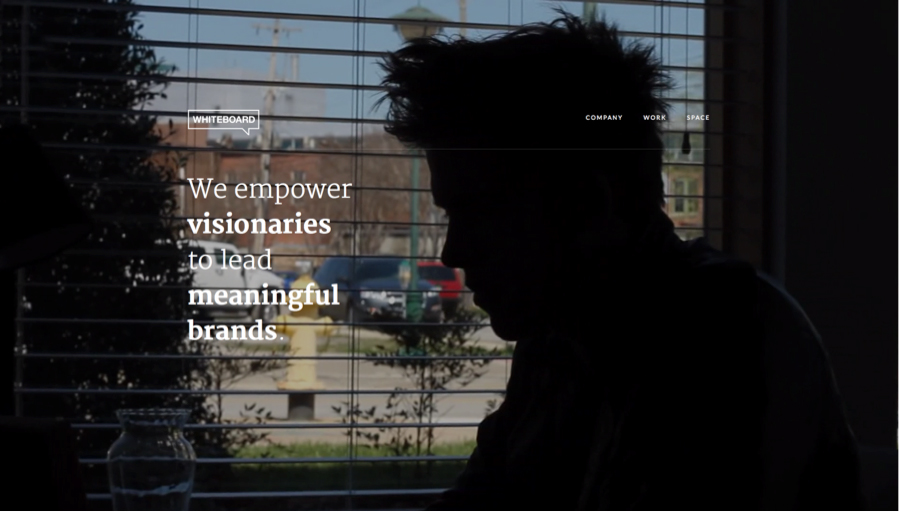 http://whiteboard.is/
Here, the website employs all of the above techniques plus “sticky” navigation (watch how the menu items “stick” to the top of your browser window as you scroll down the page) and a video that fills your screen. Farther down the page you can click to watch client videos.
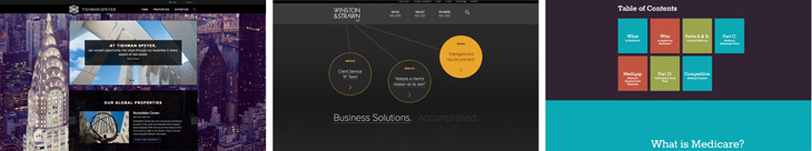
 http://www.winston.com
Designers used to be very limited in font choices for web (which made us very sad). Now, with the advent of Google fonts and other free and paid font providers, we can use typography as a major part of our web design.
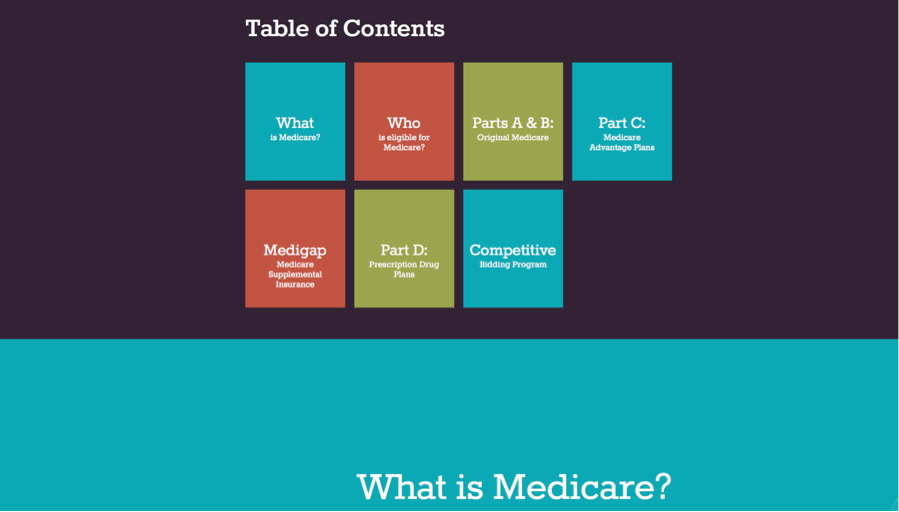 http://medicaresummary.com/
“Flat” design, characterized by solid areas of color, lack of gradients or tints, and simple icons, was popularized by Microsoft:
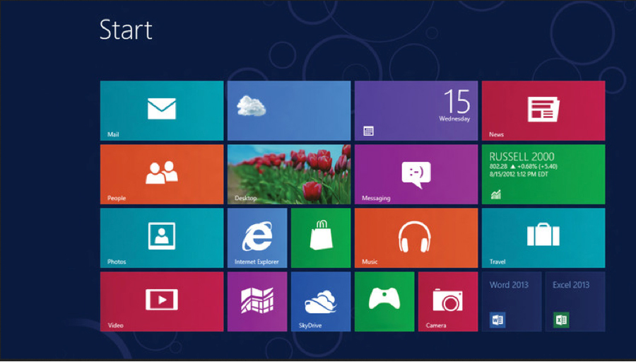
Website designers are implementing flat design and avoiding the bevels, shadows, and gloss effects that were once considered hip.
In summary, many new trends in the design, functionality, and the way we use websites to help us market have been influenced by the increase in mobile use. Make sure your firm is analyzing your site for mobile traffic, and allocating appropriate marketing efforts and dollars there for 2015.
Vanessa’s article first appeared in SMPS Boston’s Outlook, September 25, 2014.
About The Author