This post is the first in a series focusing on the basic building blocks of design. With each new post, we’ll feature a different principle that will help you understand how designers do what they do. If you’re ever tasked with creating something yourself, these principles can help you make good design decisions too!
Our brains like balance. Balance is the state of equilibrium that results from comparing visual elements to physical structures (such as mass, gravity, or the sides of a page). Balance is the arrangement of objects in a design in relation to their visual weight within that composition. Our mind likes when things are even and stable. When things are scattered and disorganized it gives us subconscious tension. Thus, visual balance is key when designing all marketing materials, including websites.
SOME THINGS THAT AFFECT VISUAL WEIGHT:
- Size – As you would expect, larger elements carry more weight
- Color – It’s not fully understood why, but some colors are perceived as weighing more than others. Red seems to be heaviest while yellow seems to be lightest.
- Density – Packing more elements into a given space gives more weight to that space
- Value – A darker object will have more weight than a lighter object
- Whitespace – Positive space weighs more than negative space or whitespace
BALANCE USUALLY COMES IN TWO FORMS:
Symmetrical
Both the left and right sides of the design are a similar size, shape, weight, texture, etc. Symmetrical balance tends to be more formal and more static. It evokes feelings of consistency, elegance, and classicism. Symmetrical design balance is easy to see and relatively easy to achieve.
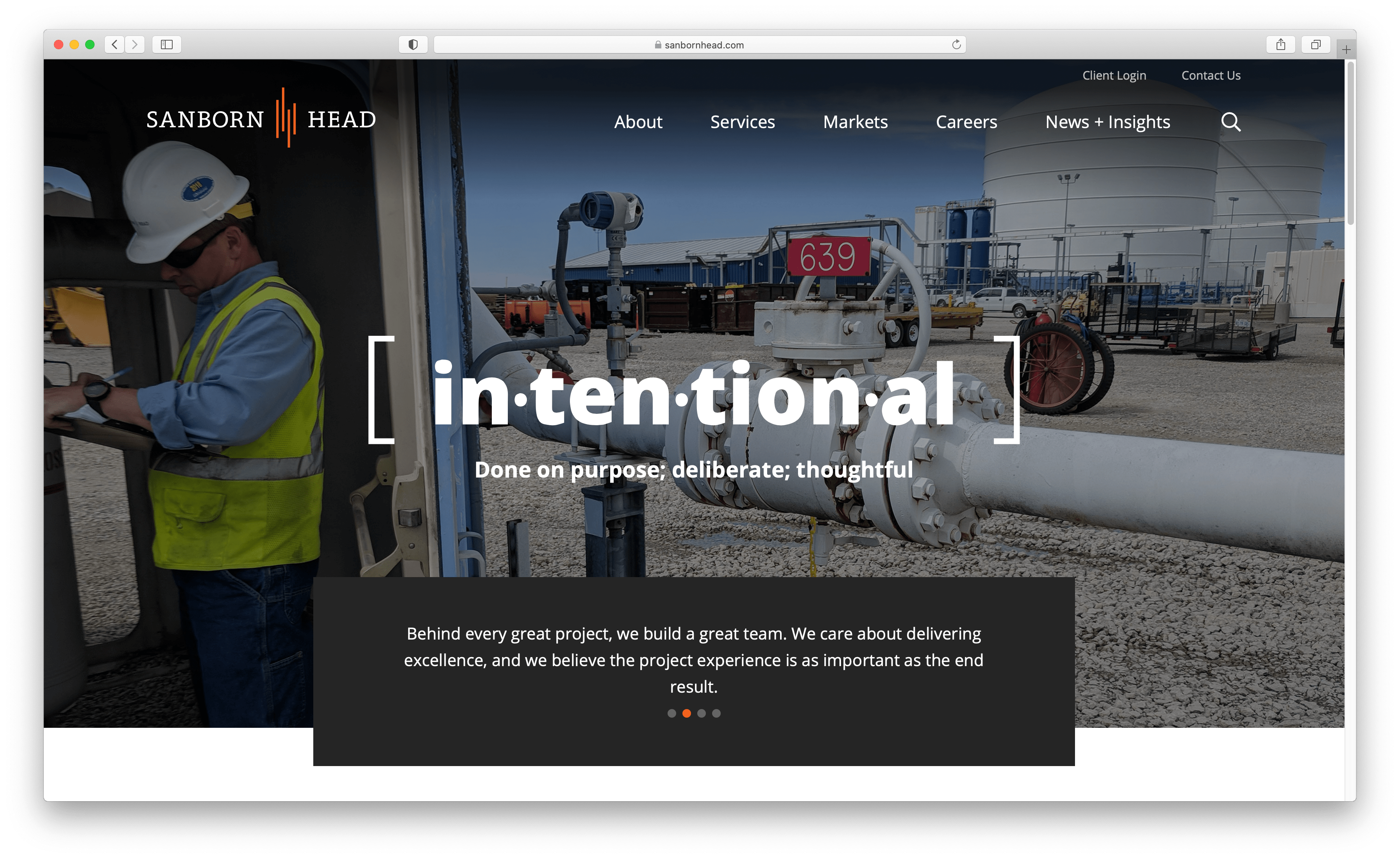
When we designed the website for Sanborn Head, we made a conscious decision to have the images and headline centered on the page. The headline [intentional] is large and bold and acts as the focal point. This is a good example of a symmetrical layout.
Asymmetrical
The left and right sides of the design are different from each other. Asymmetry creates energy and tension. It’s more dynamic as there’s more visual variety in design elements. It’s more interesting because of that variety, but also more difficult to achieve. The overall design will use more whitespace to equalize the balance. The asymmetrical design evokes modernism and feelings of forcefulness, vitality, and movement.
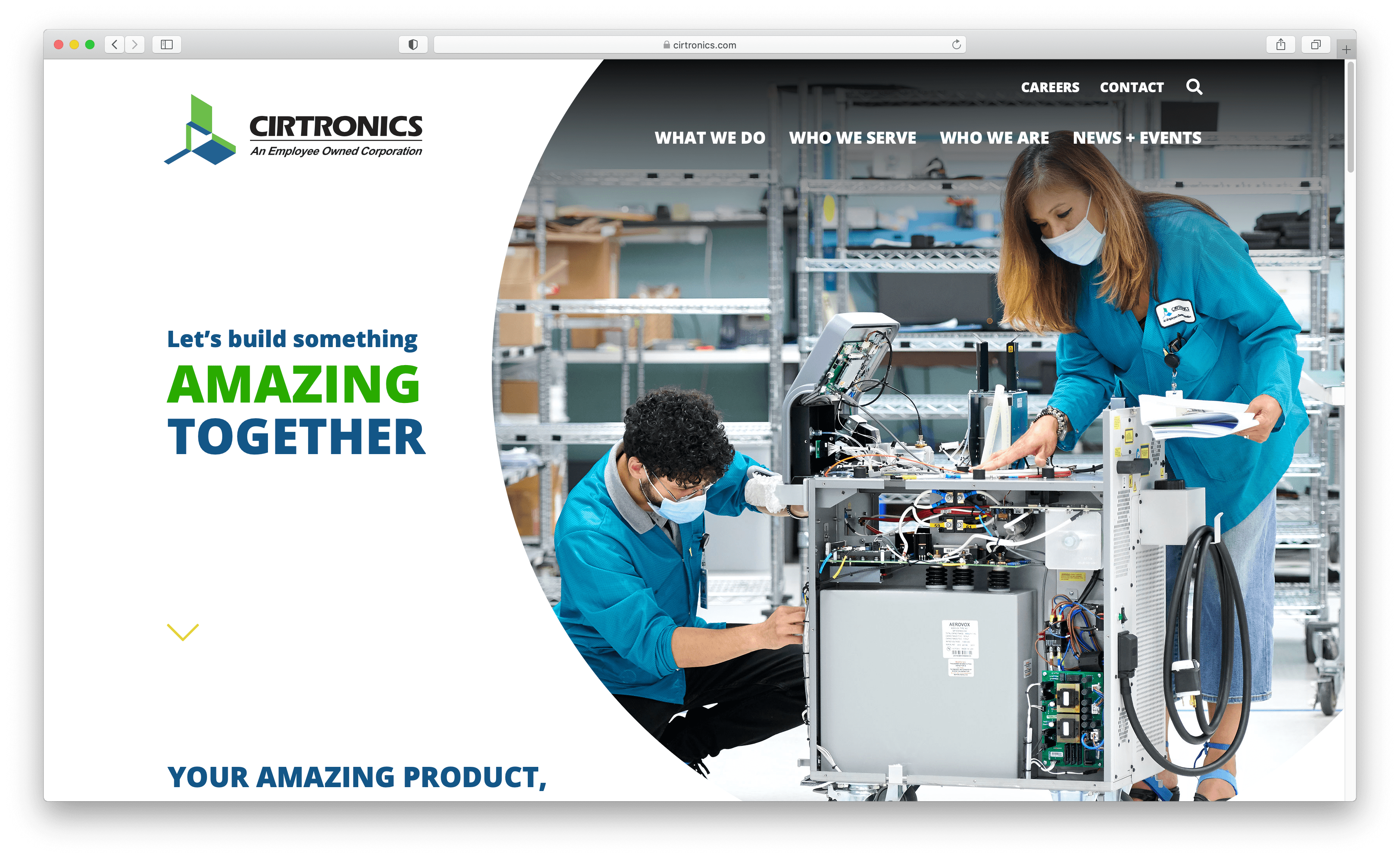
When we designed the website for Cirtronics, we wanted to highlight the people of the company as well as their products. The tagline really needed to combine the two. The left side is mostly whitespace with colorful typography, while the right side is primarily a large circle displaying people working closely together. As you scroll you see the zig-zag flow of the design leads you down the page.
We love talking about all things design. If you have any questions about design principles or how to use asymmetrical or symmetrical layouts, shoot us a message on LinkedIn, Facebook, Twitter, Instagram or Email and we’ll be happy to help.
Additional Resources:
1st Web Designer – Web Design Symmetry and Asymmetry
1st Web Designer – Graphic Design Basics: Design Principles
The Principles & Elements of Design – The ULTIMATE Guide
Top Design Mag – The Importance of Balance in Web Design
*This post has been updated and revised from its original version posted on November 24, 2014.
About The Author