Being tasked with redesigning your firm logo may seem daunting at first. Your logo is often the first visual representation of your firm’s brand that a new client encounters. Therefore, it’s important it accurately conveys the personality of your firm and reflects how you want to be perceived to current and future clients. Having worked with many professional service firms over the years, we’ve heard many of the same misconceptions about logo designs. Here are the top 10 things you should consider before jumping into the redesign process:
- What font works best? Be creative, but professional. Choose a font that fits the personality of your firm:
a. Sans-serif = more modern (for example, Arial is a sans-serif font)
b. Serif = more traditional (for example, Times New Roman is a serif font) - Do you want a visual graphic or emblem, or just a typographic treatment? Emblems can be memorable, but can also add complexity, detracting from the firm’s name (and making the consensus process more difficult.)
- What do your competitors’ logos look like? Make sure your new design stands out from the crowd, in a good way!
- Can you simplify your name? Less is usually more. For firms with a series of names, think about minimizing the number of names to one or two. Think about how the receptionist answers the phone, or how your clients refer to your firm name. If you are already being called by a shortened name, chances are that’s what you should use for your new logo.
- Are those letters at the end really necessary? Legally, you don’t need LLP, P.C., Attorneys at Law, Certified Public Accountants, Inc., Corp, etc. in your logo. Instead, spell out the full firm name in the footer of your website.
- What color works best? Be unique in your color choice, but make sure the selected colors will work well in both print and online mediums.
- Is it scalable? Your logo’s proportions should not be too horizontal, as this can lead to issues when it is reduced for smaller materials. It can also make your logo appear tiny when it’s used on a sponsorship page/banner with many other logos (and no one wants their logo to be tiny!)
- Do you have a tagline that can help cement your brand? Think of the logo as a mark rather than a full description of your firm. It should be suggestive of your brand, not a literal description of the services you provide.
- Is it visually interesting? Think about the negative space, can you use this to your advantage?
- Is it easily legible? If clients and prospects can’t read your logo on a first scan, then it’s not helping with brand recognition.
It’s important to think of your logo in conjunction with the rest of your brand. Make sure your new logo works with your website, printed materials, social media outlets and all forms of marketing. Your new logo must not only look great, but must support and help achieve your marketing and strategic objectives.
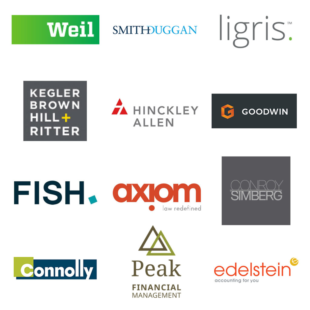
Here are a few good examples* of professional service firm logos:
![]()
![]() Links to the websites for each of the logos above:
Links to the websites for each of the logos above:
Weil, Gotshal & Manges LLP
Smith Duggan Buell & Rufo LLP*
Ligris + Associates PC*
Kegler Brown Hill + Ritter
Hinckley, Allen & Snyder LLP
Goodwin Procter LLP
Fish & Richardson
Axiom Global Inc.
Conroy, Simberg, Ganon, Krevans, Abel, Lurvey, Morrow, Kraft, Klein
Connolly Brothers, Inc.*
Peak Financial Management, Inc.*
Edelstein & Company LLP*
*Logo & Website Designed by Clockwork Design Group, Inc.
Related Articles:
How and Why to Create a Brand Standards Manual
How Do You Brand a Professional Service Firm, Really?
Dear Olympics: Don’t Steal My Logo!
Famous Logos And The Cost Of Designing Them
About The Author