Infographics make complex information eye-catching, understandable and easily digestible. Most importantly, they play a crucial role in the increasingly visual world of marketing. Having a visually impactful way to display statistics that differentiate your firm can make your website stand out from the crowd. Read on to learn how.
Why Use Infographics in Your Web Design?
Most of the time, professional service firms have a difficult time creating memorable content. Service firm websites tend to be very text heavy, but analytics show most people don’t read thoroughly on the web. Therefore, it’s crucial to get visitors engaged in a visually stimulating way. Infographics help readers understand who you are and what you do. They’re easy to comprehend, quick to digest, and visually compelling.
![]()
What Types of Content Should You Include?
Ideally, it’s important to think of key facts about your firm that make you stand out from others in your industry.
Consider some of the following:
- Numbers of cases/projects completed
- Key types of work that you do
- Number of offices/geographic reach
- Unique rankings and awards won
- Percentage of referrals/repeat clients
- Longevity of client relationships
- Diversity of your firm
- … plus anything that makes your firm unique
![]()
How Can You Create Effective Infographics
What makes infographics so engaging is the clear depiction of data. Content is key when designing infographics. The design is very closely linked to what the data says. For example in the Walker website, each icon visually emphasizes the data displayed. Therefore, your first step should be to come up with your key facts, then think of ways to visually display the information.
![]() Effective infographics typically have 3 key qualities:
Effective infographics typically have 3 key qualities:
- Interesting Content: Content should be interesting and unique to your firm.
- Short and Sweet: Make sure it’s not too lengthy, 5-7 words max. Otherwise you’ll lose your visitors’ attention.
- Clear Hierarchy in Size: Highlight key info with larger bolder fonts. Description font size should be smaller and less bold.


Where Can You Use Your Infographics?
When designing infographics, it’s important to think about where they will live on your website. Data can be a powerful asset to converting visitors to clients. How prominent should your infographics be? Where would you like them to drive website traffic? Answering these questions up front can help make your infographics more useful. Generally speaking, there are two types of data that you’ll find on professional service firm websites:
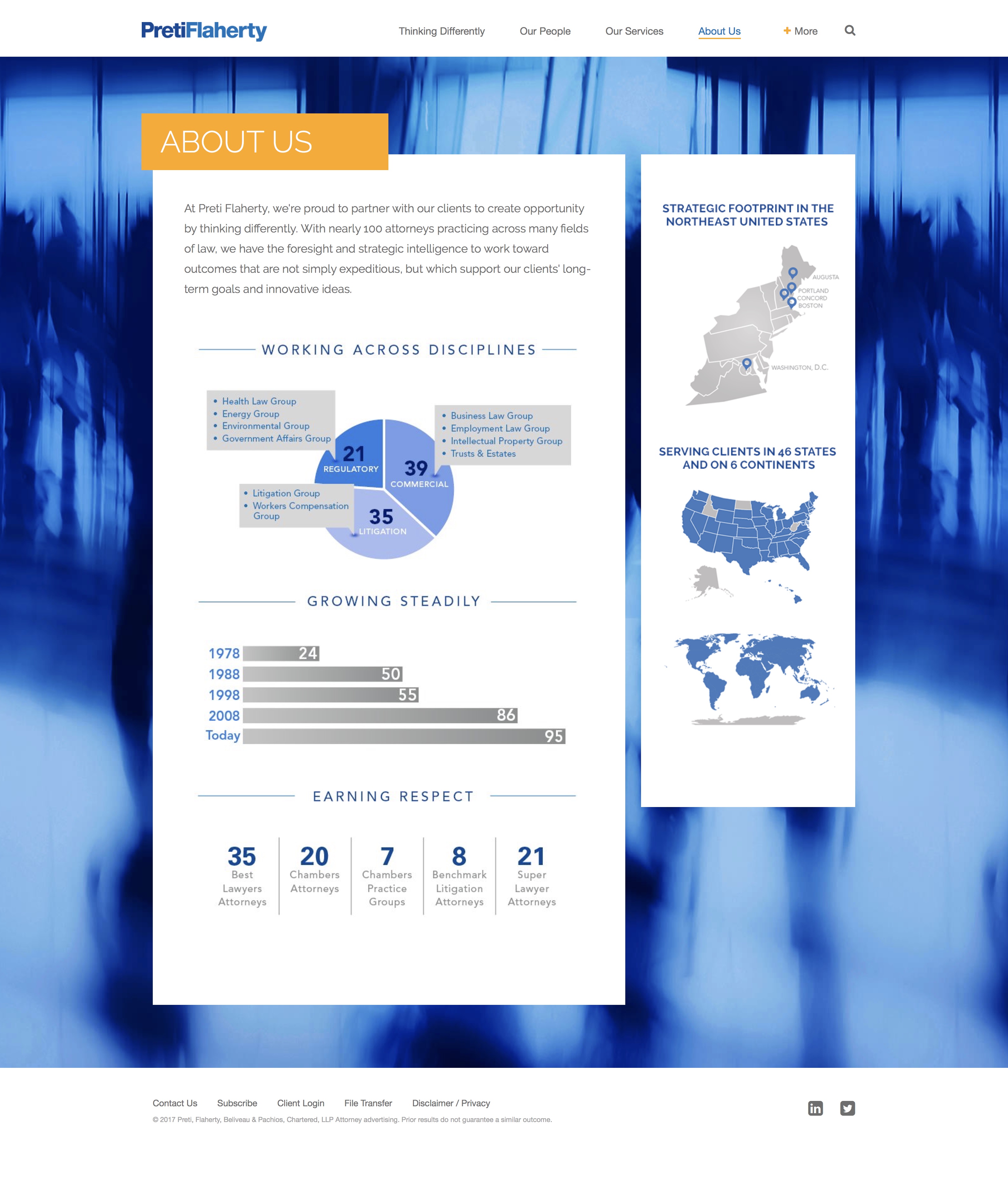
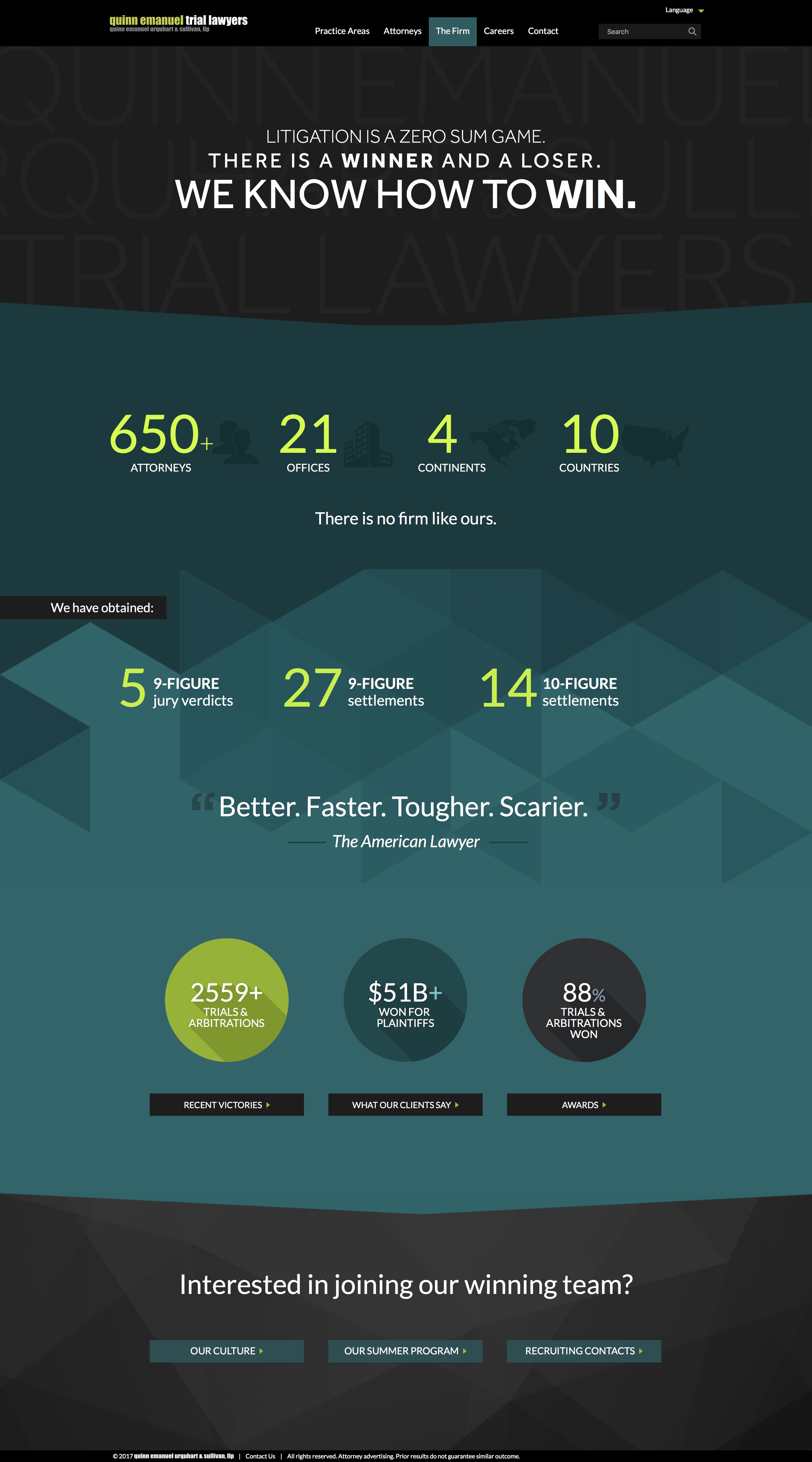
FIRM-WIDE STATS
- Including firm-wide stats in the footer of every page of the website can be a beneficial way to drive traffic to key pages of your site.
- Peppering firm-wide stats throughout the site in sidebars can also be effective.
- Incorporating stats on your firm’s About Us page can be very helpful.
See some examples below:
![]()
![]()
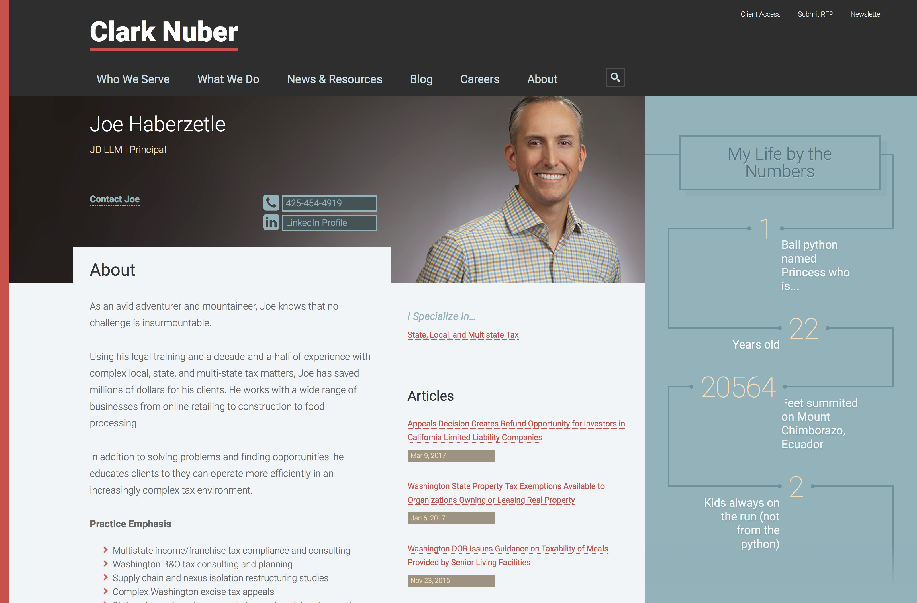
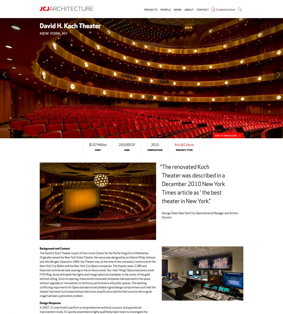
RELATED STATS
- Highlighting key data that is related to the page that you’re on is a great way to draw attention to individuals or projects.
- For Law Firms & Accounting Firms: Bio pages tend to be the most trafficked areas of your site. Emphasizing key areas of expertise, awards won, or other unique attributes that your attorneys have can help clients feel confident in choosing your firm.


- For A/E/C Firms: Project pages are the highlight of most sites. Focusing on project-specific data in an easily digestible way can help to distill your value-add to a project.
If you have questions or need help, feel free to shoot us an email. We love designing effective infographics! 😉
About The Author