Every single one of us has been there — you go to a website looking for a specific piece of information, and as you navigate the site, you lose your way. Many people start to feel frustrated, give up and just search Google instead. It’s a completely natural response to bad navigation. How do we fix this phenomenon? Keep reading to learn a few tips and tricks for designing intuitive navigation for information-heavy websites.
1. Examine Your Information Architecture
It’s imperative that your visitors can quickly and easily find the information they’re looking for. Navigation starts with your information architecture. Many websites have had content added over time, creating (what we call) a “pot of spaghetti.” Menus are outdated, information is placed haphazardly, hierarchy is non-existant. The content is so convoluted and intertwined, there is no logical way to navigate.
When redesigning a website, the first step in the process is creating a sitemap of the existing site. A site map helps all involved see what information currently exists, where it “lives,” and where content needs to be improved, edited, removed and added. Step two is reorganizing the existing content and defining the revised sitemap. The revised sitemap should streamline the main navigation, remove unclear headings, eliminate confusing hierarchy, and reduce the number of clicks to get to any given page.
Tip: When naming navigation elements, keep them obvious. Stick to titles that people are used to and immediately understand (“About Us” or “Who We Are,” not “Hi There,” for example).
2. Sticky Menus Help Navigation
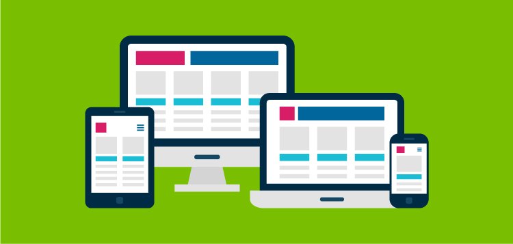
Websites today no longer need to cram all key information above the fold of the page. With the advent of smartphones and mobile tablets, we’ve become accustomed to swiping and scrolling with ease. But because of this transition, navigation can become elusive as you scroll down the page.
Tip: Technology to the rescue! “Sticky” navigation is a smart feature that allows your navigation to “stick” to the top of the browser, regardless of how far down you scroll. Thus, navigation is fully accessible at all times, making it easy for users to jump around the website without having to scroll all the way back to the top of the page. It’s a win-win.
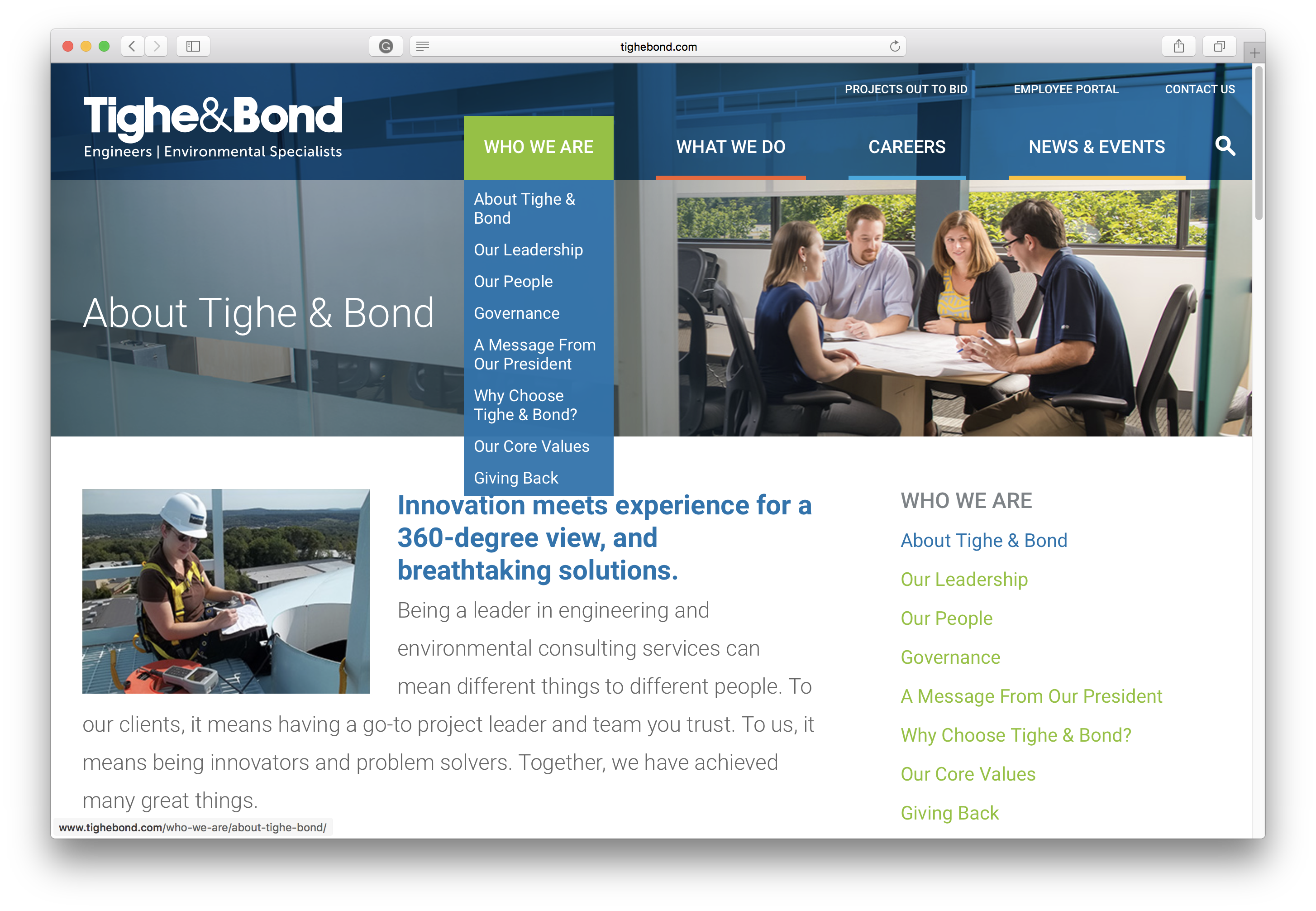
Desktop Example
3. Design Your Navigation Wisely
In recent years, mobile-first design (starting with phone, then tablet, then finally desktop design) has become more popular. Thus, the Hamburger Menu has gained popularity in desktop web designs. Although this may seem to be an easy solution to remove visual clutter, many usability tests have proven that hiding main navigation on both mobile and desktop designs is actually detrimental to users. Because users can’t see the navigational options, many don’t actually use the navigation. Some even have stated that the website they were using didn’t have navigation at all, because they simply didn’t see the menu button. On desktop and laptop screens, the hamburger menu loses prominence because it takes up so little space percentage-wise, it can be missed. Mobile-first is an excellent way to start, but be cautious of designing mobile-only.
Tip: Review your website analytics to see what percentage of your site visitors are using desktop versus mobile devices. Most professional service firms (especially law firms) are still seeing much higher desktop visitation than mobile, although mobile is increasing annually.
Hidden Navigation Is Significantly Less Used
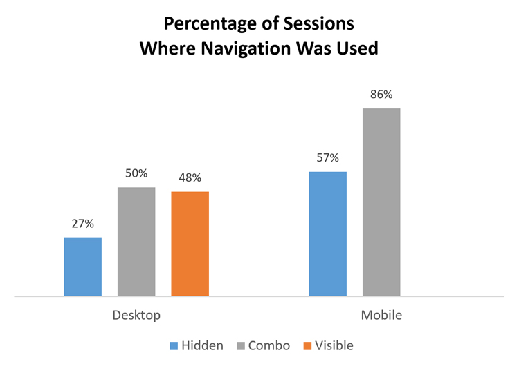
Both on mobile and on desktop, people were significantly more likely to use the navigation when all or some of the navigation options were visible.
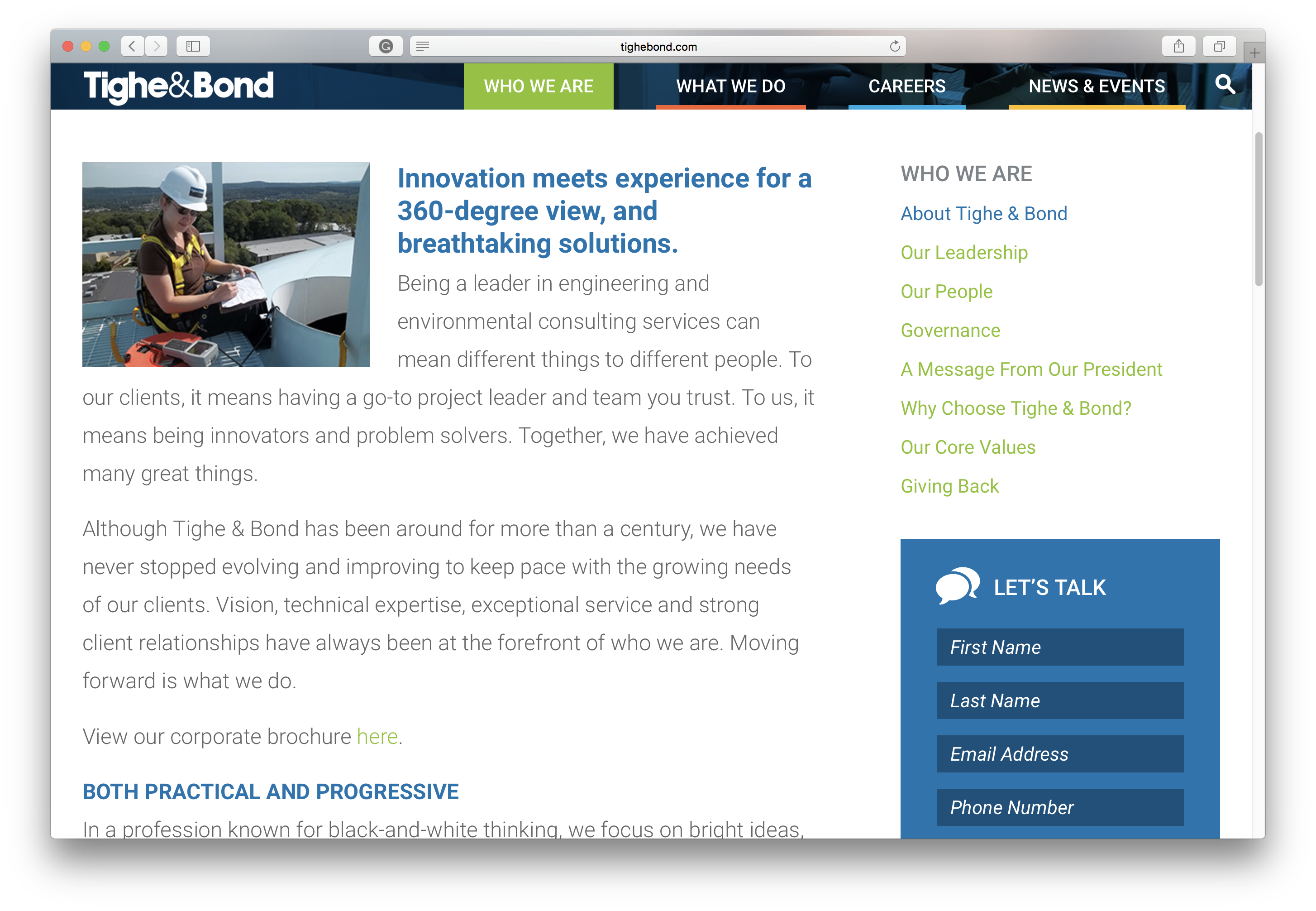
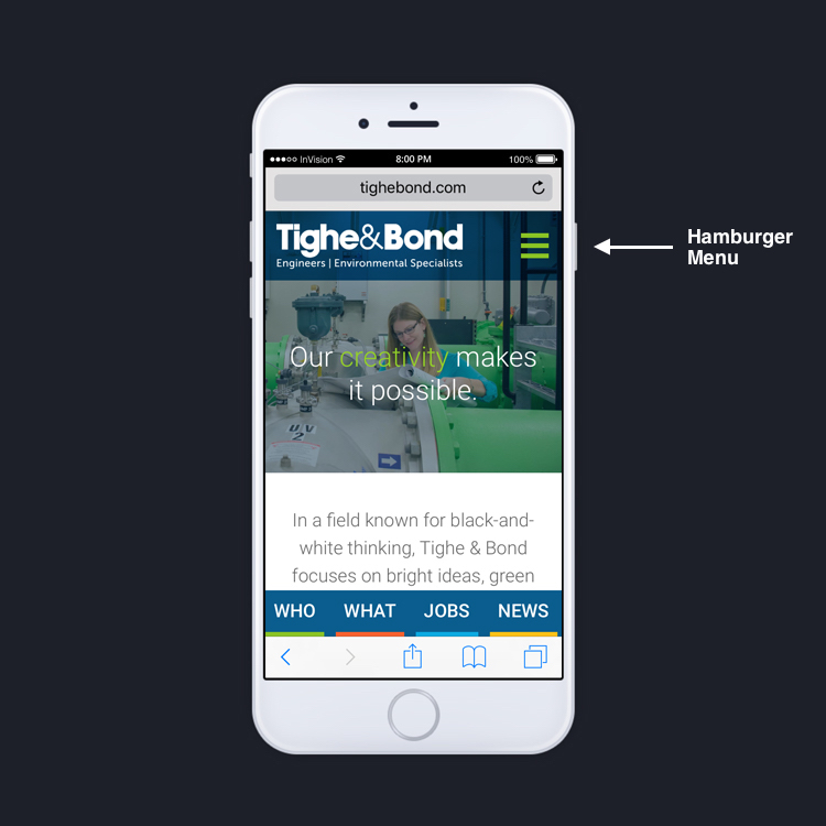
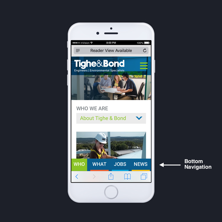
Hamburger menus make sense and function well on mobile devices. In addition to using the hamburger menu, we’ve found that using what’s called ‘Bottom Navigation‘ helps users jump to the top three or four areas of the site, without clicking to open the hamburger menu. In the Tighe & Bond example below, you can utilize both the Hamburger and Bottom Navigation:
Hamburger Menu Example

Bottom Navigation Example
Conclusion
Technology is always changing. We’re constantly working on making sites more navigable. By using modern techniques, understandable information architecture, and good design sensibility, we can make content-heavy websites simple and easy to use. If you’d like more information on web design best practices, please contact us. Give us a call, send us an email, reach out on Twitter, LinkedIn, or Facebook, or fill out our contact form.
Additional Resources
Hamburger Menus and Hidden Navigation Hurt UX Metrics
Kill The Hamburger Button
Material Design Bottom Navigation
About The Author