I’ve been creating logos for many years, so I’m not surprised when a client asks me: “How often should we change our logo?” Most expect me to jump at the opportunity to update their logo, but my candid response to this question is: “As infrequently as possible.”
Change for the Sake of Change
Redesigning your firm’s logo is a complex undertaking. Done correctly, it can elevate your brand and improve your bottom line. But done poorly, it can confuse your audience and damage your reputation. One of the worst reasons to change your logo is because you are “tired” of it. Change for the sake of change is OK when it comes to a haircut (you can always wear a hat), but not in the case of your identity.
More of the Same
Of late, we’re seeing a trend in logo design towards homogenization rather than differentiation, or what has now been referred to as “blanding.” Consider, for instance, these major fashion labels and their logo updates:
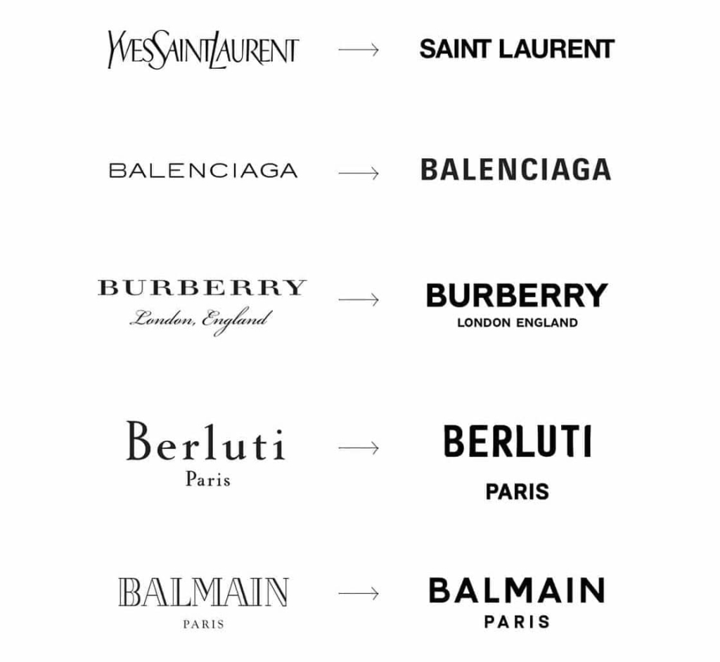
Notice anything? Although all the logos, both “before” and “after,” are typographic marks (without icons or illustrative elements), the original five logos used unique typography while the new ones rely on very similar fonts (all are sans serif, bold and uppercase). Some explain this striking similarity as a need to appeal to a wider audience. Others point fingers at the Internet and social media, saying logos must be simple and bold to work across all platforms. I think it’s a combination of both these reasons, plus the human tendency to join the pack and be risk-averse.
I understand the desire to modernize. The old Yves Saint Laurent logo, for example, always irked me in the sense that the letters looked squished together, overly tall and skinny. The slightly angled Y, S and L added to my sensation of squeezing into a tight pair of pants. The new logo has none of this. The bold, straight, dare I say “fat” letters leave me feeling… nothing really. The same way I feel when I read “95 NORTH” on a road sign. Yes, it’s easier to read, but I miss the quirkiness, the very French “je ne sais quoi”-ness about the old logo. It was different. It was memorable. It was THEM.
Looking Back to Look Forward
A fashion brand that bucked the trend (or evolved past it?) is Avon. Compare their previous logo (left) and new logo (right):
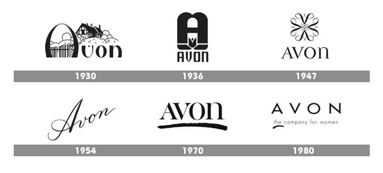
Granted, the new logo is significantly bolder than the old one, but it discards the straight, minimal, sans serif font and uses a typeface that harkens back to their logo from the 1970s:
Interestingly, it is the 1970’s logo that always comes to my mind when I think of Avon. That’s when, as a kid, an Avon lady actually came to our house and sold my mom makeup, each tube or compact like a small treasure, adorned with the logo. That memory is intrinsically tied to the brand, in my mind, so my response to the new (1970s-inspired) logo was positive before I consciously realized why.
Hello Again
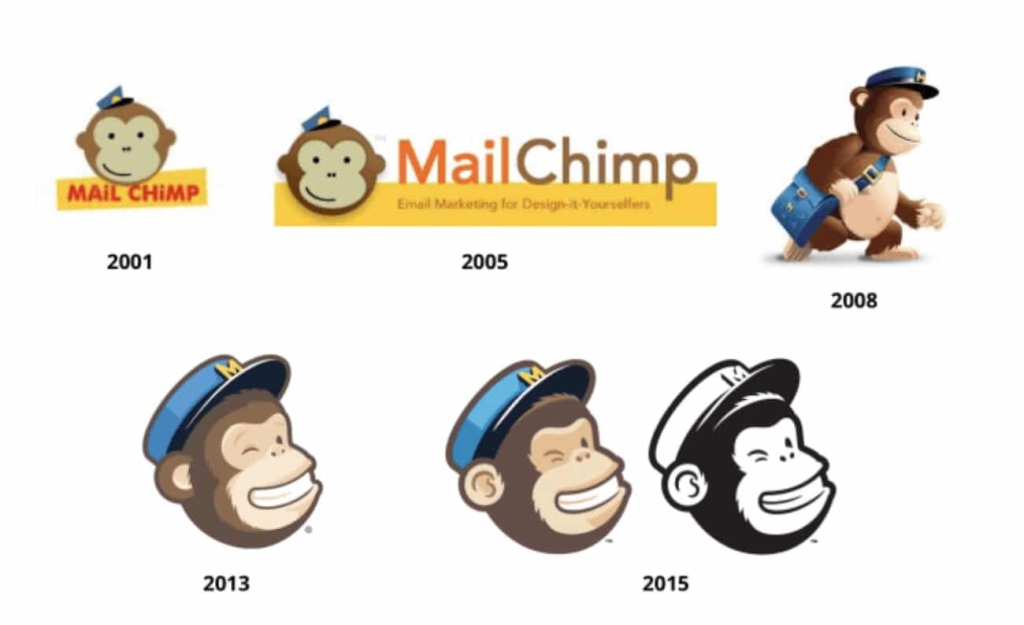
We, humans, love the familiar, that’s why we’ll listen to favorite songs over and over and movie remakes are so popular. Reinvigorating a familiar logo element can also prove successful. A recent example is the Mail Chimp logo. Originally, their logo included “Freddie” the monkey mascot:
Freddie evolved over time but was eventually removed from the logo and just used as a separate brand element, and a playful script font served as the firm’s logo. Now, Freddie has been simplified to a one-color mark, and incorporated back into the logo with a bold, funky font:
The new logo “retains all the weird, lovable elements that endeared the brand to its first fervent fans” and reunites Freddie with the wordmark, like the original logo designed by Mailchimp’s co-founder, Ben Chestnut.
Keeping What Works
Building on an existing logo, rather than throwing away an old identity, can often work in your favor. Consider the newest logo iteration of Dunkin’ Donuts, for example:
The iconic orange and pink colors and soft, rounded font have been in place since the 1980s. The coffee cup graphic was added in 2002 to strengthen their coffee market and compete with Starbucks and other brands newer to the field. That worked well, and now (I believe) Dunkin’ can afford to drop the graphic as well as the word “Donuts” while still staying true to their core brand identity. My guess is that many people will see the new logo and not even realize the change happened. Yet, it’s simpler, larger (on signage), and stronger overall.
Historic Preservation
Even when major changes are needed, preserving elements of the logo’s design can prove beneficial. The old City of Oslo (Norway) logo used the city’s full coat of arms. The full-color, highly intricate illustration was impossible to read in smaller formats. Over the years, additional logos had been added for various reasons and uses, resulting in over 200 logos for the municipality. This fragmentation was not only confusing but also expensive to maintain. The new logo is a true modernization and simplification of the old coat of arms. It works well at small sizes and online applications. The clean, softly rounded font choice pairs well with the illustrative style and the city’s aesthetic and vision for the future.
Less is (Not Always) More
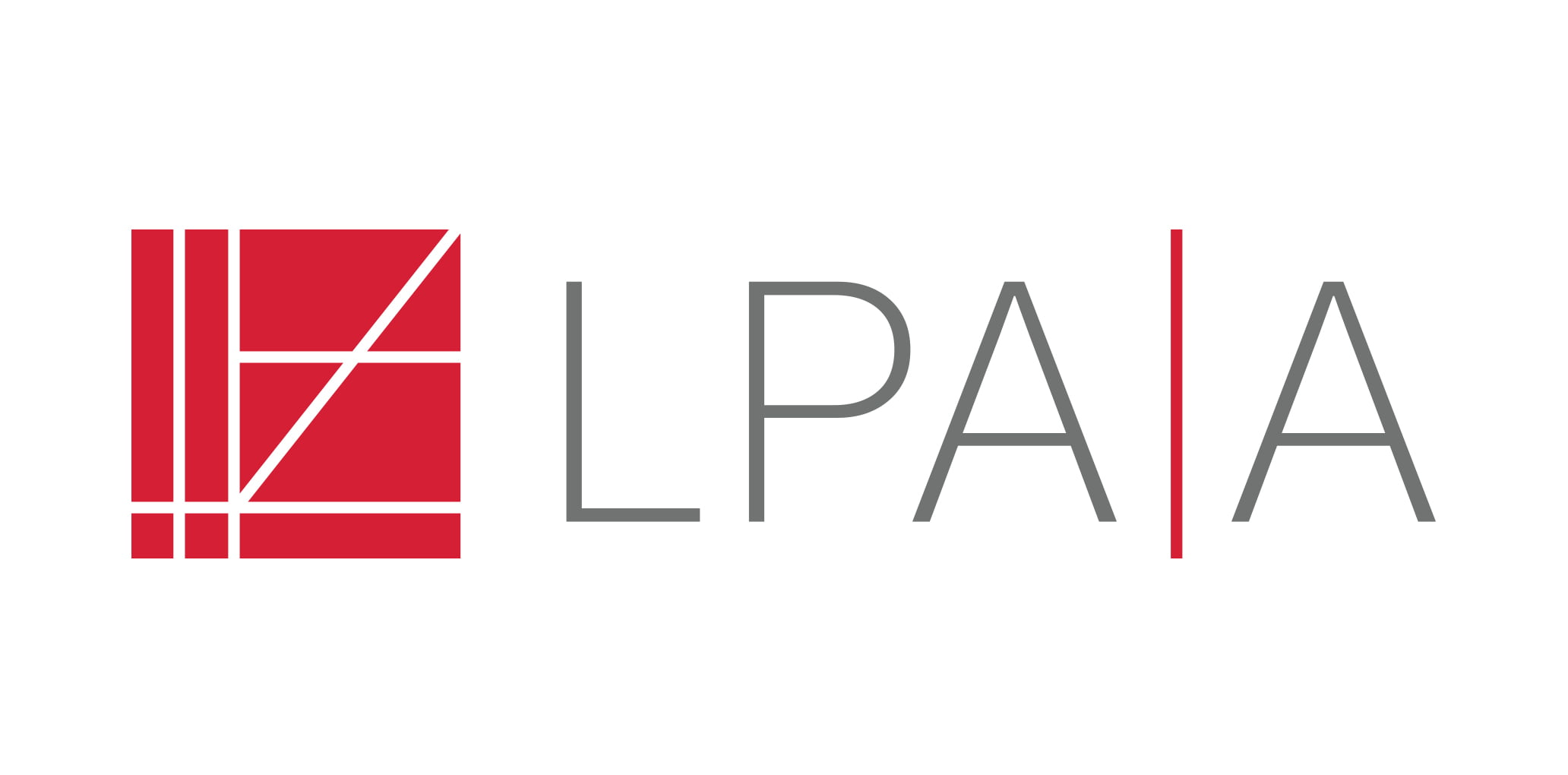
Another trend popular with professional service firms, especially law firms, is shortening the firm name to one word or even initials. If your firm is considering such a move, again, proceed with caution. Step one should always be to listen. If your current name is excessively long, chances are your employees, clients and prospects already use a shortened version when conversing. Is that shortened version the first word, the first two words, initials? Rebranding using your vernacular name (what people are already calling you) almost always helps strengthen your brand. For example, when we helped the architecture firm Lamoureux Pagano Associates Architects with their rebranding, a concern they had was the difficulty pronouncing and spelling the firm’s name. This also caused issues when Googling for the firm. As we listened to their team talk, they referred to themselves as “LPAA.” Their clients did as well. Luckily, the URL “lpaa.com” was available for a reasonable fee, and a shortened name and all new brand were born.
Knowing When it’s Time
Although there is no set timeline mandating when a logo should be updated, there are several factors that warrant considering a change:
- Readability problems when the logo is reduced or used on social media or other digital platforms
- Too many variations of the logo, fracturing the brand
- Extreme proportions, such as very horizontal or very vertical logo shapes, limiting the logo’s flexibility in use
- A misalignment between the logo and firm’s style, such as a very traditional logo with a very progressive firm
In closing, when considering changing your logo, do not assume that an all-new, “modern” design is always the best solution. If your firm has a strong reputation, leveraging your existing logo by maintaining certain colors, design elements, or fonts, may prove more beneficial than a complete redesign. Be cautious of abandoning brand elements that help differentiate your firm in favor of “bland” designs that look too similar to everyone else.
References:
The Hottest Branding Trend of the Year
Bloomberg on Fashion Brands
Avon Logo
Dunkin’ Donuts Logo
Mail Chimp Logo
Oslo Logo
Vanessa’s article first appeared in SMPS Boston’s Outlook.


