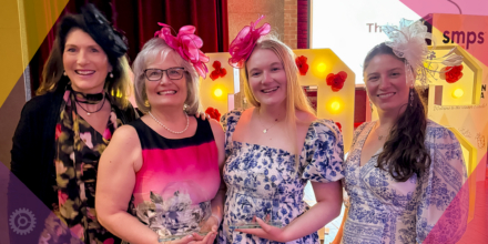
Congratulations to our clients, Sanborn Head and Environmental Partners, for their recognition in this year’s SMPS Boston Awards Gala! It was a joy to work with you and we can say wholeheartedly that the recognition is 100% deserved.
1st Place – Sanborn Head Website
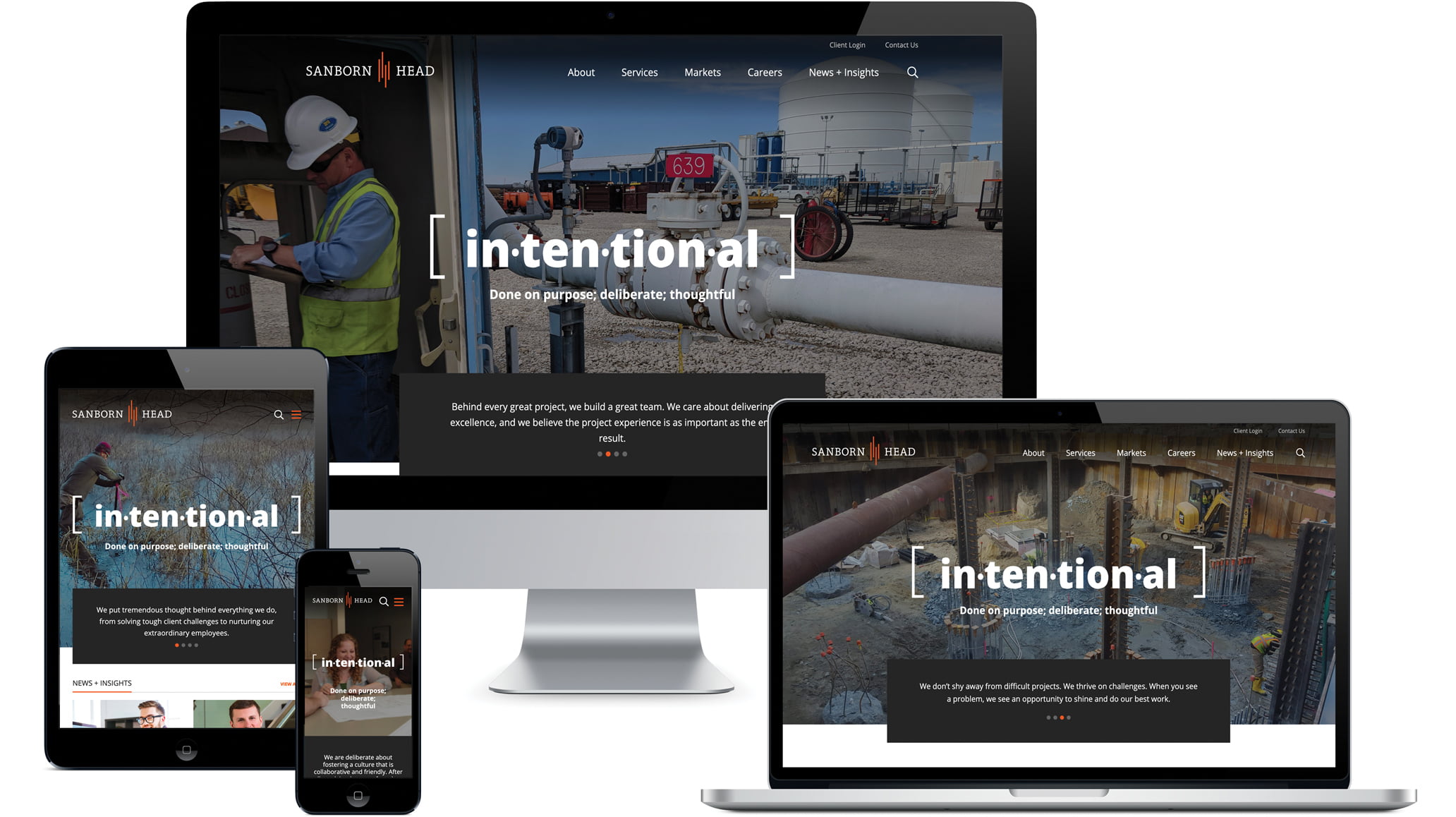
The new site features intuitive navigation, a clean, modern design across all devices, and all-new, relevant content that engages visitors.
The site analytics show:
- Site visitors look at more pages (up 65%) and stay almost twice as long (up 45%).
- More potential clients and employees are finding the site, new user organic search results are up 70%.
- New users from social media are up 182%, particularly sessions from LinkedIn (up 443%).
- A hiring spike and sustained increased interest by prospects followed the site launch.
Sanborn Head received unprompted client feedback confirming they accomplished their goals: great aesthetics, ease of navigation, a more personal feel, and a clearly-communicated vision and values that make them stand out as a company to do business with.
1st Place – Environmental Partners Identity
![]()
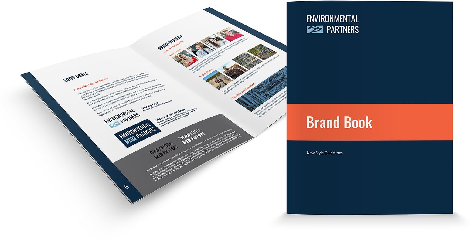
There were over a dozen versions and variations of the Environmental Partners logo with different colors, typefaces, placements, and components, as well as six different variations of the firm name in use. It was a marketer’s nightmare! We leveraged Environmental Partners’ old logo while simplifying and modernizing it to build a strong, clean, consistent brand.
2nd Place – Environmental Partners Website
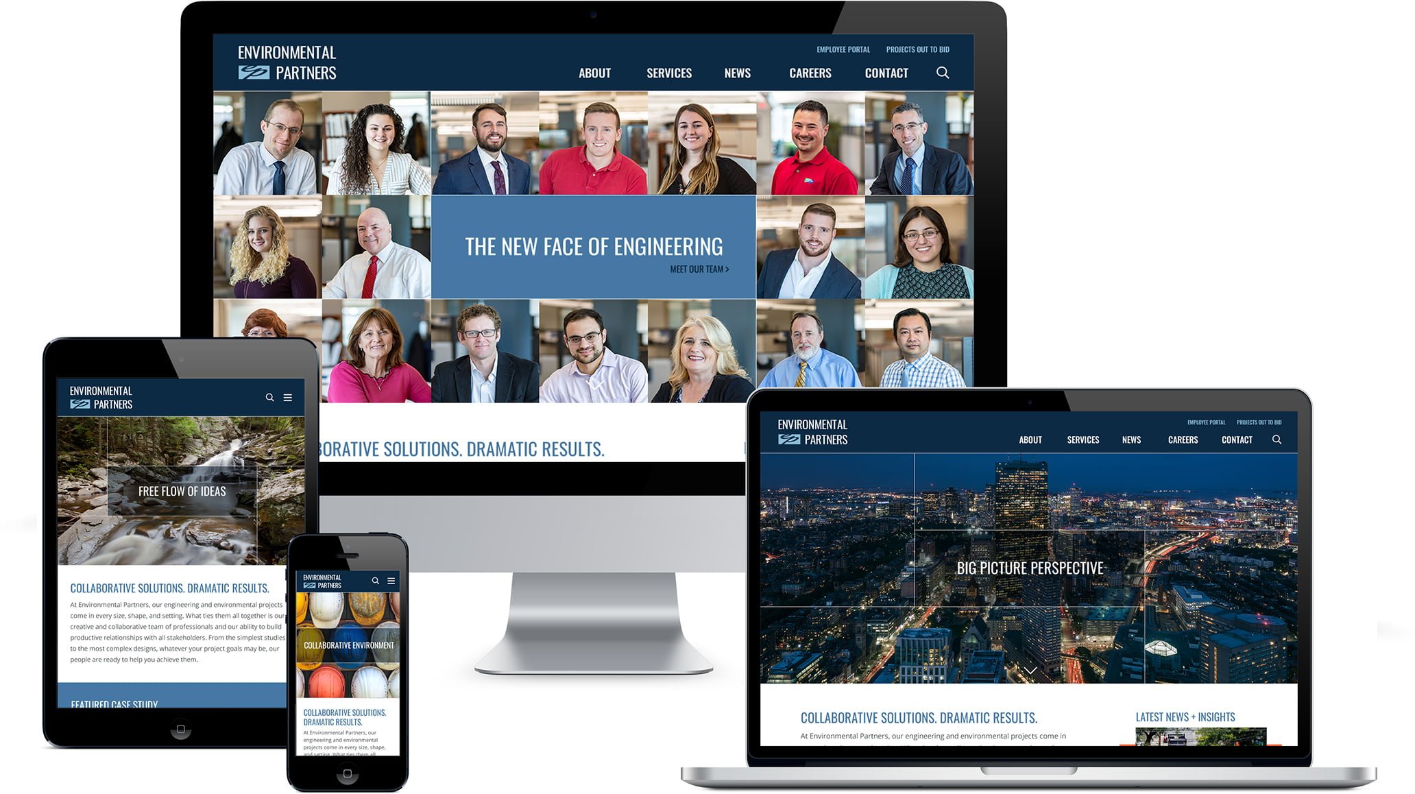
It was abundantly clear that Environmental Partners (EP) needed a website overhaul. Potential recruits were unimpressed and even turned off by EP’s previous website. After conducting a thorough brand analysis, we collaborated with EP to make bold choices to convey EP’s new brand and website:
- EP Rewrote everything to focus on our culture of collaboration and the “why” behind what we do.
- The site features all of our people on the homepage and the team page.
- We changed the common green/blue color palette to navy/slate/coral to add warmth, personality, and differentiate us from our competition
- Completely rebuilt the site with modern features and robust functionality.
EP has sky-high employee and client retention rates for a reason. Now everyone can see it!
About The Author