When the time comes to update or redesign your logo, it is important to consider the differences between a logotype and a logomark. There are definitely advantages and disadvantages to both. Here are a few important design distinctions to consider:
What is a Logotype?
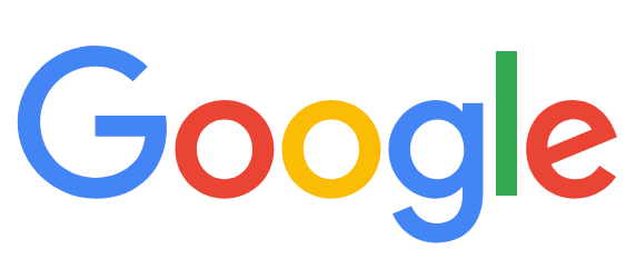
As the name implies, a logotype (or “wordmark” or “lettermark”) is a logo design that is primarily a type treatment. The logo does not include a graphic element, or if it does, it is very minimal and secondary to the text. When your logo is exclusively a text treatment, it becomes imperative that you choose the font very carefully. The font treatment has to align with your brand’s personality and mission. A modern example of a logotype is Google, made from a round, sans-serif font with primary-colored letters. The round letters and bright colors immediately convey openness and friendliness, in keeping with their corporate mission to make information accessible and easy to discover:
Many law firms prefer a logotype. One of the largest law firms in the world today, Kirkland & Ellis, uses a traditional serif font in black (or reversed to white) in all uppercase. The traditional typography of the Kirkland & Ellis logotype looks corporate, formidable, and staid. Their mission of advancing the communities in which they live and work, and other nuances of their brand, is not obvious in their logo design but is expressed in other ways throughout their website and marketing. Like many law firms that offer a wide range of services to clients in a diverse array of industries, a clean logotype is a safe, proven solution:

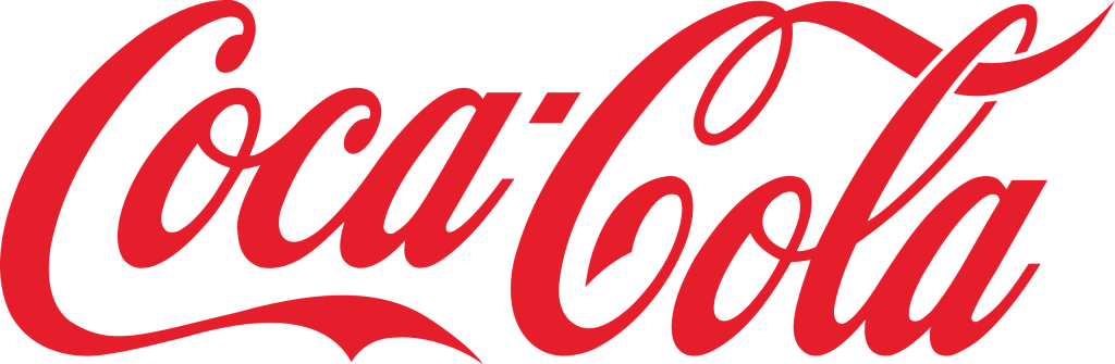
Even though the two examples, above, use standard fonts, a logotype can use any form of text, including a script font or handwritten signature. Coca-Cola is a classic example of a logotype. Amazingly, even though the design was trademarked at the beginning of 1893, the swirly letters still express their brand values today to “inspire moments of optimism and happiness”:
An old favorite of mine, sadly no longer in business, is Lord & Taylor department store. The handwritten signature of the Lord & Taylor logo aligned with the store’s original positioning of personal touch and concierge service:

Logotypes offer some obvious advantages:
- The firm name is first and foremost
- There is no graphic element to compete or distract from the name
- The lack of an icon can leave more room for personal interpretation by the viewer
- For some professional service firms, like large, multi-practice law firms, getting buy-in and consensus on a logotype can be easier
- Logotypes can be less expensive to design (but not always)
- Obtaining a trademark and/or copyright on a logotype may be easier
What is a Logomark?
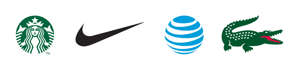
A logomark uses a design element as a primary component of the logo. The element can be a simple shape or icon, like the Nike “swoosh,” or a complex illustration, like the Starbucks’ mermaid. Usually, this element is incorporated into a typographic treatment of the firm’s name. In the examples below, the full logos include text (Starbucks, Nike, AT&T, and Lacoste), but in these cases, the symbol is so well known, it is now recognized without any words:
Logomarks offer their own advantages:
- Humans like pictures, so a graphic element tends to attract the eye
- Images are more memorable than words, so a graphic can help build brand recognition
- A graphic can immediately position you. For example, the AT&T icon says “global,” and the Nike swoosh says “fast.”
- Graphics can be used as favicons (on your website’s browser tab), on social media (instead of the full firm name), on branded swag, and on other marketing components.
Combination Logos
There are many logos that have a graphic component, but the typography is still primary. A fantastic example is Amazon. A very simple graphic arrow, when explained, tells an amazing story. The yellow arrow points “from a to z” and creates a smiley face, all in keeping with the company’s vision to provide everything under the sun, quickly, to happy customers:

Unlike Amazon, the graphic in most combination logos is typically conceptual rather than literal. For example, the Walmart symbol was inspired by their founder’s “spark of inspiration and innovation”:

Advantages of Combination Logos:
- Your name stays prominent
- The graphic element catches attention and helps with memorability
- The design component is not meant to “tell your whole story,” but rather, it lets viewers formulate their own interpretation
“Initial” Logos
A common solution employed by many professional service firms is to use their initials to create a graphic element. Here are a few law firm examples:

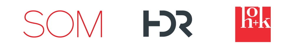
Often over time, some firms get known by just their initials and eventually drop their full name entirely. Here are a few A/E/C examples:
Do you remember the full names of the following large accounting firms? (Answers below):
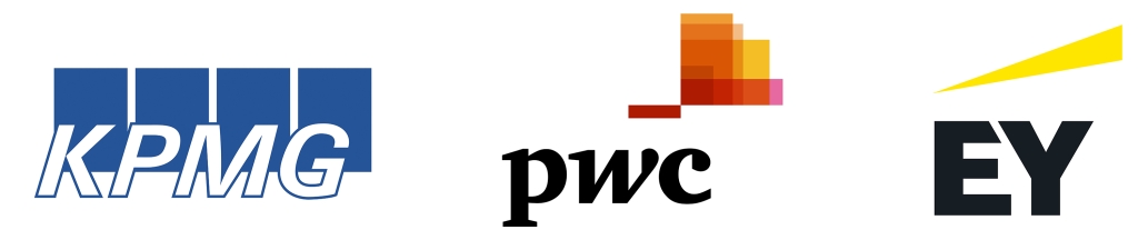
Answers: Klynveld Peat Marwick Goerdele, PricewaterhouseCoopers, Ernst & Young
Another approach, that I like to call the “McDonald’s M technique,” is to use the first letter of the firm name to create a graphic. Here are a few law firm examples:

Advantages of Initial Logos:
- For firms with a long name, using initials allows for a bolder, shorter emblem
- If your team members and the public are already referring to you by your initials, it’s often time to consider rebranding
- Using initials or the first letter of the firm’s name as an emblem is non-conceptual, and some people prefer that to a design that is open to interpretation
What Type of Logo is Best?
A logo is a crucial brand component. Often, the larger your firm, and the more people involved in the decision-making process, the more difficult it becomes to agree on a logo design. Rather than diving right into design, conducting some formal brand research, including interviews with people at the firm and clients of the firm, as well as a review of your top competitors, can be tremendously helpful. By doing so, logo design decisions and direction can be driven by over-arching brand findings, rather than individual opinions.
About The Author