Web accessibility isn’t just for websites — It should extend to every visual you share. Canva makes that easier with built-in accessibility tools that help ensure your social media graphics, presentations, and other designs meet the same accessibility standards as a website.
Canva’s Built-In Accessibility Checker
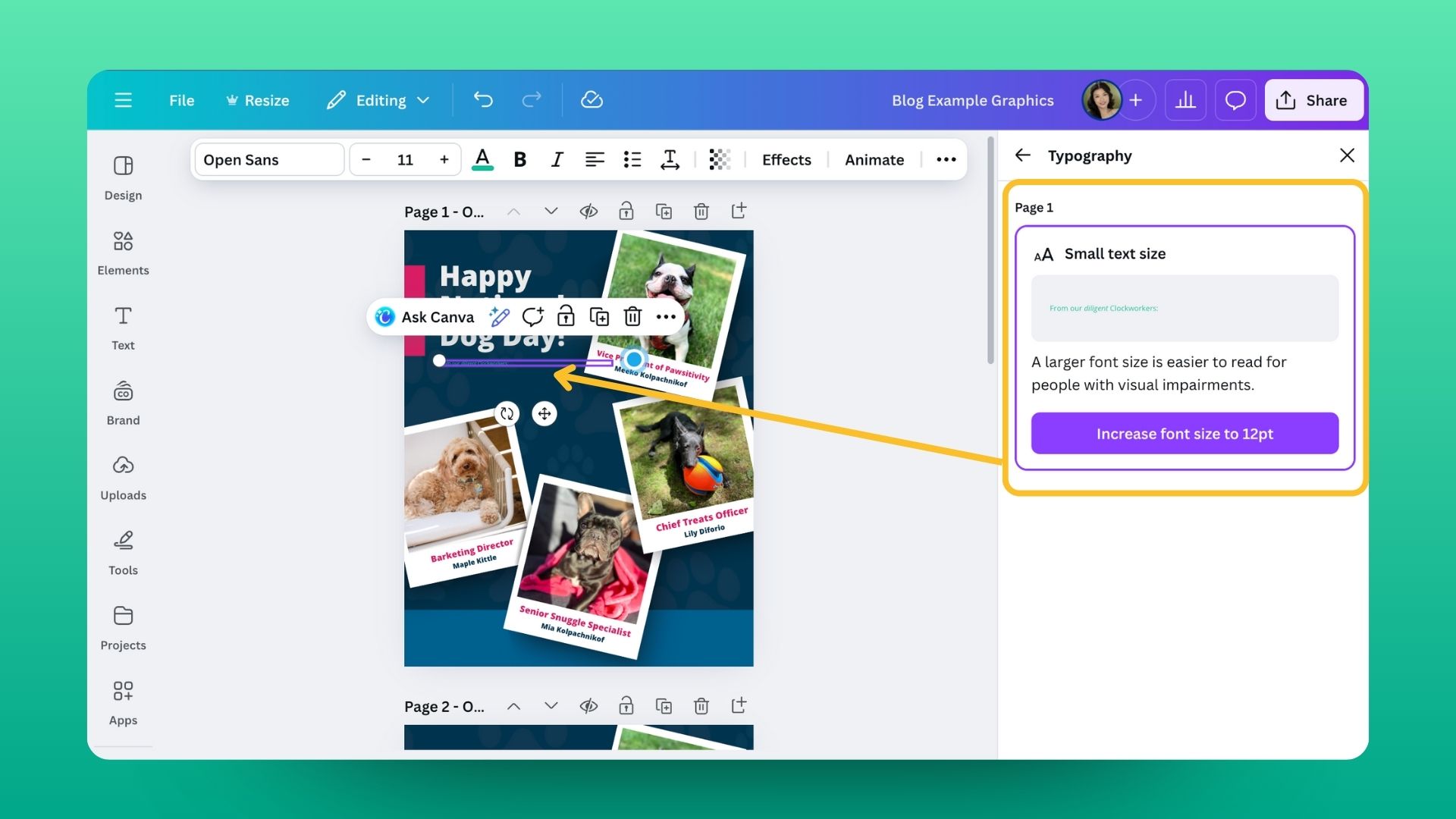
Using Canva’s accessibility checker is simple! In the editor, go to File → Accessibility → Check design accessibility. A sidebar will appear showing any issues related to Typography, Color Contrast, or Alt Text in your design. Think of it as an actionable accessibility checklist helping you to create designs that look great and include everyone.
Typography
Canva’s accessibility checker will scan your design for typography issues that might affect readability. It looks for text that’s too small. When an issue is found, Canva will suggest increasing font size.
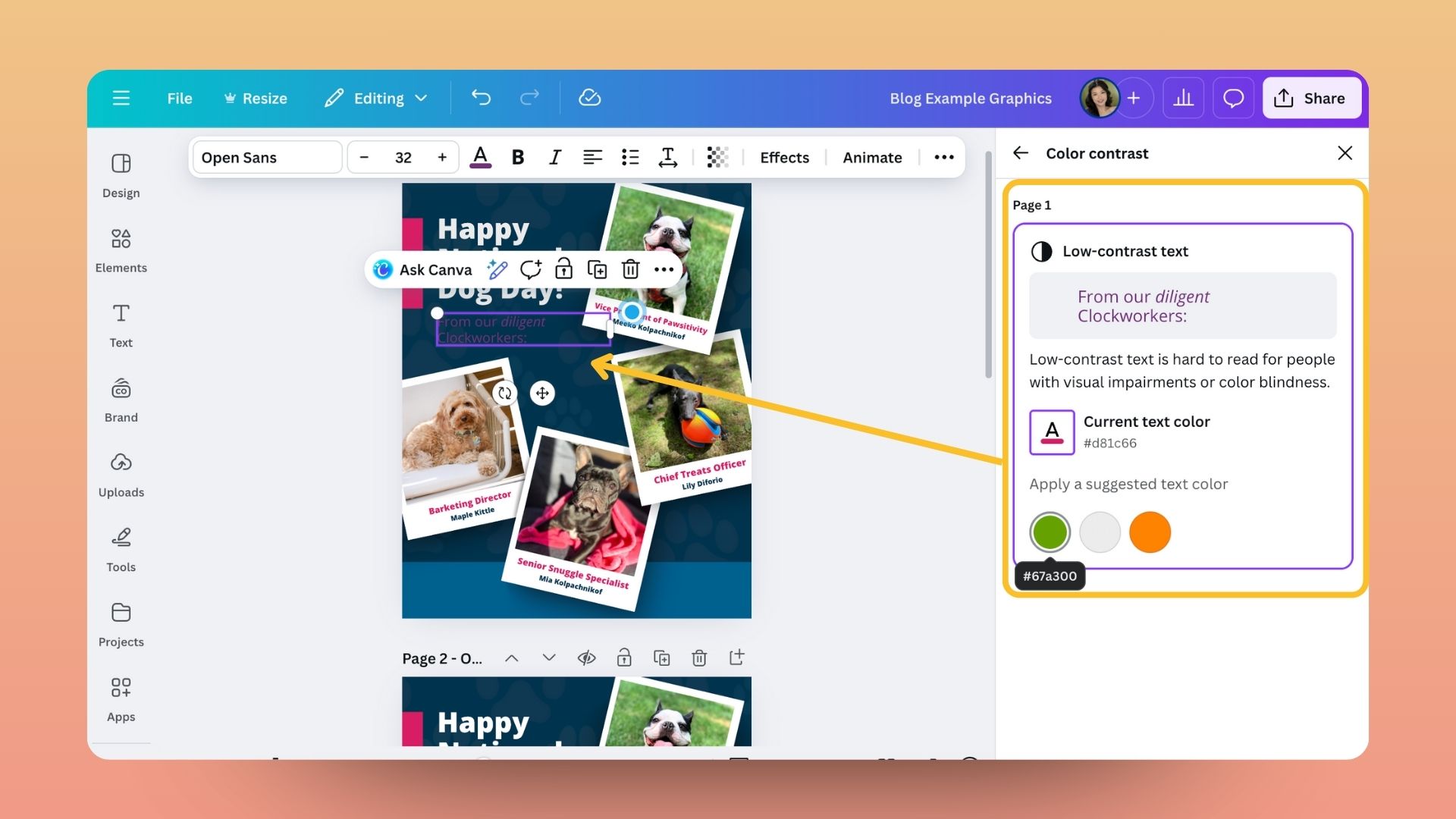
Color Contrast
Canva’s accessibility checker also evaluates the color contrast in your design to make sure text and visual elements stand out clearly. If it detects low contrast between text and background colors, it will flag the issue and suggest higher-contrast alternatives that meet accessibility standards. With a single click, you can apply Canva’s recommended fixes.
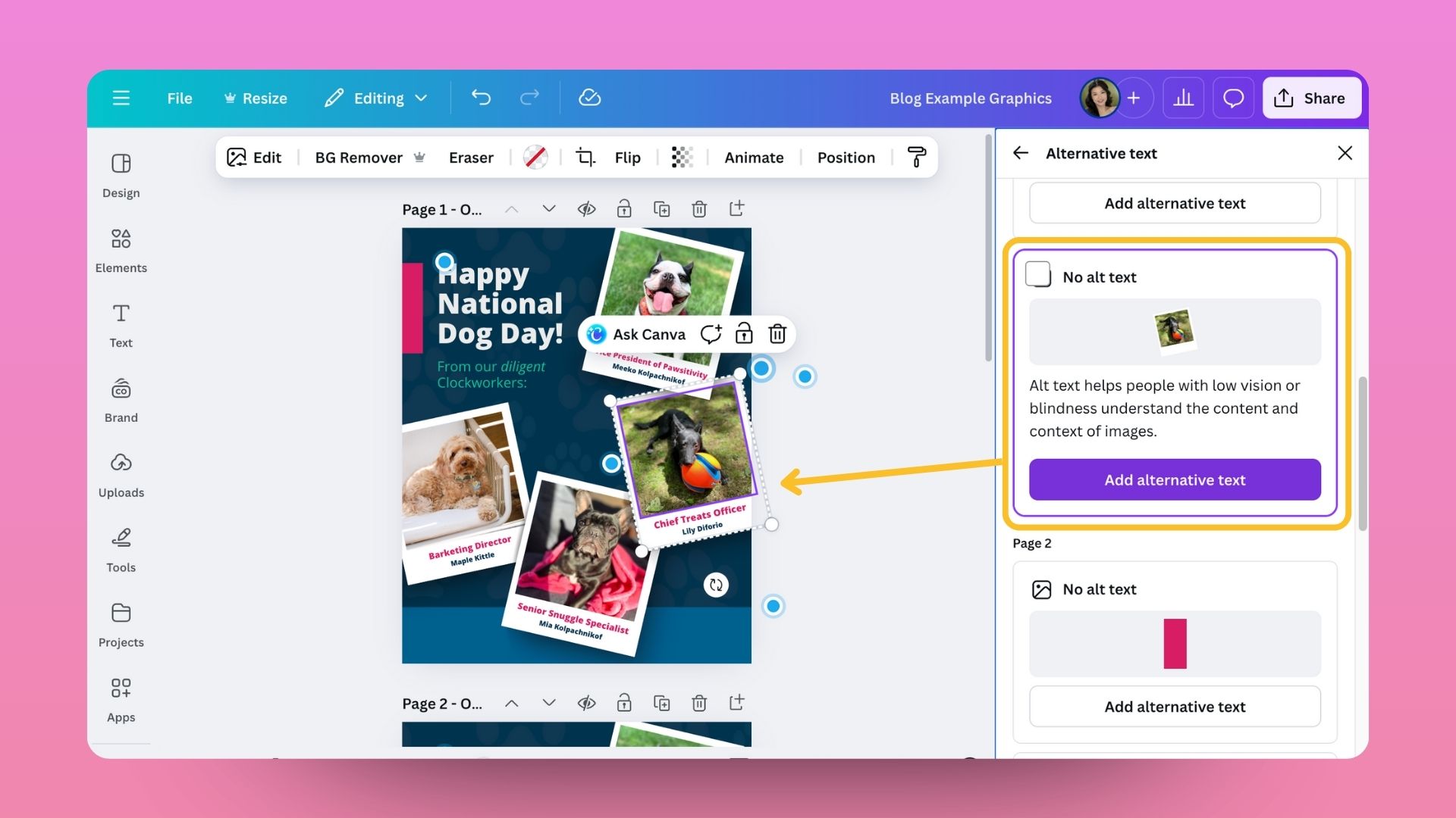
Alt Image Text
Canva’s accessibility checker also helps you review and improve your alt text. When you run a design check, it will flag any images missing alt text or with incomplete descriptions. From that same sidebar, you can quickly add meaningful descriptions that explain what’s in your image. It’s a convenient way to make your visuals more accessible to people using screen readers and ensure your content can be understood by everyone.
Related Posts
About The Author