Not every logo needs a redesign. In fact, some of the most recognizable brands have evolved through subtle, strategic changes rather than dramatic overhauls.
A logo refresh can breathe new life into an established identity while preserving the visual cues that customers already know and trust. Let’s consider four common types of logo refreshes, with examples of how brands can evolve without losing what makes them familiar:
1. Color Change
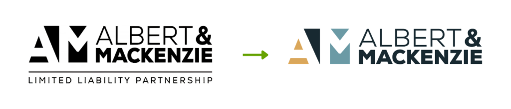
If a logo is working well, sometimes a simple color change can be all that is needed. In these cases, the basic logo remains recognizable, but its colors are updated to give the brand a fresher, more modern appearance.
Examples:
- Albert & MacKenzie: We introduced a new color palette to give this California firm a more approachable, welcoming feel.
- Shartsis Friese: We shifted the color palette from royal blue to a deep teal to align with their new interior design palette and give the brand a more sophisticated, modern look.

2. Consistent Mark
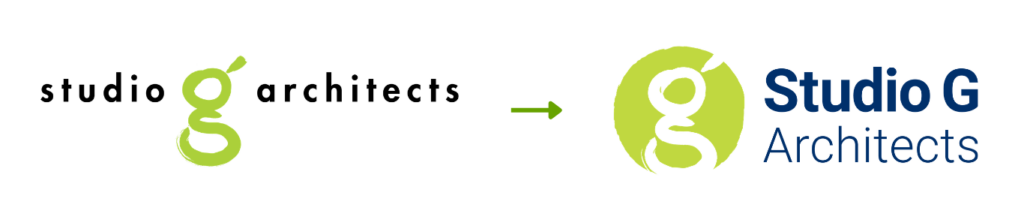
If your logo includes a graphic element or mark, preserving it can often help support brand continuity. In the examples below, we retained the main symbol or mark while updating the overall logo design.
Examples:
- Studio G: We maintained the signature “G” mark while refining the typography and color to improve the readability of its name.
- Yeroushalmi Law: As the firm shortened its name, we retained the shield emblem but simplified the design with bolder colors and typography.

3. New Name
When a firm changes its name, retaining design elements from the existing logo can help maintain a connection to the brand.
Examples
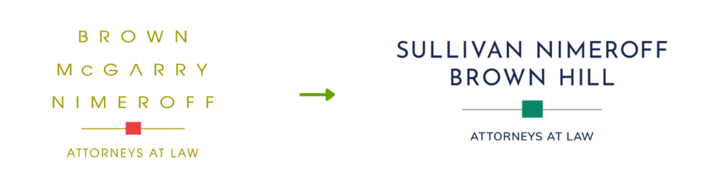
- Brown Nimeroff: We evolved the logo we had previously created into Sullivan Nimeroff Brown Hill by changing the color palette while retaining a familiar format to preserve brand recognition.
- When Allcock & Marcus became Allcock Orban, we maintained the color palette and typography and created a new mark with the same overall style.

4. Affiliated Company
When a company launches an affiliated entity, visually connecting the logos can help the new entity leverage existing brand equity.
Examples:
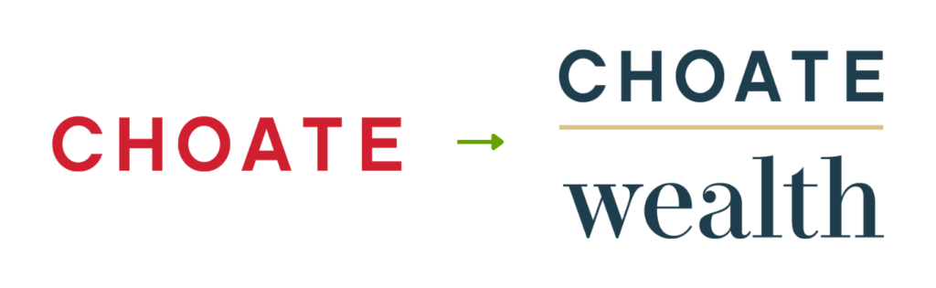
- When developing a logo for Choate Wealth, an affiliated company of Choate, the iconic Boston law firm, we maintained the Choate logo typography to create a clear visual connection between the two brands.
- As we designed the Strata CDR logo, an affiliated company of Allcock Orban, we used a similar graphic style to create a cohesive visual connection between the two brands.

Fresh Look, Same Brand
Whether your brand needs a subtle refresh or a more comprehensive redesign, we can help. Get in touch to create a logo that feels modern and relevant while staying true to your brand’s identity.
About The Author