Take full control of your website’s layout without touching a single line of code. The WordPress Block Editor (Gutenberg) transforms the editing experience into a modular, drag-and-drop process that is as intuitive as it is powerful. WordPress’s Gutenberg block editor gives you greater control over layout, design, and content.
The Power of Modular Web Design
Also known as “Gutenberg,” WordPress’ block editor is a modern content editing experience that allows you to create pages using individual “blocks.” Each block represents a specific type of content, like a paragraph, image, or button, that you can easily add, move, and customize.
Instead of working within a single, continuous text field, you can build your content piece by piece. This modular approach allows for more creative control and makes it easier to edit content as your needs evolve.
FAQ: How does it differ from the classic editor?
The classic editor treats your content as one large body of text, similar to a word processor. While simple, it can be limiting when you want to create more dynamic layouts or incorporate different types of media.
Essential Block Categories for Your Site
Understanding the different types of blocks available is key to getting the most out of the editor. While options may vary slightly depending on your platform, most fall into three main categories:
Dynamic Text Elements:
Text blocks are the foundation of your content. Everything you need to communicate your message clearly and effectively. These include the following;
- Paragraph
- Heading
- List
- Quote
- Table
- Details – a way to hide and show additional content
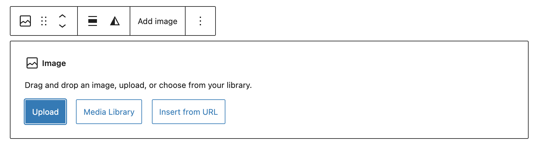
Engaging Visual Media:
Media blocks allow you to bring your content to life with visuals. You can add images, videos, galleries, or embedded content from external platforms, helping to make your pages more engaging and interactive.
- Image
- Gallery – display multiple images
- Audio
- Video – easily embed hosted videos using the URL (YouTube, Vimeo, etc.)
- Cover – allows you to add a background color, image or video with a text overlay
- Media and Text – puts media and text side-by-side
- File
Structural Layout & Design:
Design blocks help you structure and enhance your layout. Use columns to organize content, spacers to create extra padding, or buttons to drive user actions. These blocks give your content a more intentional and polished look.
- Button
- Columns
- Accordion
- Grid
- Group
- Row / Stack
- Separator – Line or dots
- Spacer – Add additional white space between blocks
- More – Collapse remaining content
How to Use the Block Editor
Getting started with the block editor is simple. Once you understand the basics, you’ll be able to build and customize content with ease.
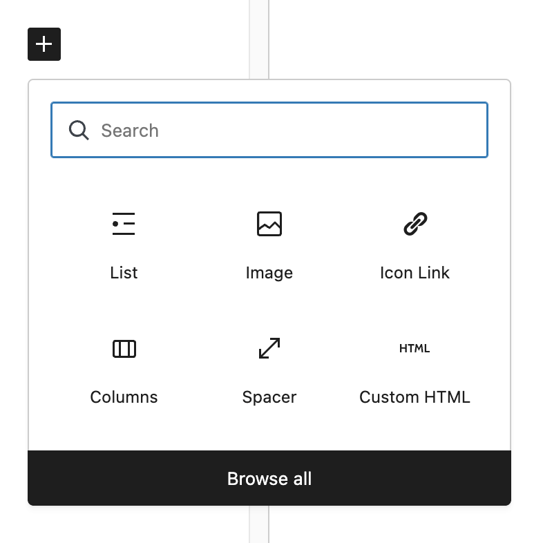
Step 1: Add a Block
Click the “+” icon to insert a new block.
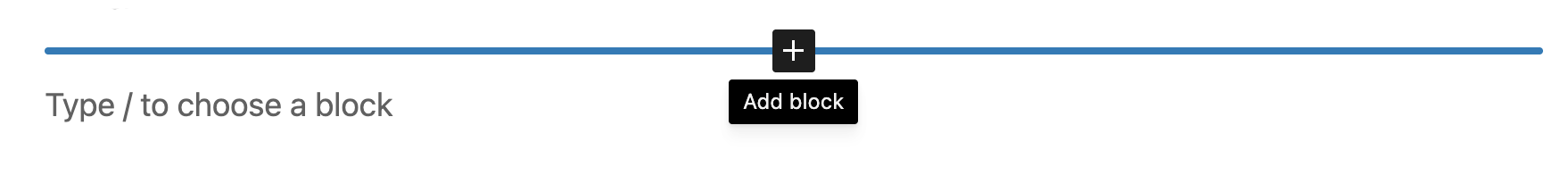
Search or select a block
You can choose from a short list of recommended block types or search for a specific one.
Step 2: Add Your Content
Once the block is in place, type or upload your content directly into it. Each block is designed to be intuitive, so you can focus on creating rather than figuring out how things work.
Step 3: Customize Your Block
Use the block toolbar to adjust formatting, alignment, and styling. Depending on the block, you may also have additional settings in a sidebar for more advanced customization.
Step 4: Keep Adding Blocks
Repeat steps 1 through 3 to build your page. Try mixing and matching different block styles to achieve your desired content layout.
Quick Tips
- Rearranging Blocks: Easily move blocks by selecting the parent block and using the six-dot handle to drag it into place. You can also use the arrow icons to move a block up or down one position at a time. Open the List View to see a clear hierarchy of your page content, making it a lifesaver for reorganizing elaborate designs without losing your place. You can also select multiple blocks to move components simultaneously.
- Deleting Blocks: Select the parent block and press Backspace on your keyboard, open the three-dot menu in the block toolbar and choose “Delete,” or use the keyboard shortcut Shift+Alt+Z (Control+Option+Z on Mac).
- Toggle Views: Select the 3 dots in the upper right-hand corner of the screen to change your editing view. Options include anchoring the toolbar to the top of the screen or enabling full-screen mode to minimize visual clutter while writing. Use the “List View” icon (the three-line symbol in the top toolbar) to easily manage and select specific elements within deeply nested sections or complex page structures.
- Patterns: Patterns are reusable groups of blocks with content that can be inserted into any page. Updating a pattern will automatically apply those changes to every instance of the pattern across your site. Save frequently used elements, like an “About the Firm snippet” or a custom “Call-to-Action”, as Synced Patterns to ensure a uniform look across your entire site.
- Reusable Layouts: Create modular blocks for recurring professional content, allowing you to update information in one place and have it reflect globally.
- Custom Blocks: Gutenberg also supports fully custom blocks. Work with a designer and developer to create tailored blocks that fit your site’s specific needs.
Resources
About The Author