
Often, when we are asked for rebranding proposals, our clients request a similar list of necessary components: logo, website, stationery, folders, pitch books, ads, trade show booths, PowerPoint and other templates, etc. But one crucial component is often missing: interior office décor.
When you think about powerful brands, their physical space almost always factors into your impression. For example, the feeling you get when walking into a Starbucks is quite different than the feeling walking into a Dunkin Donuts.
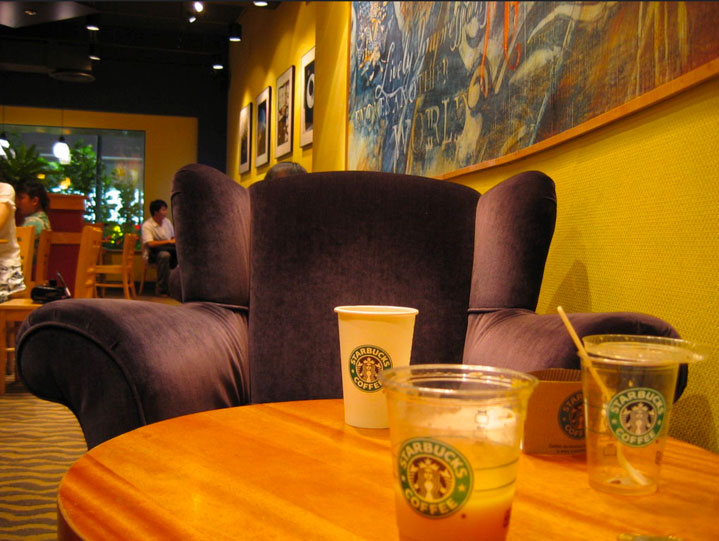
The Starbucks “vibe” is relaxed, cozy, and upscale. The lighting is subdued, the music is soft and jazzy, the artwork is modern, and the wall colors are warm golds and earth-tones. The logo is used subtly if at all. The overall impression is one that says “stay, sip, unwind.”
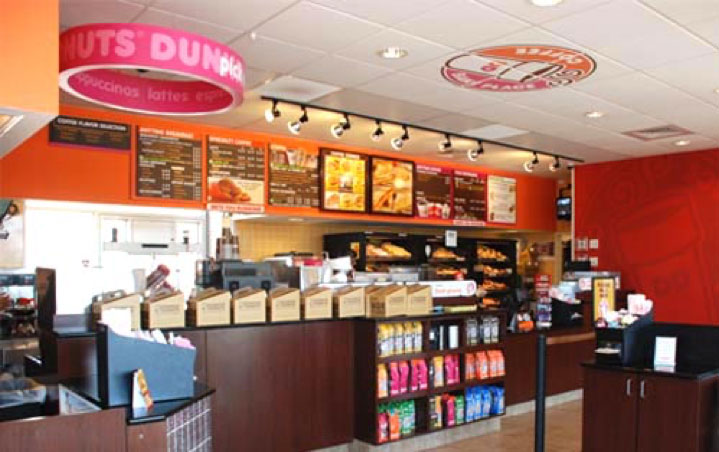
Contrast that with the Dunkins “vibe.” The lighting is bright. The logo and signature orange and pink colors are everywhere. Large monitors show videos of coffee pouring, close-ups of donuts being iced, and steaming egg sandwiches. The feeling is energetic and fast-paced.
Like these famous chains, professional service firms should also consider ways to use their physical space to reinforce and build their brands. Although our clients do not frequent our offices as much as Starbucks and Dunkin patrons do, our employees spend the good part of their day within our work spaces. How we design our interiors can greatly impact how employees, recruits, clients and other visitors perceive our brand.
Last year my firm helped a CPA firm with a complete rebranding. The process was thorough: We interviewed clients and staff, conducted competitive analysis, and created all new marketing materials including logo, tagline, messaging, website, and all printed collateral. The makeover was dramatic and extremely successful. The difference is evident in the “before” and “after” website homepage screens below:
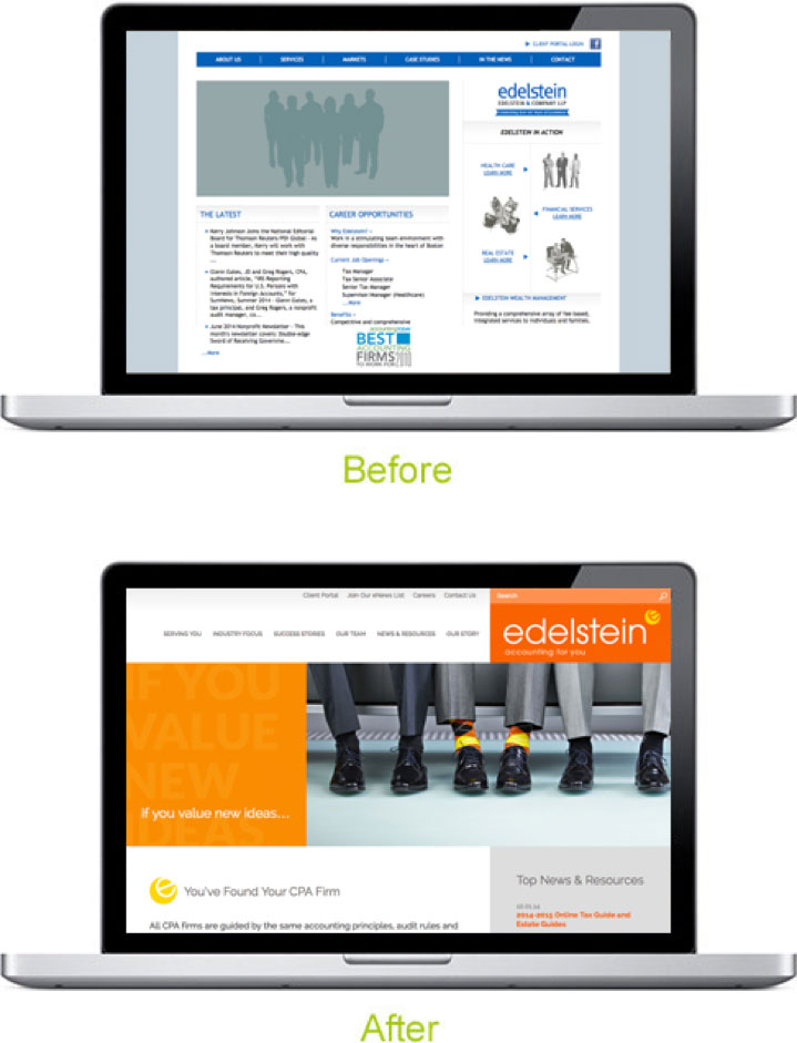
The old website did not convey any sense of the firm’s personality. The blue and gray color palette presented a cool, all-business tone. But the firm was a vibrant, friendly, highly personable group. Clients used words like “flexible,” “accommodating,” “down to earth,” and even “fun” to describe their relationship with Edelstein CPAs. The new website and brand reflects this persona.
As the company grew in size, they needed more office space and expanded to fill the entire floor of their building. The newly renovated space is now truly “on-brand,” using the newly established warm and friendly palette colors and brand elements throughout the décor.
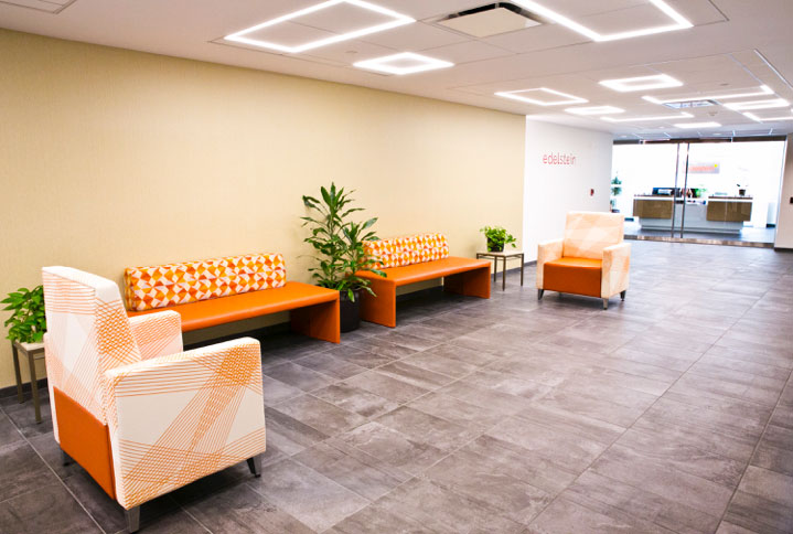
Orange patterned furniture greets you when you step off the elevator.
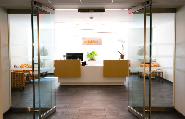
The new logo is a focal point above the clean, modern reception desk.
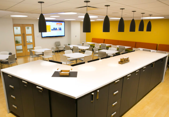
A bright yellow accent wall and orange booth seats add vibrancy to the break room.
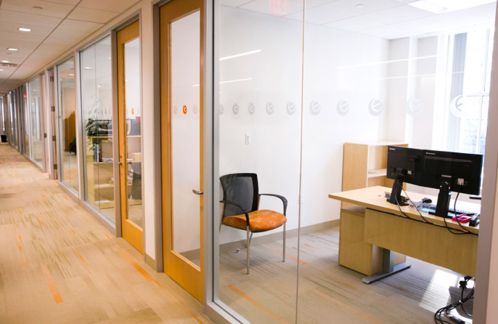
The logo “e” is embossed repeatedly on the glass walls and printed in bright orange on the glass doors.
Although the roll-out of the new brand was extremely successful, the added impact of the renovated space is dramatic. There is a real cohesion to the brand, and, I’m sure, a much stronger understanding of the brand standards among employees now.
Kudos to Margulies Perruzzi Architects for their beautiful work on the Edelstein space.
Vanessa’s article first appeared in SMPS Boston’s Outlook, .
About The Author