Congratulations to Critchfield on the launch of their new brand, logo, and website! The new look represents the firm’s strength, positivity, ongoing commitment, and rock-solid dependability to their clients and communities.
Critchfield is a law firm with deep roots in the Northeast Ohio community dating back to the Civil War era. Prior to refreshing the brand, we conducted brand research to ensure the words and visuals we suggested during the design process will resonate internally and externally. The research included interviews with attorneys at the firm as well as clients of the firm, a competitor review, a branding SWOT analysis (strengths, weaknesses, opportunities, and threats), and culminated with our recommended brand pillars and brand positioning statement.
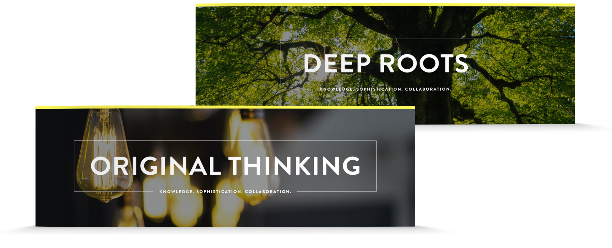
Logo & Color Palette
Based on our research, we simplified and strengthened the logo to “Critchfield,” rather than “Critchfield, Critchfield & Johnston Attorneys,” in response to what we heard during our interviews. The color palette of yellow and charcoal conveys the firm’s personality of energy and rock-solid dependability. Coincidentally, gray and yellow were later selected as Pantone’s Colors of the Year for 2021!
![]()
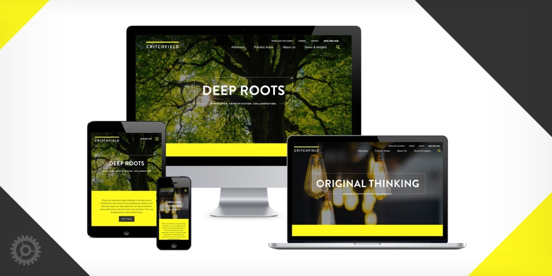
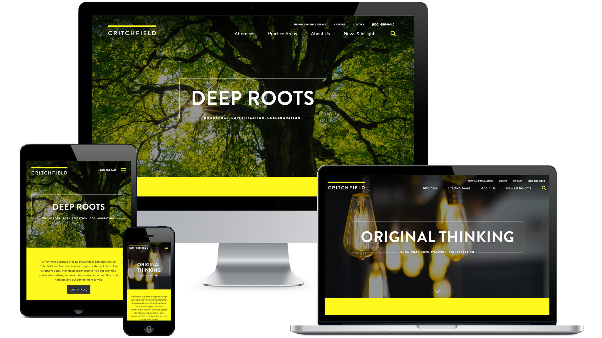
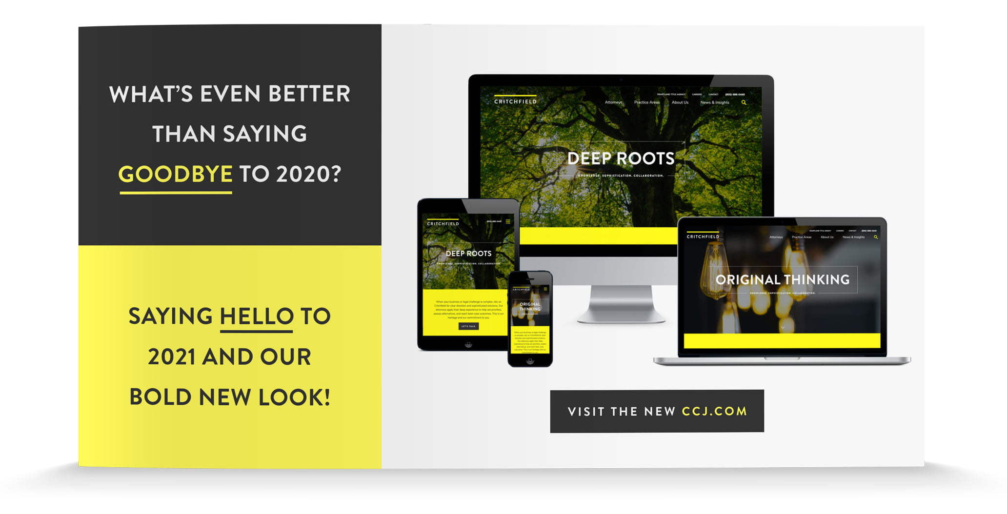
Website
The new, responsive website is modern and professional while also enabling the attorneys to show both their serious and “off the clock” sides. The sticky navigation, interactivity on rollover, long scrolling page, and partial dark mode (dark backgrounds with light text) drastically modernize the site. The new site also includes multiple ways to sign up for client alerts and contact the firm with questions to encourage site visitors to reach out to Critchfield’s friendly team.
Social Media
Additionally, we created social media banners and the announcement graphic for a coordinated brand launch.
About The Author