Website design trends evolve constantly, driven by technology adoption, shifting aesthetic preferences, and the desire to stand out. Here’s a list of web design trends that have grown on us this year. Keep reading for inspiration on how you can utilize colors, shapes, and layouts to refresh or redesign your website and brand.
FYI the images in the examples below are clickable and will open in a new window.
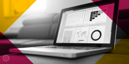
1. GRADIENTS
Solid colors, color blocking, and “flat design” have been extremely popular for many years. But now, gradients are making a comeback in powerful ways. Gradients can be used subtly to add visual interest, in a dramatic and playful way, or as a “pop” to draw the eye to a specific element on the page, such as a call-to-action.
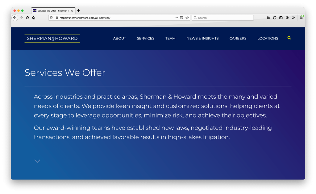
Subtle Gradients
We used a two-tone gradient across the top of select interior pages to give Sherman & Howard’s site a modern, innovative feel.
Dramatic Gradients
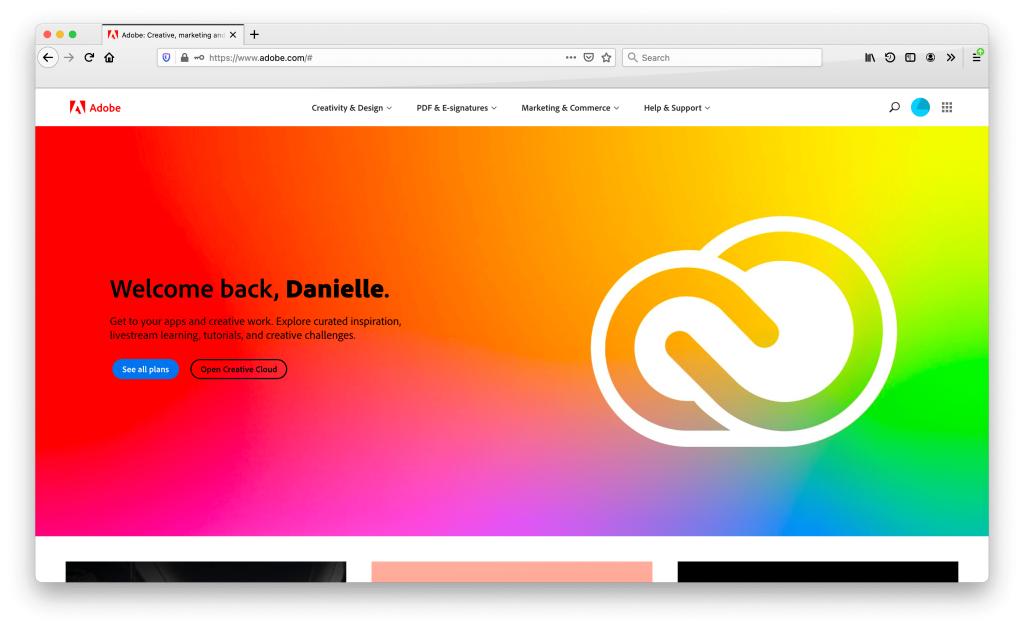
Adobe uses a multiple color gradient for a fun, playful, splash page:
 Gradient “Pop”
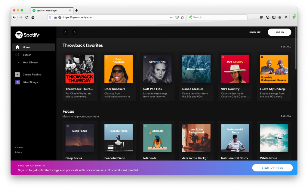
Spotify effectively uses a gradient to draw attention to the call-to-action band at the bottom of the page to encourage sign-ups:
2. DARK MODE
If you have ever used Google Maps at dusk, you’ve seen all the colors change from bright, light colors to a dark theme, which is easier to view at night. Dark mode is trending in website design as an alternative to bright whites, no matter the time of day. Dark backgrounds can feel soothing and sophisticated or techy and edgy depending on how they are used.
Dark Mode for Subtle Background
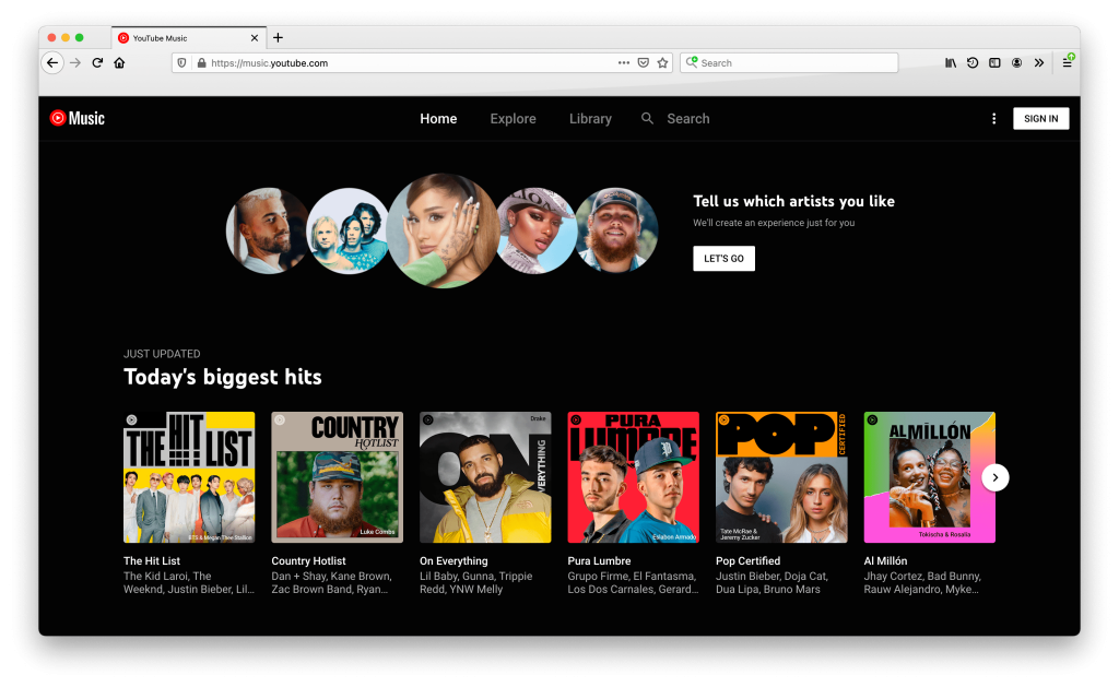
YouTube Music (below) and Spotify (above) as well as many other streaming services use dark mode to make the colorful image options sing as the visual focus.
Dark Mode for Emphasis
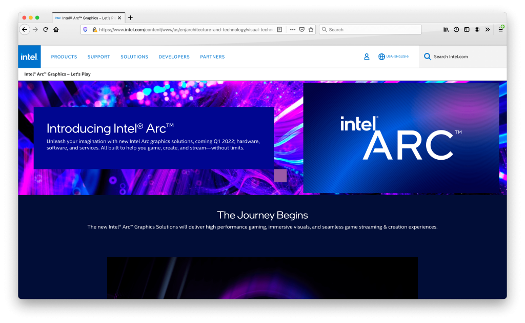
Most of Intel’s website pages are bright white. The shift to the dark navy background differentiates this product page from the rest of Intel’s site and offerings:
Partial Dark Mode
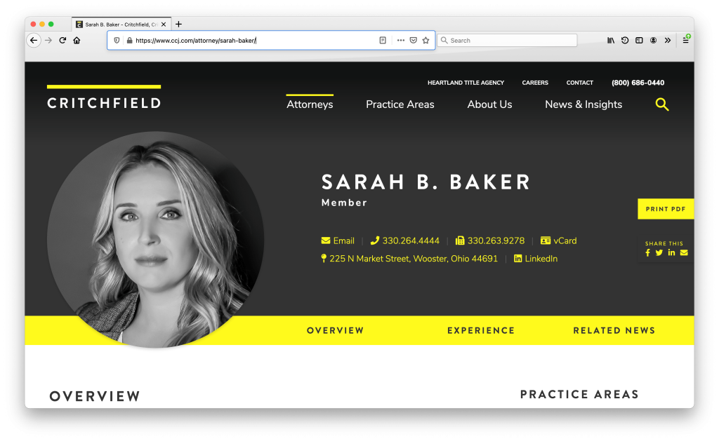
On Critchfield, we combined both white and charcoal backgrounds throughout the site for a modern, sophisticated look:
3. COMFORTABLE COLORS
If you have found yourself looking at screens constantly since the start of the pandemic, you are not alone. Staring at a bright white screen can be glaring. That said, it is not surprising web designers are re-evaluating background color palettes. Beiges, light grays, and pastels are more comfortable on the eyes.
Beige Color Palette
Gray Neutral Color Palette
Pastel Color Palettes
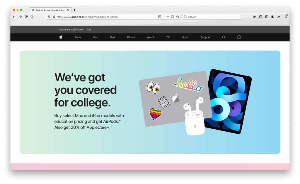
Apple has a splash page to promote AirPods to college students. The variety of pastel color backgrounds are easy on the eyes and give the page a youthful feeling:
Mailchimp updated its homepage with bands of pastel and neutral colors. It seems like Mailchimp is constantly iterating its site design and is at the forefront of website trends. (You might remember their last homepage design that made waves with bold, custom illustrations. They are still using the illustrations further down the homepage and throughout the site):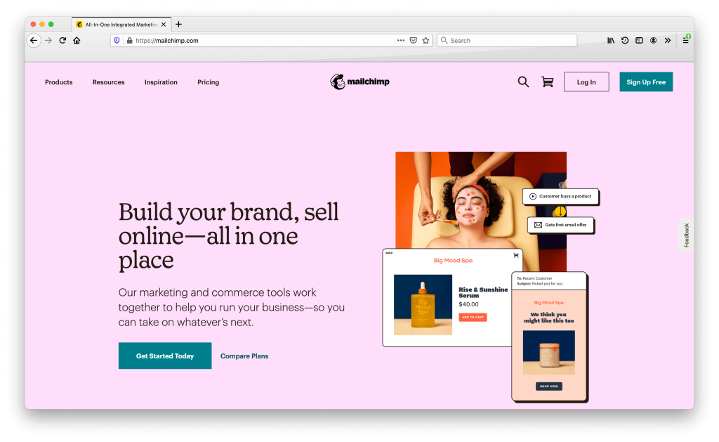
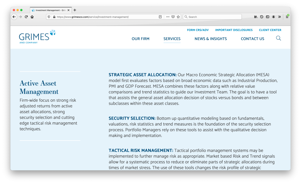
On the Grimes & Company website, we designed the pages with a mix of white, light blue, and beige backgrounds that give the site a calming feel.
4. WHITE SPACE
White space (also known as negative space) is the space between elements on a page. Sites can push the amount of white space to extremes. The minimalism of extreme white space provides a sense of sophistication and enables the limited words and graphics to be the star of the show.
White Space for Visual Focus
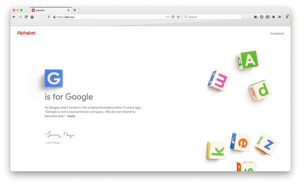
Google’s parent company, Alphabet, effectively uses white space to focus attention on the headline “G is for Google.” The contrast between the starkness of the vast white background and the playful 3D-looking letter blocks is what makes this page memorable. Don’t be fooled by the brevity of the text. They have a lot more to say, but it is hidden under the “more” link:
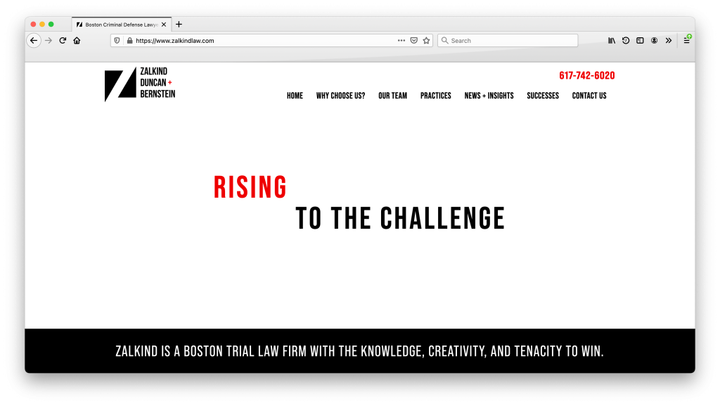
On Zalkind, Duncan & Bernstein, we used white space to make the headline pop off the homepage for a striking and memorable design. The word “rising” also automatically animates to further draw attention to the headline:
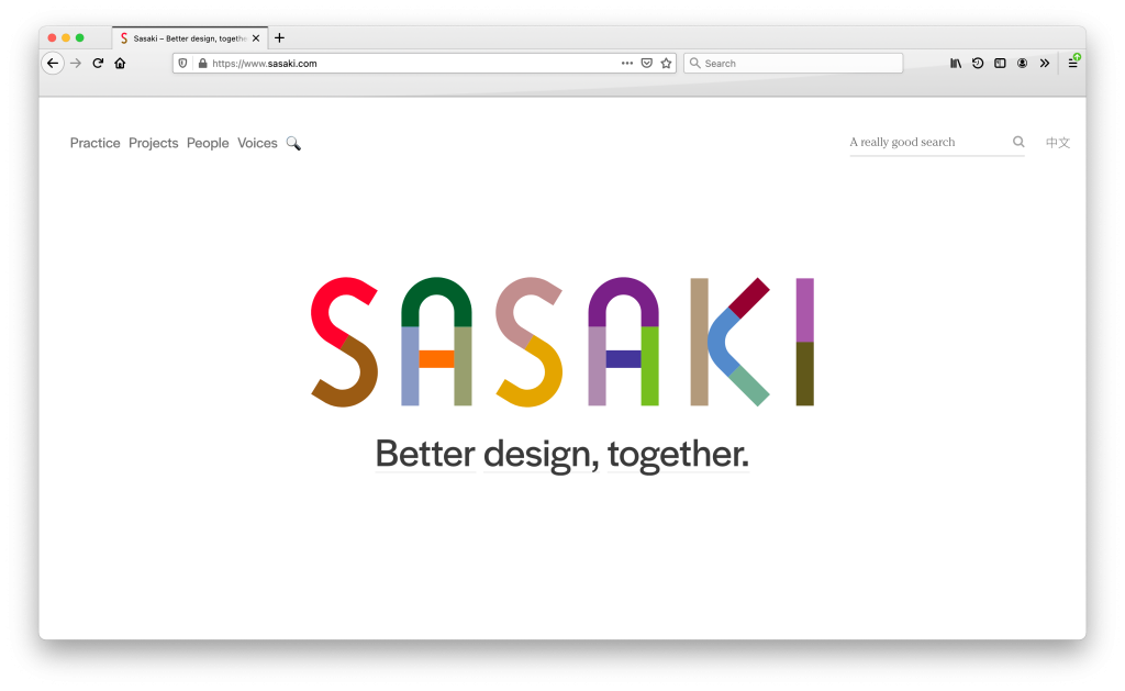
White Space for Navigation
The use of white space on Sasaki’s homepage creates a clear visual hierarchy. The simplicity helps users make choices of how to interact with the site after seeing the large logo and tagline. Site visitors can click the main navigation to jump to an interior page, use the prominent site search to find something specific, or scroll down to keep exploring and see links to a variety of pages:
5. BREAKING THE GRID
Do you remember when every website had images and videos that filled the screen? We certainly do. Sites all started to look the same “above the fold.” In response to that, brands are finding ways to break the mold to be more memorable. Incorporating white space with unusual grids creates striking looks.
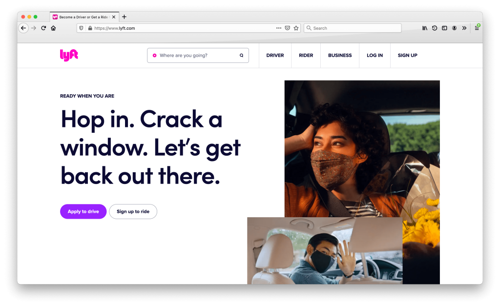
Rectangular Assymmetrical Layout
Lyft layers rectangular images to the right. They are also using white space to focus attention on the words and navigation options:
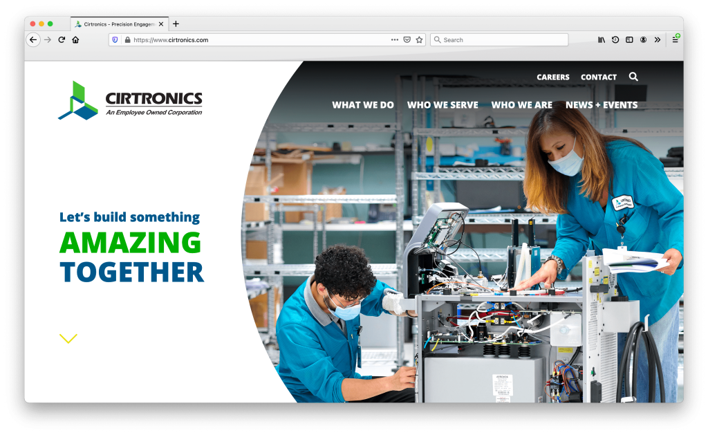
Circular Assymmetrical Layout
We designed Cirtronics with circles, bold typography, and white space for a fresh, techy look:
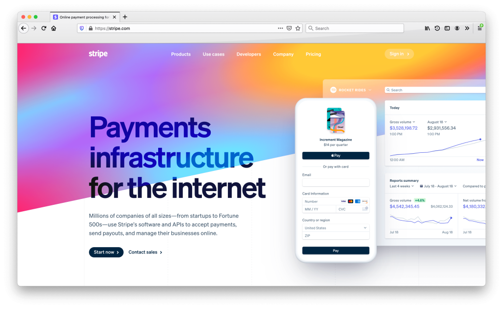
Angled Graphic Layouts
Stripe uses angled background elements to break the grid throughout the homepage and draw the eye downward to keep scrolling:
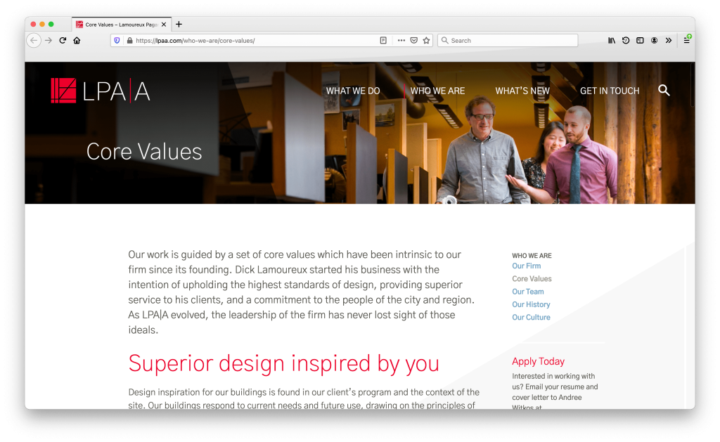
We designed LPA|A with subtle angles to increase the visual interest. Angles are used throughout the design: the header images include a dark angled overlay, an angled light gray background cuts across the body of the pages, and the footer is a slanted gray block:
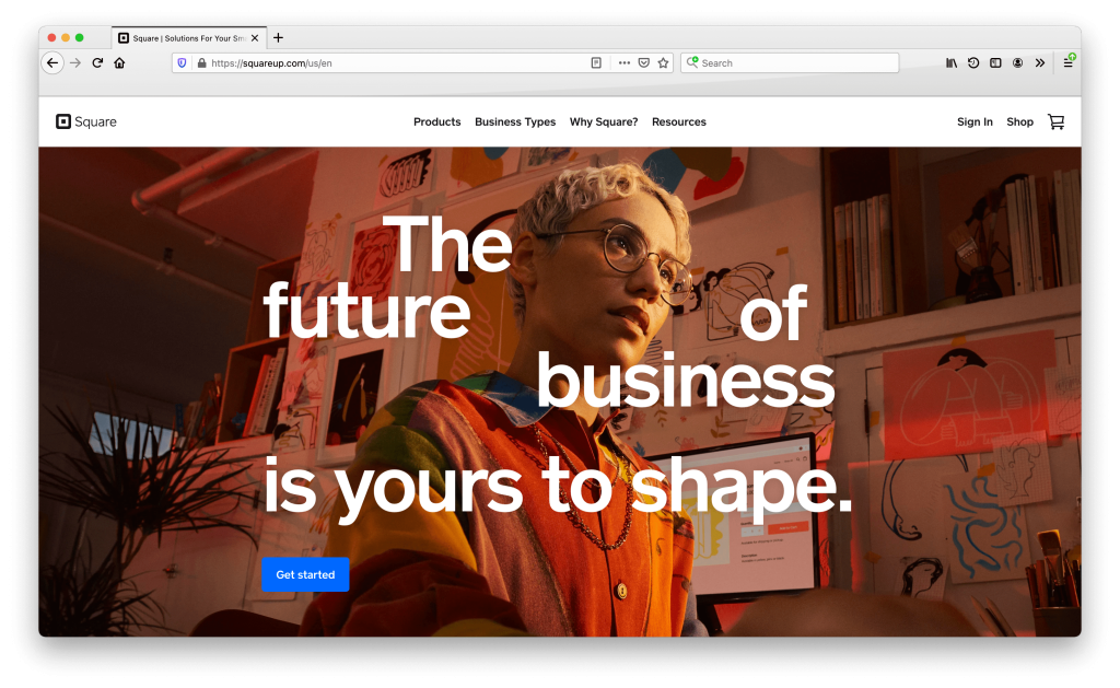
Typographic Layout
While Square does use a full bleed image at the top of the homepage, they have broken the anticipated grid with the headline. The words are carefully placed around the face of the featured person:
6. ORGANIC SHAPES
Organic shapes are unexpected and whimsical, and shaping up as an eye-catching new trend as a result. Sites use organic shapes in obvious as well as subtle ways.
Obvious Organic Shapes
Subtle Organic Shapes
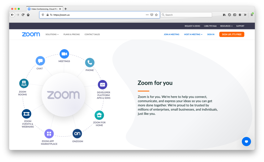
Zoom includes a gray background blob to add depth:
7. Animation
On-page animation has also become a very common trend as it helps create a user experience that draws users into the site. Some animations happen immediately and others are triggered, typically by scrolling down the page or hovering your cursor over page elements. Keep your eyes peeled for our follow-up article defining different types of animation trends with examples.
In Conclusion
It is important to always continue adapting and modernizing your website. By implementing any of the trends we’ve highlighted here, your site can look more relevant, modern, and engaging to your clients and prospects.
Extra Credit
Do you have a favorite trend from the list above? Did you notice that some of the sites we’ve featured exhibit multiple website trends? Test your new knowledge by scrolling through the list again or look for these trends as you surf the web in your daily travels.
About The Author