Color management — making sure colors print the way you expect them to — does not end when you hand off your file to the printer. In order to keep your firm’s brand colors consistent and other colors in line with expectations, it is crucial to stay involved.
Matching colors and keeping colors consistent is not easy, it is always difficult no matter what you are printing. Sadly, many printers today will let color shifts happen, or say the shift is “within tolerances,” so always expect inconsistencies and proactively address expectations prior to, and during, every print run.
Here are a few tips I find essential when I manage printed work:
- Whenever possible, use the same printer for “branded” materials where color needs to stay consistent. Using multiple printers will compound color inconsistencies.
- Ask your printer to keep your jobs on the same press within their plant. This is not always feasible or cost-efficient, but if they can do it, it’s best. Changing presses will compound color inconsistencies.
- Whenever possible, use the same paper stock. Colors will look different when printed on different stock, even different weights of the same stock. Colors printed on uncoated paper versus coated paper will often look widely different.
- If you have existing printed pieces of stationery or other components, always provide actual samples to your printer for them to match. Send samples when you provide your files and instruct the printer to adjust your files, as necessary, to match the printed samples.
- Always review hardcopy proofs (not just PDF proofs) before a job runs. If the hardcopy proof color does not match the printed sample you provided, do not approve the proof (even if the printer’s rep says they can “adjust on press”).
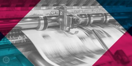
- Go on press when your job runs. I regularly go to printers and review the press sheet to confirm it meets my expectations. A good, professional printer usually has a room just for this purpose, with color-correct lighting, for viewing press sheets. Smaller printers may take you right to the press itself where the pressman is running your job. Press checks take time but are worth it in the long run.
- Don’t be afraid to request adjustments. When you are on-press with a job, shifts in color can happen. If the job is running in CMYK, for example, you can ask the pressman to pull back on Magenta if blues are looking too purple (a common problem) or push yellow if you have large fields of orange that look too dark. If your job is running in spot (PMS) colors, I often request they push all of the inks heavier, for a richer saturation (which pressmen tend not to want to do).
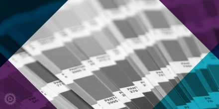
- Matching spot colors with CMYK colors and vice versa is tricky. If your logo is designed in spot (PMS) colors and you run it in a magazine or other piece printed in “full color” (CMYK), matching your colors exactly may be difficult. Similarly, if your logo is designed in CMYK (4-color), matching those colors in spot (PMS) colors will never be exact.
- Silkscreening, vinyl lettering, and embroidery add more complexity. Often, printers that produce mugs, embroidered items, signage, etc, can not use PMS inks so they have to try and match PMS colors (or CMYK colors) using the inks (or thread or vinyl) they use for their specific process, which compounds color matching issues further. In these cases, you may want to use a 1-color version of your logo instead.
In summary, no matter how simple you think a printing job will be, it’s always best to proactively manage the color matching process to help avoid inconsistencies in your brand colors.
About The Author