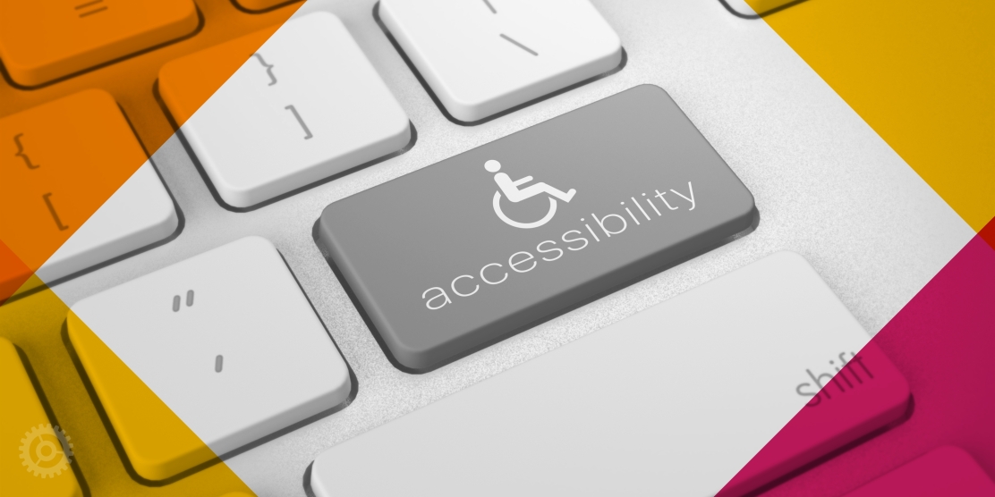
Most people are familiar with accessibility as it applies to physical spaces. We commonly see wheelchair-accessible ramps, hear audible sounds at crosswalks, feel braille on ATM machines, etc. But now, we must also consider how accessibility applies to websites, allowing all people equal access in the digital world.
Website accessibility requires designing and programming websites so they can be used by everyone, including individuals with visual impairments, hearing impairments, mobility impairments, and learning disabilities.
Unfortunately, many websites today are not accessible to all users. For example, a visually impaired user may have trouble navigating a website that relies heavily on graphics or images, while a person with a mobility impairment may have difficulty using a site that is not keyboard-friendly.
In the United States, under the Americans with Disabilities Act, organizations and businesses must make their content (websites, videos, and other digital content) accessible unless there is an “undue burden.”
What are the guidelines for Web Accessibility?
Court cases and the Department of Justice cite the Web Content Accessibility Guidelines (WCAG) by World Wide Web Consortium (W3C), an international web standards group, for technical guidelines on how to make websites accessible. The current recommended guidelines for web accessibility are WCAG Version 2.1 Level AA released in 2018. However, there is a new working draft for Version 2.2 that should be released later this year.
WCAG Conformance Levels
WCAG is organized into 3 conformance levels with specific success criteria for each level. The higher levels must include the success criteria from the lower levels.
- A: Least strict. This includes the most basic elements to avoid major accessibility issues, but is not considered sufficient.
- AA: Recommended. This is the recommended level for reasonable accessibility, which is pointed to for legal conformance.
- AAA: Most strict. This is considered optimally accessible but is very limiting.
WCAG Principles
The WCAG guidelines are based on 4 principles.
- Perceivable: Can people see and hear the content on the site?
- Operable: Can people use the site with a mouse, keyboard, or an assistive device?
- Understandable: Is the content clear? Does the site operate in predictable ways?
- Robust: Is the site accessible with assistive technologies (i.e. screen readers)?
Although it is currently impossible to guarantee 100% compliance, it is important to show an effort is being made to make your site accessible, in the event your company is sued.
Ways to Improve Accessibility
Fortunately, there are many ways to make websites more accessible. Here are a few tips.
Backend Programming
Most of the guidelines are focused on site usability, and can be implemented by your website developer if they have WCAG experience.
- Keyboard/Tap Navigation: Some users with mobility issues may not be able to use a mouse to navigate a website, so it’s important to ensure that all functions can be accessed using a keyboard.
- Screen readers: The site must support screen readers to enable blind and low-vision users to easily access all content and functions on the site. For example, there must be an ability to skip over repeated blocks of content (i.e. navigation menu) to go directly to the page content. Forms require special markup to be used on screen readers. Depending on how your site was built, this can be a significant undertaking or require reprogramming.
Design Considerations
Established brand colors may have to be reviewed and modified to meet web accessibility guidelines. Whenever possible, new brands and websites should be designed with accessibility in mind. When updating an existing site, the firm may need to approve visual changes before they are implemented by your developers.
- Color Contrast: Colors used for text and clickable elements must have sufficient contrast for readability. For example, text should not be a very light color when placed on a white background, or a deep color on a dark background. More surprisingly, brightly colored text, like orange, often does not pass when placed on a white webpage.
- Interaction Indicators: A change in color should not be the only indicator for interaction. For example, when hovering over a clickable element, the element should not just change color. An underline, box, or another indicator should also appear. Required fields on forms should be marked with an asterisk, not just be indicated by a different color.
- Text Size: Text should not be too small; larger is obviously better for readability. Although there is currently no set minimum, it is generally agreed that website body copy should be 16-point or larger.
Content Considerations
As you add content (text, images, videos, PDFs, etc.) to your website, it is important you make sure that content is accessible to people with disabilities.
- Alt Image Tags: Screen readers read out the text on a web page, but they can’t interpret images. Providing descriptive “alt text” for images ensures that visually impaired users can understand what the picture represents.
- Link Text: Make sure that buttons and links are explicit and describe what the button is linking to. Do not use generic text such as “click here” or “read more,” as visually impaired visitors using screen reads will not know what the links refer to, if they skip from link to link. Proper link naming examples:
- Read the full article, [article name with external link], on [publication name].
- View the PDF of the full article, [article name with PDF link].
- Sequential Headings: Heading styles help to break up content into manageable sections, making it easier to read, understand, and navigate. Use headings to divide content into sections to present information in a structured way. The page name is the H1 heading style. You should use the H2 heading style to label all the main sections of the page. For sub-sections of an H2, you should use H3, and so on.
- Closed Captioning & Video Transcripts: Captions and transcripts make it possible for hearing-impaired users to understand the content of a video.
Avoid Web Accessibility Overlays
Some companies promise cheap and easy web accessibility through automated solutions added over existing sites without any programming. Unfortunately, they are too good to be true. These solutions (such as AccessiBe, UserWay, etc.) are known to cause other usability issues and will not protect organizations against lawsuits. To provide an inclusive web experience for all users, the source code must be modified. To learn more about this topic, read the article “For Blind Internet Users, the Fix Can Be Worse Than the Flaws” published in the New York Times and the Overlay Fact Sheet by a group of web accessibility experts.
Web Accessibility Tools
There are many web accessibility resources and tools available, including:
- WCAG Guidelines: Version 2.1 and the working draft for Version 2.2. Note: Guidelines labeled as level A and AA are recommended for compliance.
- Site Testing Tools: (for automated checks only): Accessibility Insights for Web browser extension and Lighthouse browser extension (Chrome / Firefox). Note: Manual testing should always supplement automated checks.
- Color Contrast Tools: WebAim and Polypane. There are also paid tools available, such as Stark.
- Alt Image Tags Tool: Image Attributes Pro is a WordPress plugin that makes adding alt image tags much faster and easier if you have informative image file names.
In Conclusion
Although ADA compliance for websites is a complex undertaking, you can make your website more accessible. Once the overarching design and programmatic changes are made, keeping your site compliant as you add new content becomes an easier process. Website accessibility is not just about compliance with legal standards but also about creating an inclusive environment for all users.
About The Authors