
As a self-proclaimed design nerd, I can’t get enough of graphic design jokes. Most have some really good lessons at their core, and this video is no exception. And since most people (unlike me) don’t have the patience to watch almost 19 minutes (plus ad breaks) of flag critique, I’ve shared my top takeaways, below.
All of the graphic design best practices in this hilarious video can be applied to many end-products, not just flags. So watch the video and/or read my summary and use these rules to your advantage:
Guidelines for Good Flag Design
- Keep it simple.
- Make it distinct at a distance. A flag is not meant to be looked at up close. No tiny details.
- Use three colors or fewer (unless you really know what you are doing, but if you think you do, you probably don’t).
- Symbols. Have them. Your flag should mean something.
- The ideal number of words on a flag = 0
- Don’t include a name on the flag (i.e. “Massachusetts”). A flag is not a nametag.
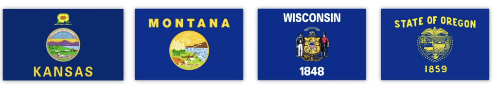
Examples of Bad State Flags
Flags Should Not Be Templates
Sadly, almost all US state flags fail one or more of the simple rules listed above. Many break almost all of these rules. In the examples below, all appear to be using a very similar template: a seal on a blue field. By all looking similar, they all fail to be distinct, especially at a distance. Not one of these flags is memorable in any way. Plus, they are busy, use many colors, and use words including the state name:
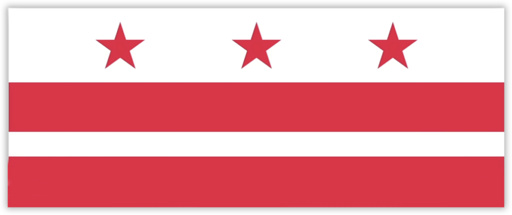
Flags Are Not Money
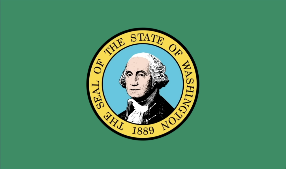
Putting George’s “fancy face” on this flag doesn’t work, especially when the flag is flapping in the air (or hanging limp in no wind). Compare it with the D.C. flag, which is a simple and iconic adaptation of George Washington’s family coat of arms :
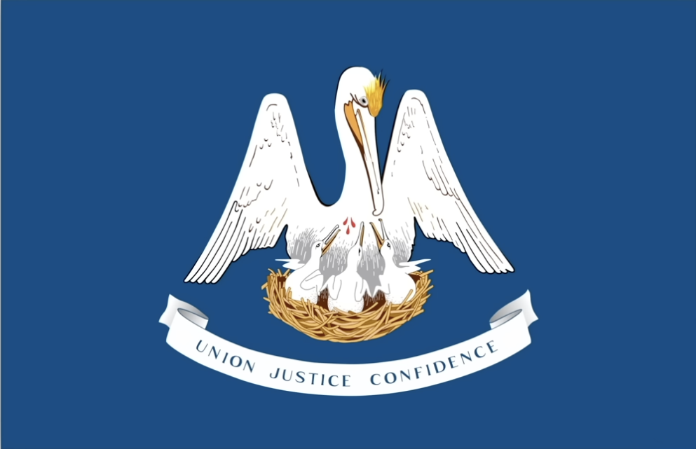
Flags Are Not (Weird) Illustrations
Louisiana’s state bird is a pelican, and there are so many ways to graphically represent that bird. Why this?
Examples of Great State Flags
Flags Should Be Simple
New Mexico does everything right with its flag:
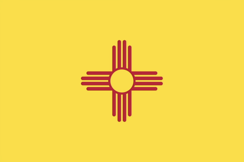
The design reads equally well vertically and horizontally. It uses a powerful symbol that is sacred of the Zia people. And the bold color matches the New Mexican landscape.
Flags Should Be Distinct
Utah has a winning design:
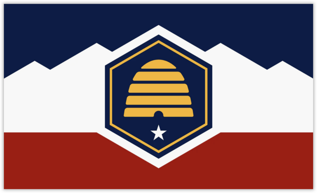
Although Utah is not a big honey producer anymore, it was an important industry back in the 1800s. The beehive symbol sits atop the state star, on red rocks, under white peaks, below a blue sky.
Flags Teach Design Lessons
I’ve never designed a state flag, but can imagine the conversations and committee meetings that went into many of these (bad) designs. I’m amazed and inspired by the few, strong designs and would love to know the stories behind their approval process. My guess is that the designer educated the committee first, and explained why these simple rules are important to make a flag design successful. Without that knowledge and understanding, non-designers are likely to look at other flags and assume that following their template is the way to go.
About The Author