
In web design, icons function as visual signposts. They help users scan content quickly, breaking down complex information into digestible, actionable cues. An icon is a universal symbol, easily recognizable by many. When used on a website, its purpose is often to help visitors quickly recognize and interact with a design. Most commonly, it’s used as a tool for wayfinding or navigating.
Icons are graphic symbols that are so familiar to people, viewers should recognize what they mean without reading any words. Icons speak a common visual language that is understood by all, regardless of native tongue, race, nationality, gender, or age.
An icon can convey a lot of information that is delivered instantly through a simple picture. However, they can be subjective to each viewer, which is why we recommend showing them around to different people before you consider them final. The most effective icons follow these guidelines. How do your icons stack up?
Basic Requirements for a Great Website Icon:
- Clarity over Creativity: An icon’s primary job is to be recognized instantly. If a user has to think for more than a second about what an icon represents, the icon has failed.
- Stylistic Consistency: Ensure all icons in a set share the same line weight, corner radius, and level of detail. Mixing a “flat” icon with a “line” icon creates visual friction.
- Scalability: A great icon looks just as sharp at 16px as it does at 100px. Avoid over-complicating the design with fine details that disappear at smaller sizes.
Icon Design Scorecard: 6 Rules for Clarity
- Universally Recognized: Ensure the symbol is a global standard that transcends language.
- Single Concept: Limit each graphic to one specific message without secondary metaphors.
- Minimalist Detail: Strip away complexity to focus on a bold, legible silhouette.
- Micro-Scale Legibility: Verify the design remains distinct at 16px and 32px sizes.
- Stylistic Unity: Maintain identical line weights, corner radii, and fill styles across the set.
- Square Proportions: Balance the visual weight within a 1:1 aspect ratio for consistent alignment.
Don’t Over-think Icons
It’s important to remember that icons are not meant to tell the entire story. It can be tempting to get really creative, but a word of caution: Do not over-think an icon. The first image that pops to mind is usually the best solution because it is the most obvious.
For example, an icon of a wheelchair in a parking lot is widely understood to mean a space is reserved for persons with a disability. We understand that it does not exclusively mean people in wheelchairs, and applies to people on crutches, on scooters, with vision problems, etc. Similarly, if you are considering a set of icons to represent different types of buildings, a book would be an obvious choice for libraries. Of course, libraries also have audiobooks, music, offer lectures and classes, and tons of other things, but books are still universally symbolic of libraries.
Pro Tip: Some icons are so ingrained in our digital DNA that changing them causes confusion. The “Magnifying Glass” for search, the “Gear” for settings, and the “Envelope” for contact are universal. This is one area where you should stick to the script rather than trying to reinvent the wheel.
Survey Says!
Try not to let your own personal definitions influence your icon design. In the library example, above, if you personally only use the library for borrowing movies, that does not mean an icon of a DVD is the best choice. Use the “Family Feud” approach: If you surveyed 100 people and asked “Name something you find at a library,” what would be the top answer? Sometimes, the “correct” answer is not the top answer.
Take a look at your current service icons. Do they accurately represent your brand’s sophisticated approach, or is it time for a visual refresh?
Portfolio in Action: Strategic Iconography
See how we’ve integrated these icon styles into our recent web designs:
Sanborn Head
SanbornHead.com – Icon Style: Solid

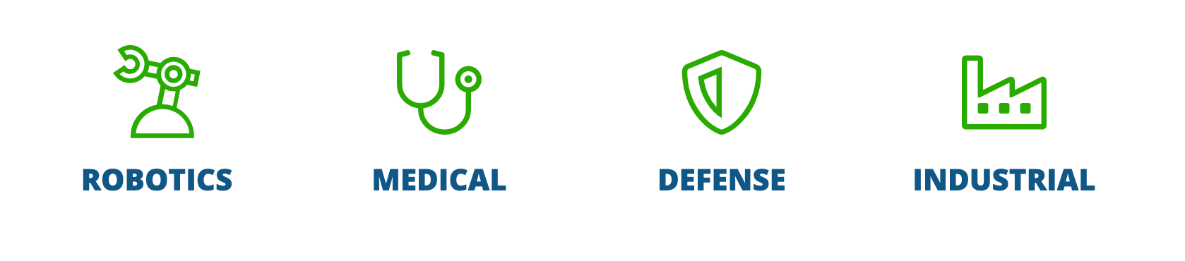
Cirtronics
Cirtronics.com – Icon Style: Line
Northeast Investment Management
Northeastinvest.com – Icon Style: Duotone Style

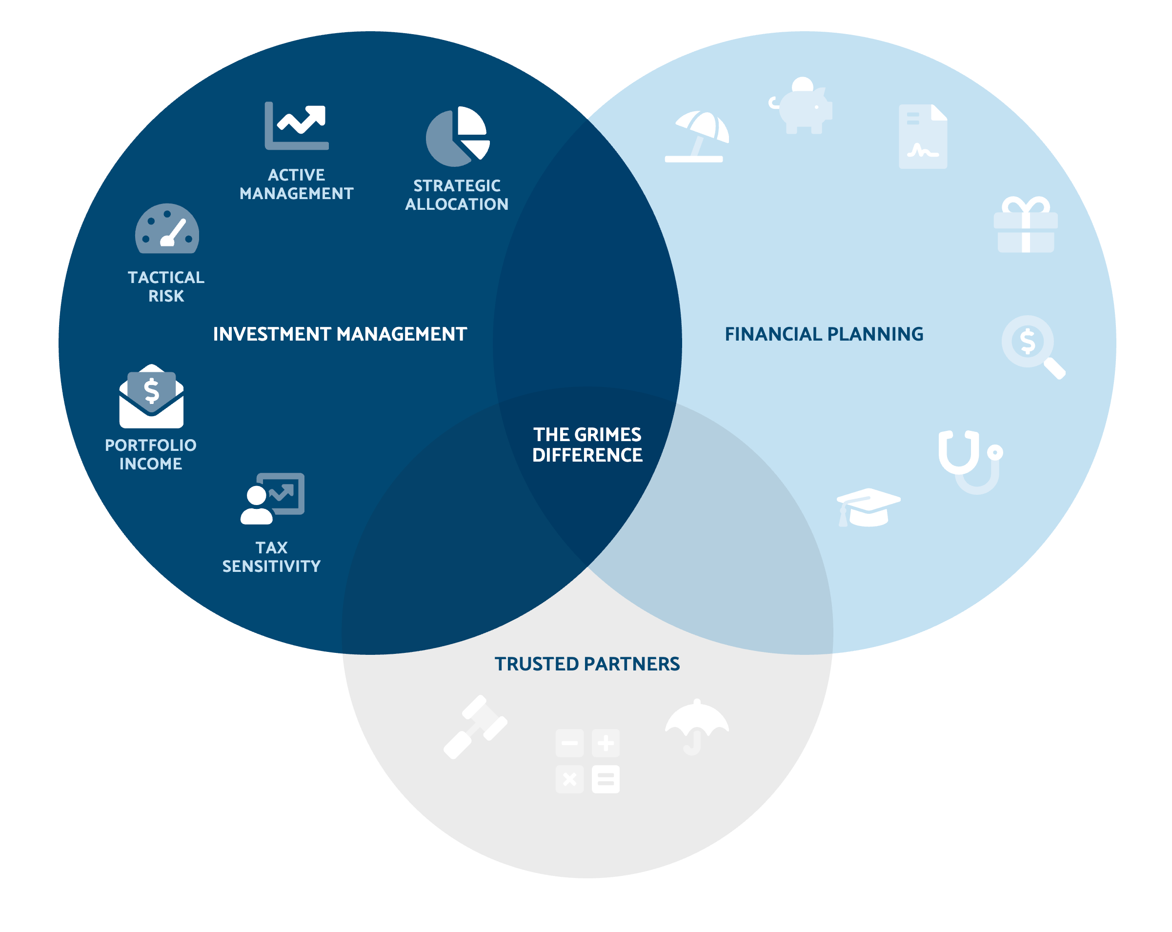
Grimes & Company
Grimesco.com – Icon Style: Duotone
Helpful Links:
- We adore fontawesome.com, they have a HUGE library of icons to choose from in different styles. You can also download them as vectors so you can create your own icons in a similar style if they don’t have exactly what you’re looking for. It’s a great resource and a really handy jumping-off point.
- This article was inspired by Unblast.com where they wrote a great article on how to create an icon set.
About The Author