
This is the fifth post in a series focusing on the basic building blocks of design. With each new post we’ll feature a different principle that will help you understand how designers do what they do. If you’re ever tasked with creating something yourself, these principles can help you make good design decisions too!
Contrast simply means difference. It is the juxtaposition of opposing elements and it allows us to emphasize or highlight key elements in a design. With that in mind, make sure that when you’re designing you clearly indicate elements that are not the same as clearly different, not just slightly different. Contrast is at the root of pretty much everything. Design for the web depends heavily on establishing hierarchies of information. We want to constantly draw people to certain areas of a page and communicate clearly through the design.
Different ways to achieve contrast:
Color Contrast:
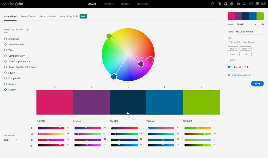
Take a look at the color wheel below. Using colors that are very different from each other, like blue and orange, is a good example of high contrast. They are located on opposite sides of the color wheel. Using colors that are more closely related, like yellow and orange, is a good example of low contrast. Notice how these colors are located closer to one another on the color wheel. When designing for the web you want to make sure that your action items stand out and don’t blend into the rest of your design. If you’re struggling to come up with a successful color palette take a look at this free tool from Adobe.
Size Contrast:
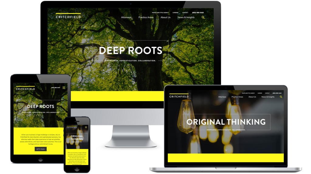
This one may seem fairly obvious, but making something BIG next to something small indicates that the bigger item is more important. The bigger the size difference the more emphasis you’re placing on the larger item. Don’t be afraid to make your call-to-action items and headlines much larger than your less important elements. Think magazine layout more than novel. Notice on the Critchfield website the primary focus is on the white typography but pops of yellow draw your attention down the page.
Shape Contrast:
When using graphic elements like circles, rectangles, lines, and arrows, you’ll need to think about how each shape relates to the others on the page. For example, if everything on the page has straight edges and square corners, adding a circle can help highlight that element. On the DRA Architects website, we made sure that the important information about Careers was in the circle. Notice how the other elements on the page are rectangular. For more subtle contrast, you can include buttons as a primary calls-to-action with just text as secondary ones. Or try mixing things up with different line weights and other shapes.

Typography Matters Too
Pair your fonts strategically. A common rookie mistake is including too many fonts. If you’re unsure what the difference is between a serif and a sans-serif font, check out my design lesson on the topic here.
- Style: Take a look at any font resource site, like Google web fonts, and you’ll see fonts categorized as Blackletter, Monospace, Script, Slab Serif, etc. Fonts of different styles will often contrast well.
- Size: Big font, little font. Say no more.
- Weight: Varying the weight of fonts (Bold vs. Regular) is a common way to establish visual hierarchy. Hierarchy is achieved by contrast.
- Form: Consider the proportions of a typeface. The relative length of the descenders, (such as – g, j, y, p, q), the height of the ascenders, (such as – d, f, h, k, l, t).
- Links: Links provide great contrast in the text. The color change and the addition of an underline work well to contrast from the surrounding text.
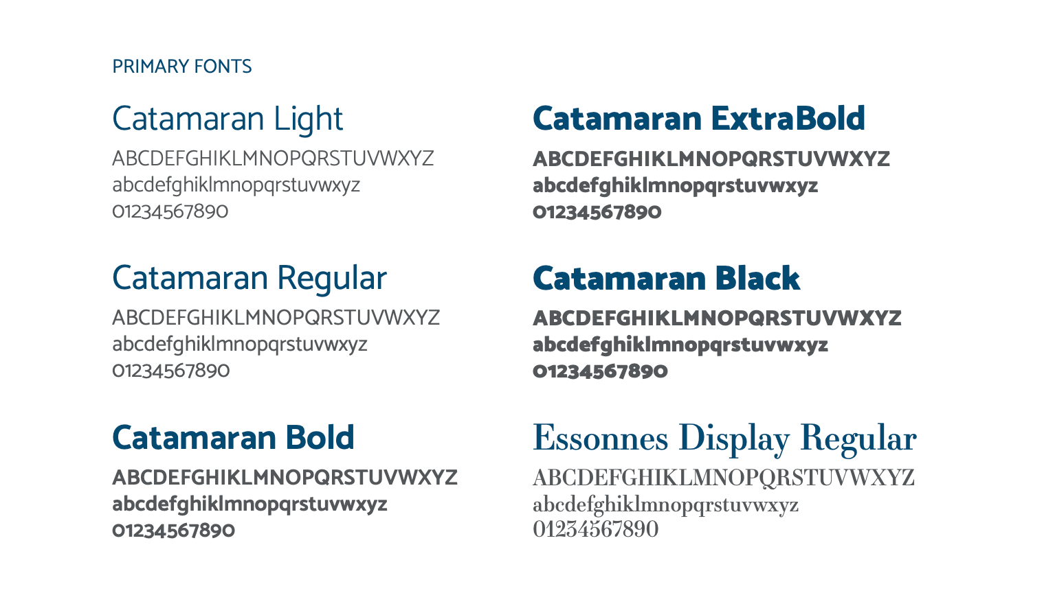
A good example of this is found on grimesco.com a financial planning and investment management firm. We used a font paring of a classic yet modern serif font, Essonnes, with a clean easy to read sans-serif, Catamaran. You can see how the serif is used sparingly as an accent, whereas the sans-serif is used more heavily.

If you have any questions about design principles or the projects mentioned above, shoot us an email and we’ll be happy to help.
Additional resources:
Fully Understanding Contrast in Design by John O’Nolan
A Beginner’s Guide to Pairing Fonts by Ian Yates
A Beginner’s Guide to Pairing Fonts
About The Author