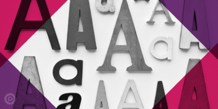
With hundreds of thousands of fonts out there it may seem overwhelming to pick ones that you love and that work together visually. In today’s lesson, learn how to pair fonts like a design pro.
Think of Your Audience
Who will be looking at your design? Is this for attorneys? A kids party? Wealthy individuals looking to invest millions in your business? It’s important to consider the audience when selecting typography. Remember that each font has a personality, so it’s important to think about how that personality works with what you’re trying to convey.
There are no hard and fast rules about how many fonts you should use in any given layout, but generally speaking, less is more. It’s important to remember that the more fonts that you have in a piece, the more complex it will be to pair them properly. For this post, we’ll show 6 examples of font pairs that I personally like. In each of these examples, there is a differentiation between styles. When pairing fonts, try to make sure that they are different enough from each other. The closer the fonts look to each other, the less of a contrast and more of a “clash” may ensue. There are countless resources to find and buy fonts. For this exercise, I chose to use Google Fonts since they are web-friendly, free and easy to download and use.
Harmony and Concordance
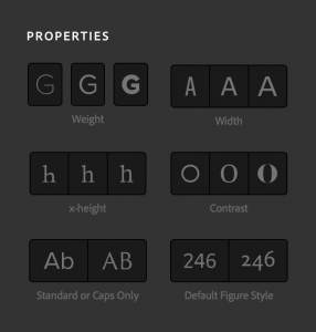
When picking 2 fonts, try to find similar traits in both of them. Maybe their kerning (spacing between characters) is similar, or their proportions, cap height, etc. seem close to one another. Take a look at the chart from TypeKit.com that lets you sort through their fonts by similar properties. An easy way to pair fonts is to use multiple fonts from the same font family. For example, below I’ve paired Roboto Condensed with Roboto Regular: 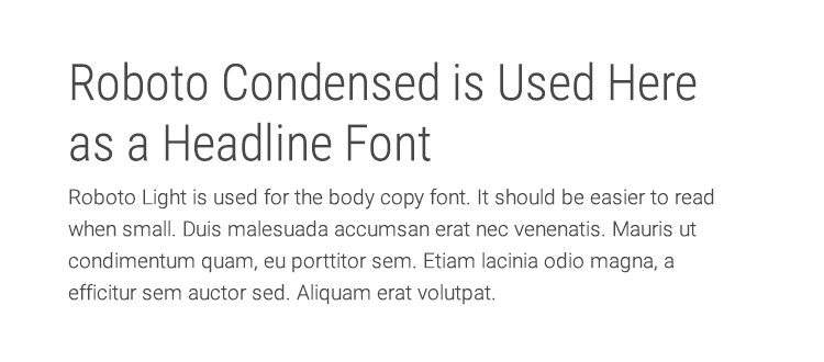
Roboto Condensed & Roboto Light
Contrast
Picking fonts that are too similar can be a no-no when pairing fonts. Here’s where contrast between fonts comes into play. In what ways can fonts contrast? Here are just some things to look for:
- Style: Consider categories such as Serif, Sans-Serif, Blackletter, Monospace, Script, Slab Serif etc. Fonts of different styles will often contrast.
- Size: Large font versus small font.
- Weight: Varying the weight of fonts is a common way to establish visual hierarchy. Headings can be bolder while the body can be lighter.
- Form: Consider the proportions of a typeface. The relative length of the ascenders (b, d, k, l, t) and descenders (g, j, p, q, y), the x-height of the letters (the height of a lower case x), the curvature and direction of the font face.
At its most simple, consider the contrast between serif and sans-serif fonts.
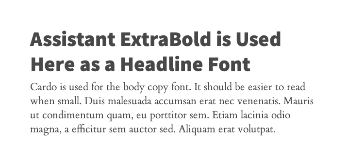
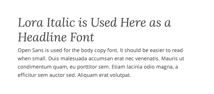
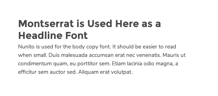
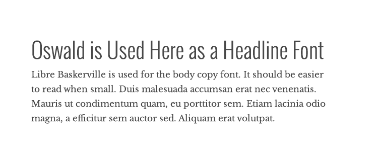
A Few Good Examples
Without further ado, here are a few examples of some of my favorite font pairs:
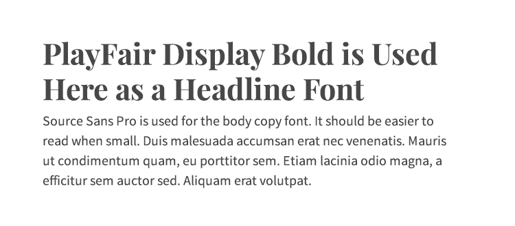
PlayFair Display & Source Sans Pro
What Not to Do
Here’s an example of two fonts that are just too similar. They lack contrast in size, weight, and decoration. Both fonts have odd serifs at the ends of them. For an in depth discussion, check out this article that analyzes just why certain fonts just don’t work well together. 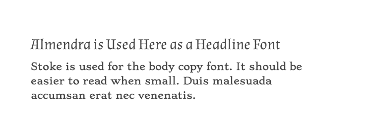
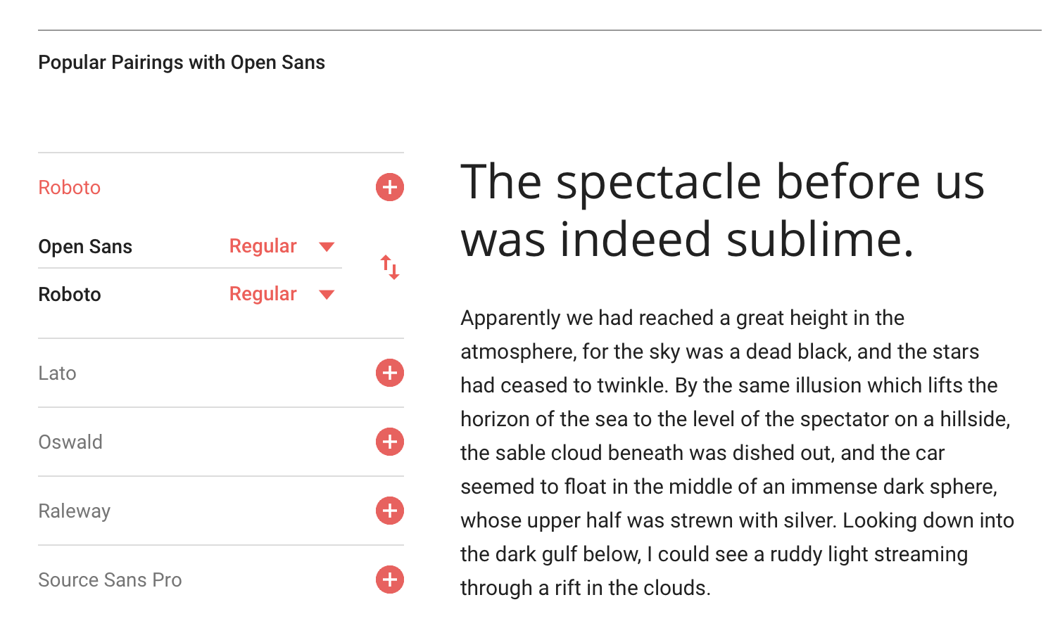
Google Webfonts Pairing Tool
When in doubt, if using Google fonts, find a font you love and then click inside the font and scroll to the bottom of the page. There you’ll find the Google Webfonts Pairing Tool. It gives you suggested pairings no matter what font you’ve picked. Props Google!
ADDITIONAL RESOURCES:
A Beginners Guide to Pairing Fonts
Google Fonts
Typekit
Font Pair Tool
Typeface Combinations
Font Combinations for Web Designers
OTHER POSTS YOU MIGHT LIKE:
Design Lesson: What’s the Difference Between Serif and Sans-Serif Fonts?
What’s the difference: Desktop vs. Web Fonts?
Design Lesson: Top 10 Logo Redesign Tips for Professional Service Firms
About The Author