

Good web design isn’t just about how nice your color palette looks; it’s also about how well people can use it. Color contrast plays a key role in making text, buttons, links, and other elements easy to see and understand.
That’s why accessibility standards like WCAG provide specific guidance for choosing and combining colors. Understanding these guidelines can help you make intentional design decisions that look good while creating a more accessible experience for your visitors.
Why It Matters
Low-contrast text can be difficult to read, especially for people with low vision. Certain color combinations can also be difficult to distinguish for people with color vision deficiencies.
Accessibility also has legal implications. The Americans with Disabilities Act (ADA) prohibits discrimination against people with disabilities, and website accessibility has become an increasingly important consideration for businesses. Proactively addressing digital accessibility helps protect your firm against the rising number of web ADA lawsuits.
The Standards
Americans with Disabilities Act (ADA)
The ADA is a U.S. civil rights law that prohibits discrimination against people with disabilities. The law itself does not establish specific color-contrast ratios or other accessibility requirements for websites. Instead, U.S. courts and the Department of Justice reference a set of technical guidelines known as WCAG as a benchmark to decide whether a website is accessible.
Web Content Accessibility Guidelines (WCAG)
The Web Content Accessibility Guidelines (WCAG) provide internationally recognized recommendations for making websites more accessible.
For color contrast, the most commonly referenced requirements are:
AA Level (Standard Accessibility)
- 4.5: for normal text
- 3: For large text (18pt/24px), bold large text (14pt/19px), and meaningful non-text elements (e.g. user interface controls)
AAA Level (Enhanced Accessibility)
- 7: For normal text
- 4.5: For large text (18pt/24px), bold large text (14pt/19px), and meaningful non-text elements
Level AA is commonly used as the baseline for accessible web design. Level AAA is a higher level of conformance. Color contrast is only one part of WCAG; accessibility also covers keyboard navigation, alternative text, and focus indicators.
Color Contrast Examples
Let’s look at the three examples below using the same green on various backgrounds. Color contrast is about being thoughtful about how you pair colors together and what text size you use.
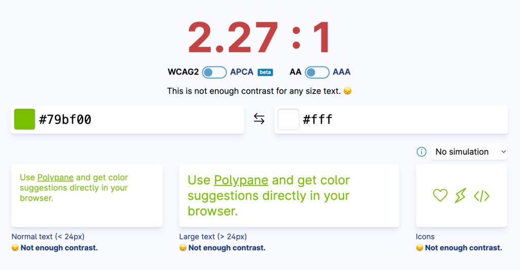
First, we test the green against a pure white background.
The contrast is too low, so this combination doesn’t meet the contrast requirements for any use cases:
- ❌ Normal text
- ❌ Large text
- ❌ Icons
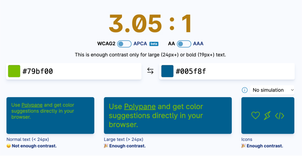
Next, we test the same green against a medium blue background.
The darker background creates more contrast, but not quite enough for normal-size text:
- ❌ Normal text
- ✔️ Large text
- ✔️ Icons
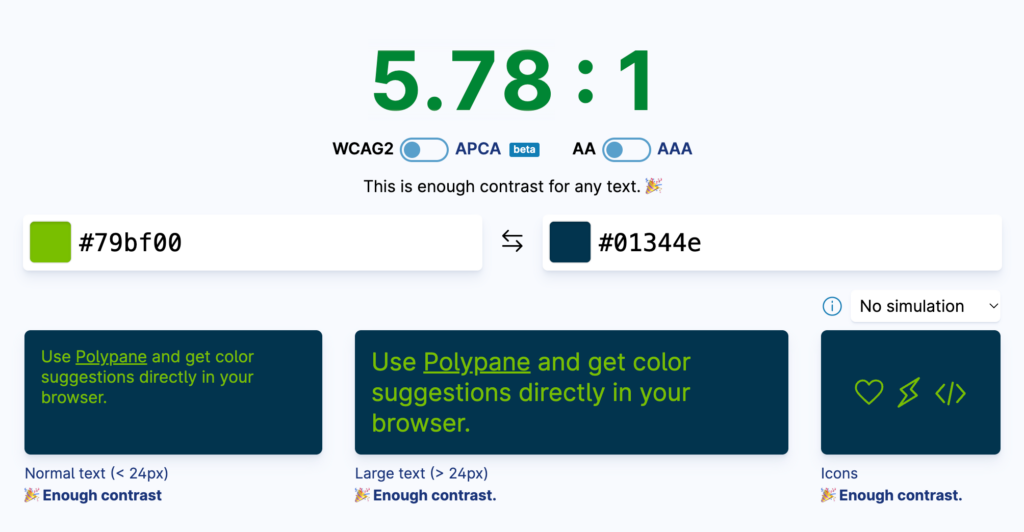
Finally, we make the background even darker and test the green again.
This gives us enough contrast for all three use cases:
- ✔️ Normal text
- ✔️ Large text
- ✔️ Icons
Takeaway: When a color combination doesn’t have enough contrast, increase the difference between the foreground and background colors until the combination passes for the intended use.
Tools
There are many tools out there that can help you check color contrast in your designs; these are some of our favorites:
- ColorContrast.App — Quickly test foreground and background combinations. This is the tool shown above. It also includes color blindness simulation and suggests higher-contrast color combinations.
- Color Contrast Grid — Document your full color palette for all foreground and background color combinations.
- Adobe Color Blindness Simulator — Simulate common types of color vision deficiencies with your color palettes.
- Adobe Color Contrast Checker — Quickly test foreground and background combinations.
Remember that automated tools are helpful, but they shouldn’t replace human review. Color should also never be the only way you communicate important information.
By considering contrast early in the design process, you can create a website that is both visually appealing and more accessible.
Looking for Assistance?
Does your website need help meeting any of these requirements? Whether you need help with redefining your color palette for accessibility or a full website design, we can help!
About The Author