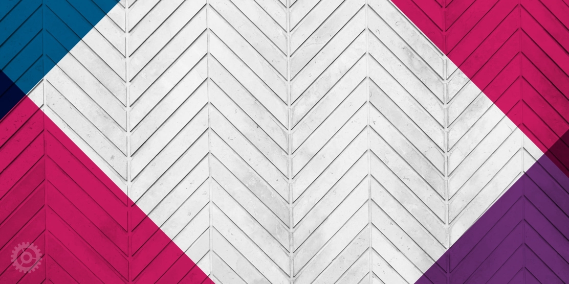
Put simply, graphical repetition means the reusing of the same or similar elements throughout your design. Doing so brings a clear sense of unity, consistency, and cohesiveness to your website or printed brochure.
As humans, we intuitively look for and expect patterns. As designers, we use repetition to help people find what they are looking for more quickly and easily. In web design, repetition helps users understand how interactive elements work. Repeating consistent elements within a website gives the visitor a road map, and a way to navigate confidently around your site. Visitors who are comfortable with the design elements will most likely stick around and visit more pages of your site.
How repetition helps your design:
- Organizes information coherently
- Guides the audience in a clear way
- Brings everything together in a cohesive way
- Teaches users the best way to interact with your website
- Helps your visitors to anticipate how things work
- Makes people feel comfortable, so they will visit longer (yay!)
Repetition in Action
Can you find the repeating elements in this design? Check out the full site here at www.obermayer.com. See the list below for the answers.
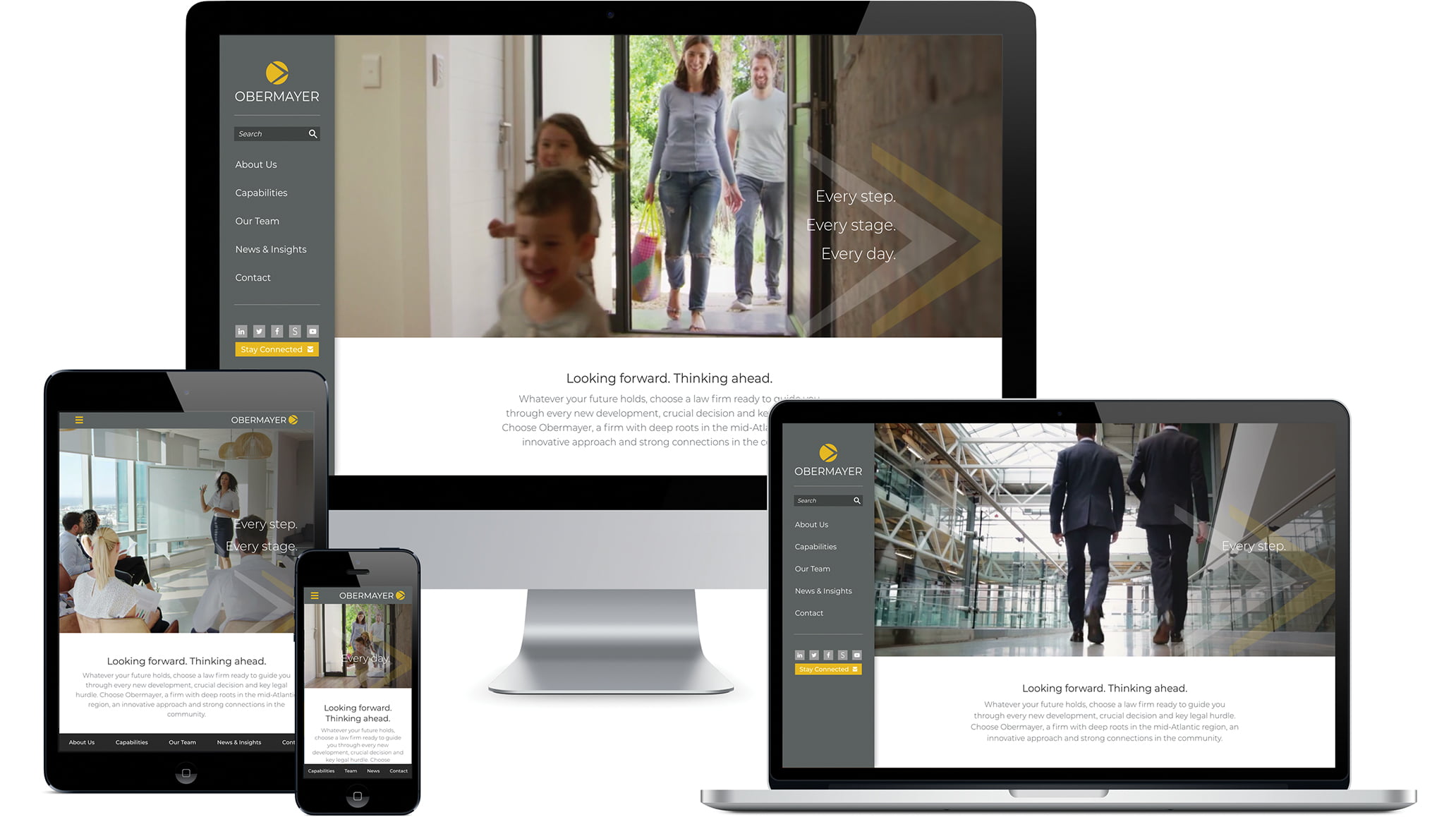
These elements repeat in the Obermayer website design:
- Navigation: Use of color helps with wayfinding. The navigation always being gray with white text helps to clearly differentiate it from the content of the page.
- Logo: The logo has a circle graphic with an arrow, depending on the space there are different versions of the logo being used, but this never seems out of place or unrecognizable as a mark.
- Graphics: Arrows are repeated on top of the video on the homepage as well as on the interior pages.
- Brand Colors: Gray elements with pops of yellow are clearly recognizable as Obermayer.
- Typography: The font treatment is consistent throughout the site. Headers always have the same style: dark gray. Calls-to-action are always highlighted yellow.
- Photography: Dramatic and professional, imagery is always placed in a similar location across the top of the page.
- Links: Clickable elements are noted as dark gray, yellow, or white. Anything clickable has a hover state throughout the site.
- Footer: Quick access to important parts of the site are accessible from the bottom of every page of the site.
A word of caution:
Overusing repetition can make a website or a lengthy brochure visually boring. Don’t be afraid to mix it up and add a bit of variety, where appropriate. But do so with great caution. The main website navigational design elements should never be altered, just as the placement of page numbers, headers and footers in a brochure should always be located in the exact same spot.
If you have any questions about design principles or the projects mentioned above, shoot us an email and we’ll be happy to help.
Additional resources:
Principle of Repetition & Pattern by Visscom
Learn Web Design: How Repetition Leads to Rhythm
About The Author