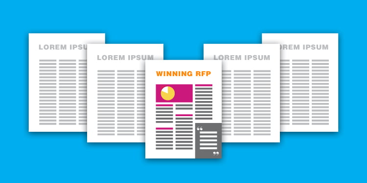
Many of us share a love/hate relationship with Request For Proposals, or RFPs. We love being asked to pitch, (especially when we win the project!) but hate the time it takes to prepare a well-written and successful proposal. Read on to learn how to win more pitches!
From Zero to Dozens
When we founded Clockwork back in 1994, we never received RFPs. We doubt we even knew what those letters stood for. Now, RFPs are commonplace not just for ad agencies, but for our clients as well. Law firms, construction companies, architecture firms, technology companies, and many other industries are asked to submit extensive responses in order to make the “short list.”
Looks Count
As every proposal writer knows, the content in your proposal is critical. Your responses must be clear, concise, and on point. But now, with RFPs becoming more and more competitive, the presentation can play a crucial role as well. A well-written proposal that is page after page of 10-point Arial text (with a few headlines and bullets thrown in) just does not stand out in the crowd. It needs to look good too.
10 Tips for Better Proposal Design:
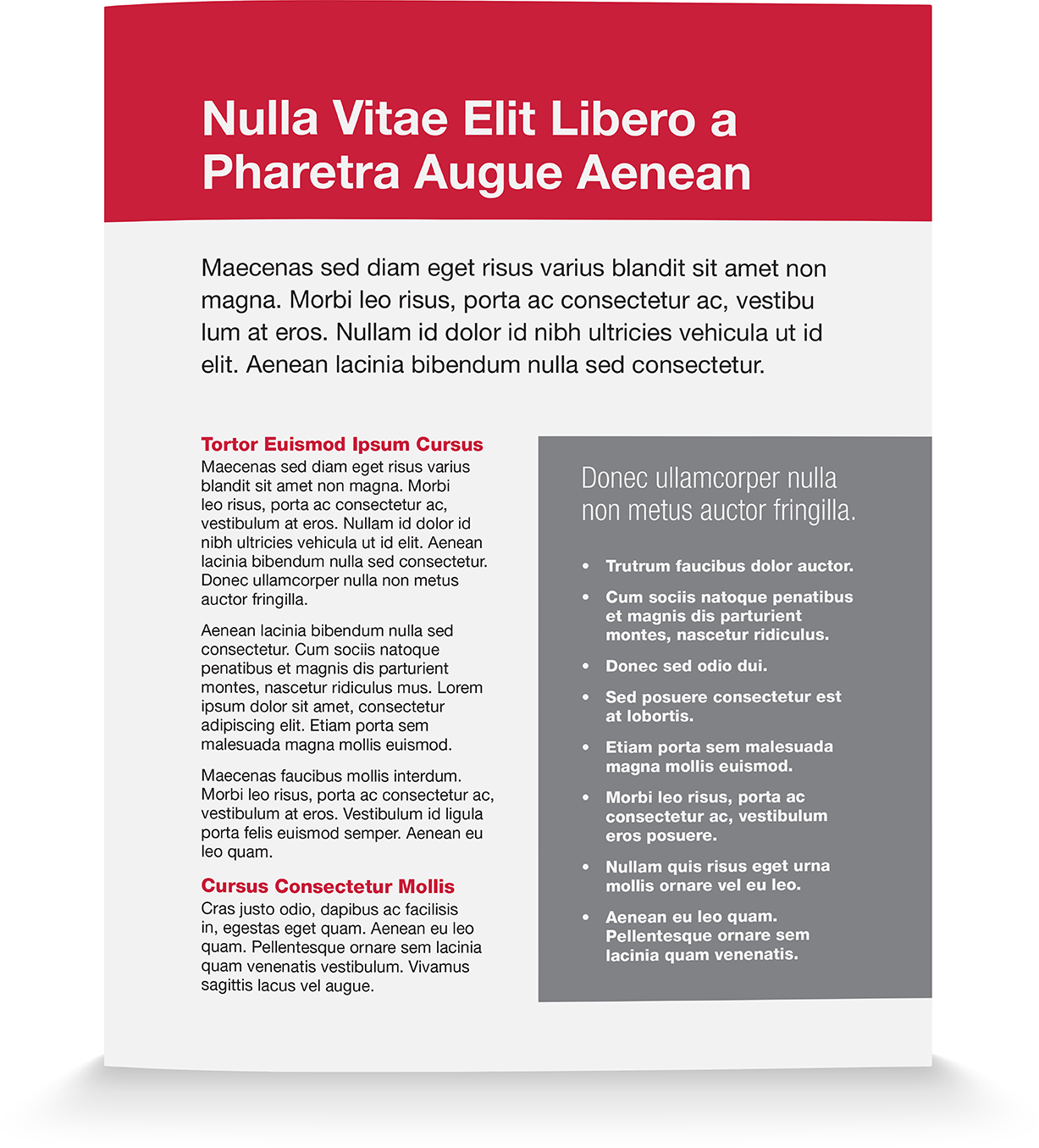
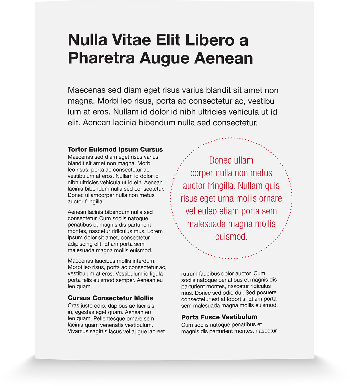
- Create a hierarchy for typography styles and adhere to it consistently. For example, we often create styles called “A Head,” “B Head,” “C Head,” “Body,” “Caption,” etc. These styles must be easy to differentiate on a quick visual scan.

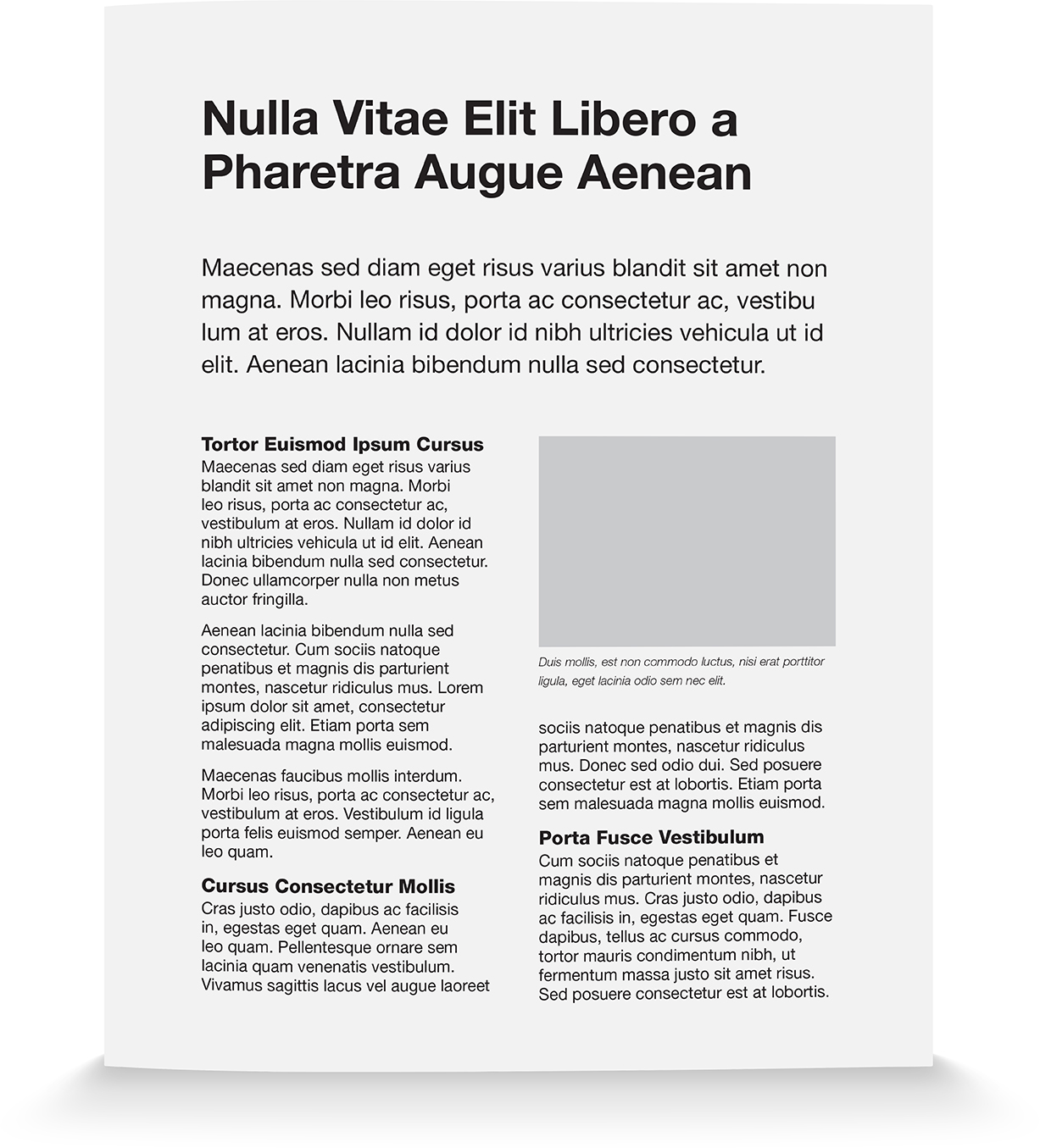
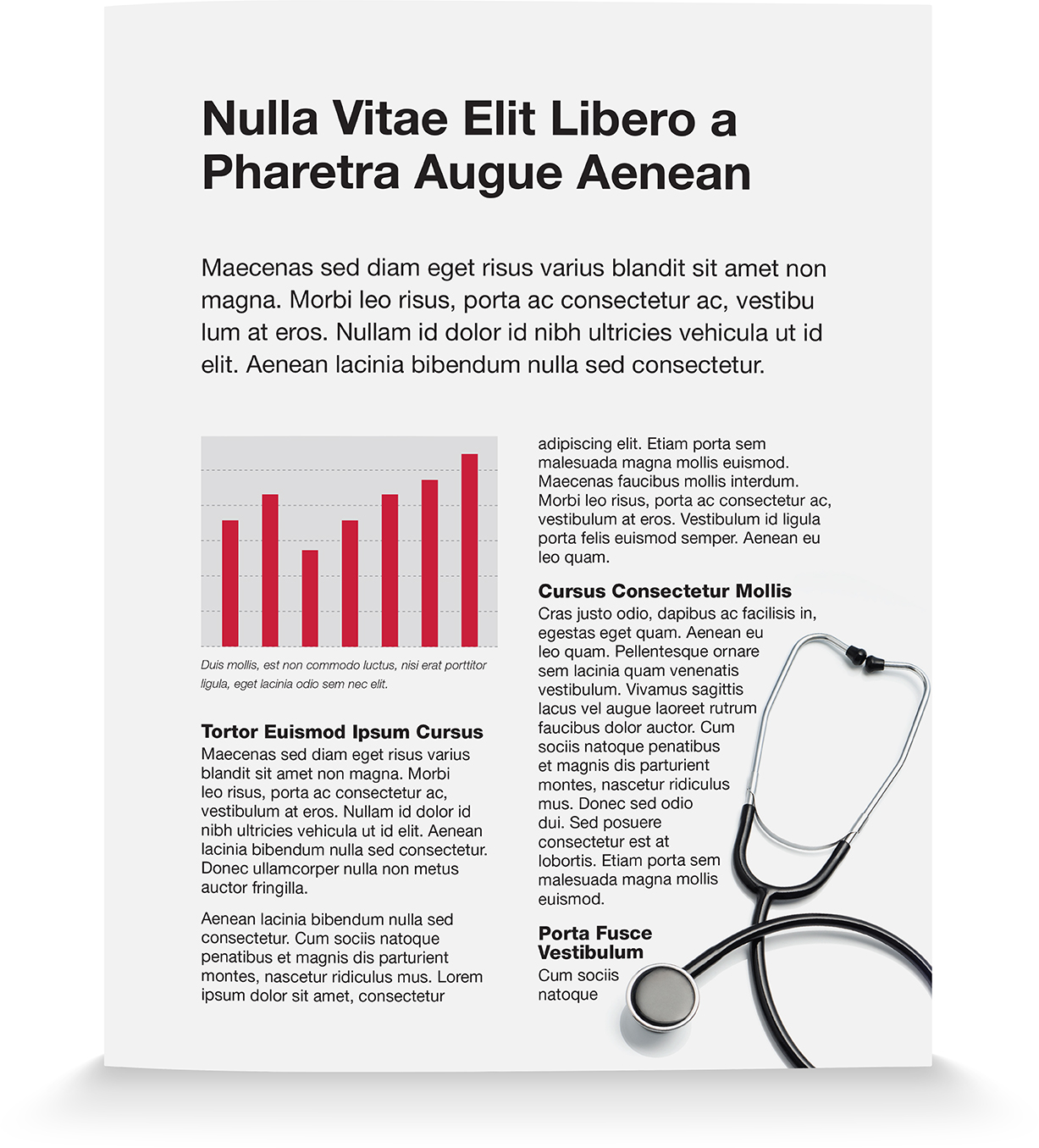
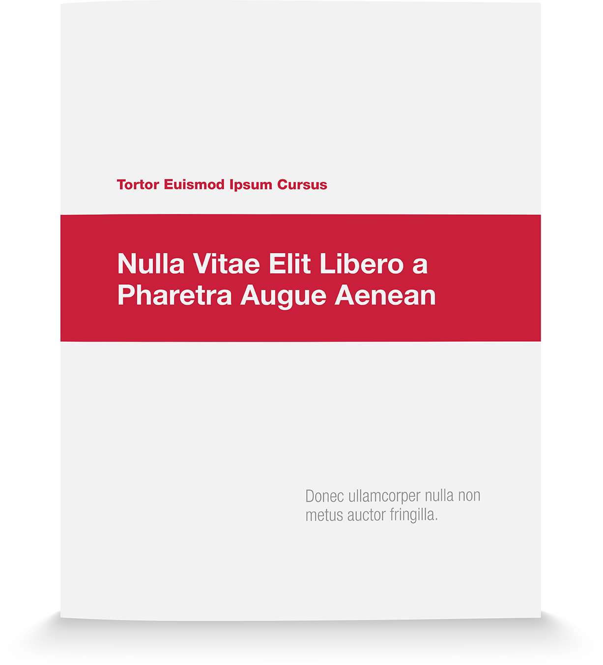
- Think “magazine,” not “whitepaper.” Create different page grids for different kinds of content to help add visual interest. For example, bio pages may include a small portrait photo and a colored sidebar for education and credentials. A project page or case study might include a large photo area with a caption, and a testimonial or pull-out (see below).
- Use photos, charts, and other graphics to break up the page and illustrate a point whenever possible. Studies show that people will read a caption under a visual often before reading any other text on the page.
- Avoid low-resolution logos, photos and graphics. If a logo or image appears fuzzy or pixelated, do not include it. Photos and logos should never be “grabbed” off the Internet and used in proposals without proper licensing.
- Don’t be afraid of color. Color helps signal what’s important, it draws the eye in, indicates important section starts, and gives the reader’s eye a “break” from a sea of text.
- Finishing touches matter. Invest in a good binding machine and throw away those old plastic combs that everyone hates.
- Don’t be afraid of white space. White space is a crucial design element that, if lacking, will make your proposal seem busy, uninviting, and a chore to read.
- Stay true to your brand. When you submit a proposal, it must conform to your company’s brand standards. This may be the first piece of marketing your prospective client sees from your company, so make sure the visual style and messaging is 100% “on brand.”
- Use text pull-outs. Select a very important sentence or phrase and enlarge it on the page. Not only will this help ensure the sentence will be read, but it will keep readers engaged and entice them to read more.
- If you don’t have an in-house graphic designer, consider hiring a professional. A well designed presentation will not only help your firm win pitches, but will save you time building future proposals. Custom designed InDesign templates that adhere to your brand standards make it easy for novice InDesign users prepare beautiful, elegant, effective proposals, in less time.
Related Posts:
Winning RFPs: 10 Questions to Ask Yourself
Pare Corporation Proposal Design
Consigli Construction Proposal Design
About The Author