Congratulations to LPA|A on their elegant new brand! Collaborating with other designers is always fun, and helping bring this architecture firm’s brand to life was a truly fulfilling experience.
Logo Design
The new logo is in keeping with the firm’s design aesthetic and pays homage to the Arts & Crafts movement and Art Deco motifs found within their work. The full name of the firm, Lamoureux Pagano Associates Architects, was difficult to spell and find online. Now shortened to LPA|A, the URL was also changed to reflect the concise name.
![]()
Website
The new LPA|A website showcases the firm’s work as well as its people, core values, and commitment to the community.
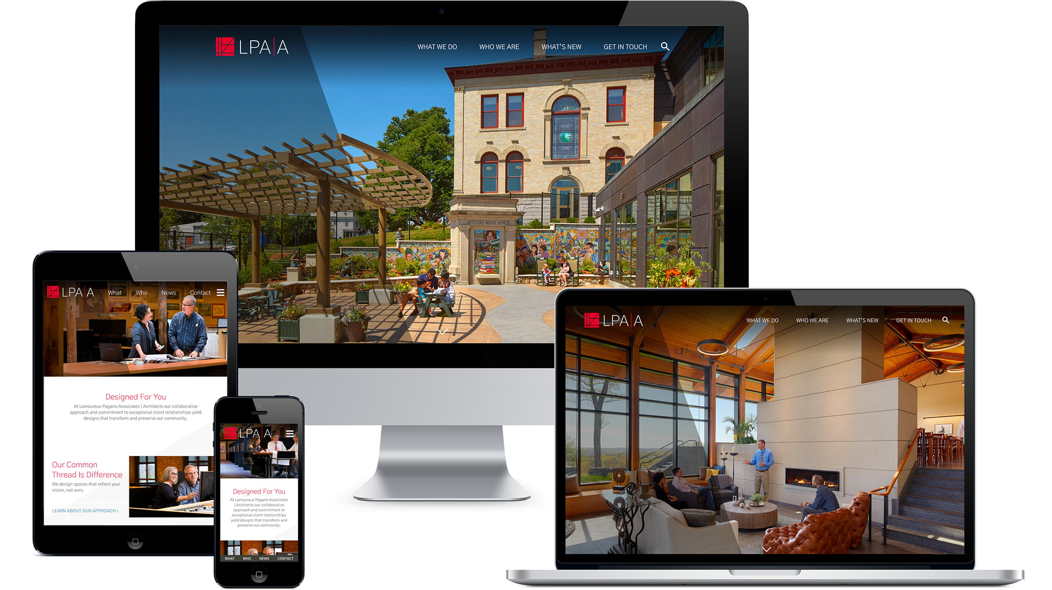
Some additional site features include:
- A fully responsive design including intuitive sticky (fixed) navigation on all devices.
- Project portfolio and case story pages that use flexible, organic grids so photos can be vertical, horizontal, or square, and text and images can be laid out in configurations that best showcase each project.
- Large, engaging color portraits on bio pages for every employee at the firm.
- A history page that tells the story of the firm in an illustrated timeline format.
- A robust, integrated blog to publish the firm’s thought leadership, news, and highlight community involvement.
- An eNews sign-up that integrates with the firm’s email platform.
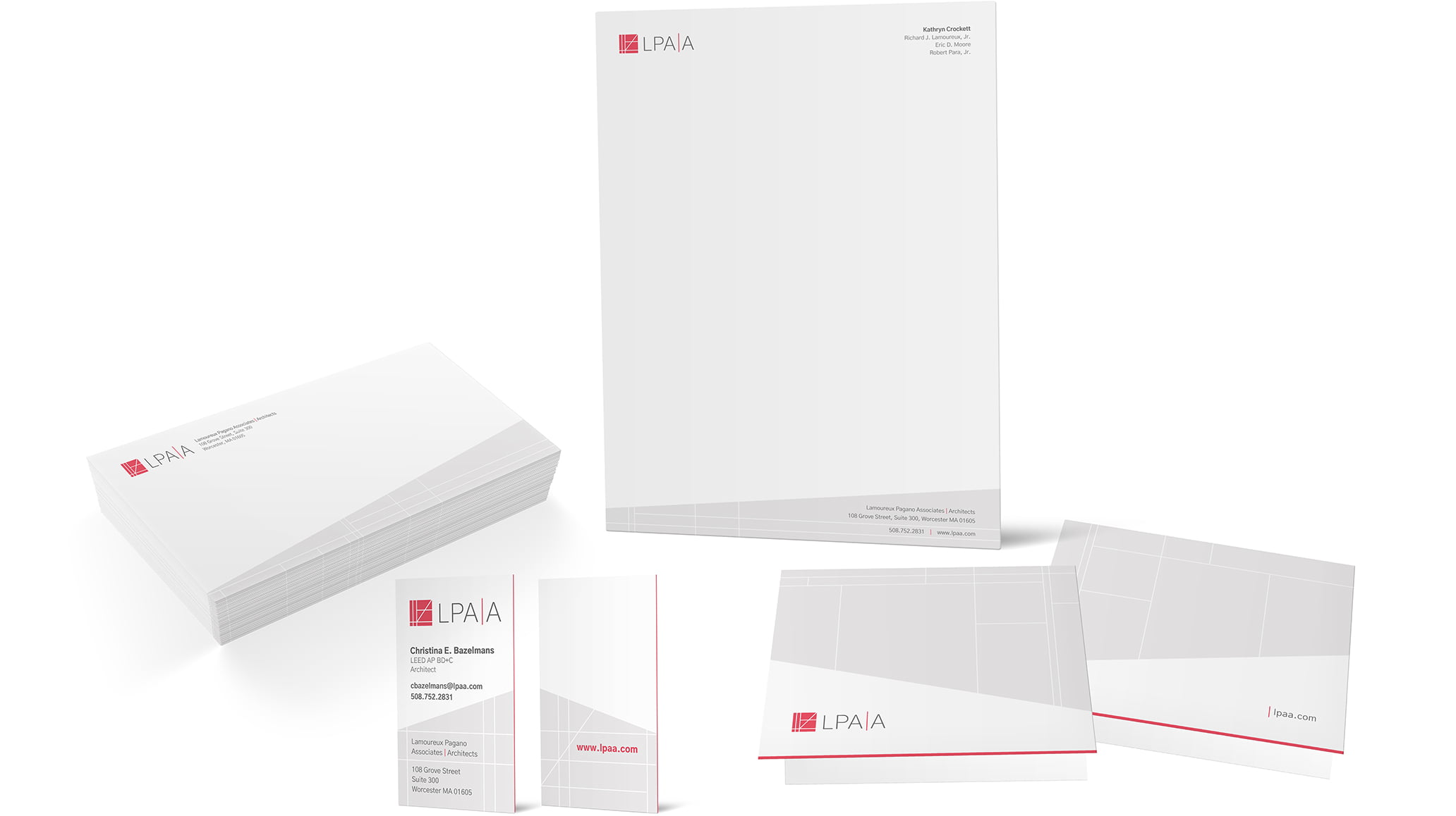
Print & Digital Collateral
The red and gray color palette carries through coordinating marketing collateral including stationery, note cards, and more.
About The Author