When navigating the physical world, color is a natural cue that we use to understand the space around us. In today’s digital world, we use color for the exact same thing. Occasionally, our minds get hijacked by certain color combinations that just don’t play nicely together. These vibrating color combinations can be jarring, aggressive, and deeply disconcerting. It’s especially critical to avoid these color pairings in modern web design, where legibility dictates whether a user stays on your site or bounces within seconds.
It’s an exciting time to be a web designer. With advanced digital design systems, robust layout engines, and high-performance screens, we have more options than ever to build engaging user experiences. With that said, it can be tempting to mimic the ultra-vibrant, high-saturation neon color palettes currently trending in print and experimental media.
However, the distinction between print and digital has never been wider. In print, vibrating color can sometimes be used as an intentional, avant-garde design choice to stand out in a physical space. In web design, it is an absolute usability nightmare.
What on earth is chromostereopsis and why should you avoid it?
Chromostereopsis is a visual illusion where the human brain perceives depth in a completely flat, two-dimensional image. This most commonly occurs when highly saturated complementary colors, like vibrant red and blue, or intense red and green, are placed directly next to each other.
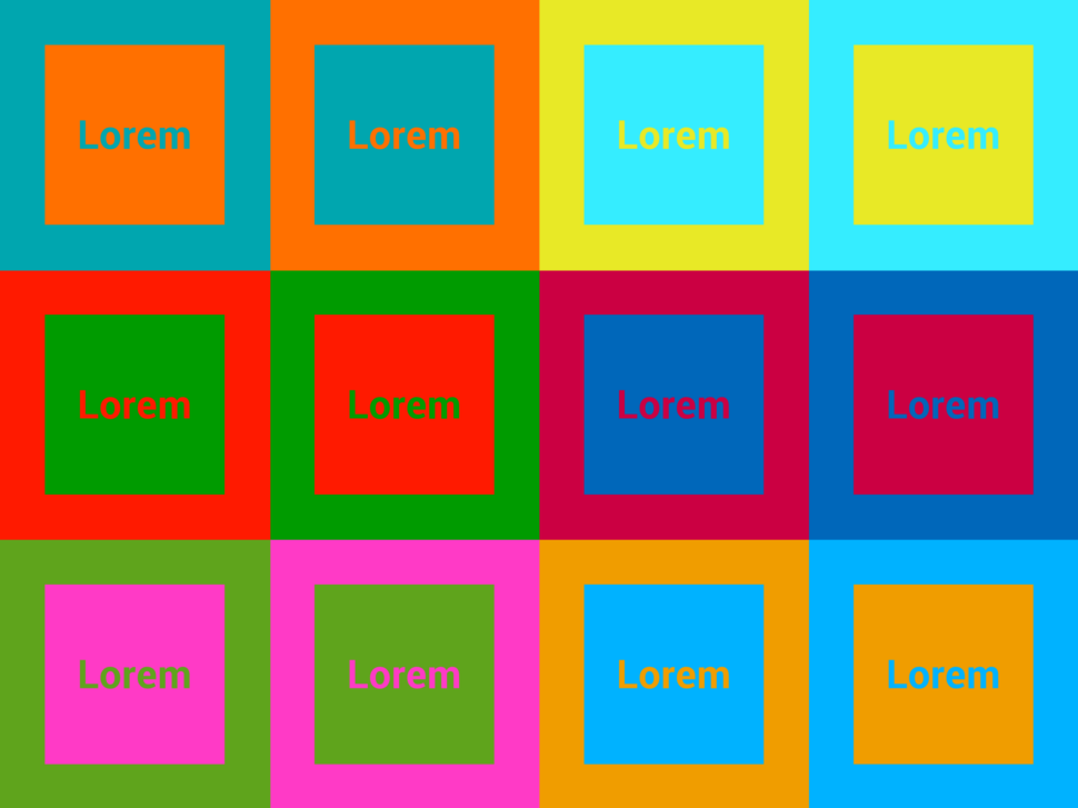
Because our eyes focus on different wavelengths of light at slightly different depths, these colors don’t settle smoothly on the retina. One color seems to aggressively float forward while the other recedes. When they share the same tonal value (meaning they have the same level of lightness or darkness when converted to grayscale), the edge where they meet appears to blur, shake, or emit a strange “glowing” distortion.
What NOT to do:

Why Modern Screens Worsen the Vibration Effect
While color vibration has always been a digital annoyance, modern high-refresh-rate displays and dark mode interfaces have made it physically painful. With the ubiquity of high-contrast OLED screens and ultra-bright mobile displays, the visual strain of chromostereopsis is amplified. Saturated red text on a deep blue background or bright neon green on magenta doesn’t just vibrate on a modern display; it creates an afterimage effect that leaves users with immediate eye fatigue and headaches.
The Accessibility and Legal Reality
When color vibration occurs, the element most strongly affected by the glowing distortion effect is the edge between the two colors. This is why vibration is particularly dangerous in the context of UI fonts, small icons, and other detailed elements that are not large enough to compensate for their blurry, vibrating edges. When color vibration occurs, the elements hit hardest by the blurry edge distortion are typography, micro-copy, and small UI elements like icons or buttons. If a button’s boundary is vibrating, the user’s brain has to work twice as hard to process where to click.
Beyond general eye strain, color vibration presents a major barrier to inclusivity:
- Color Blindness & Low Vision: For users with deuteranopia (red-green color blindness) or low contrast sensitivity, vibrating combinations make interactive components completely invisible or muddy.
- The Legal Stakes: Under the WCAG 2.2 standards, accessibility isn’t an afterthought; it’s a strict baseline. Crucially, some vibrating color combinations can technically pass automated color contrast formulas while still failing real-world human usability. Furthermore, with compliance laws tightening globally (including the enforcement of the European Accessibility Act), having an unreadable, vibrating user interface exposes businesses to severe legal liabilities and ADA lawsuits.
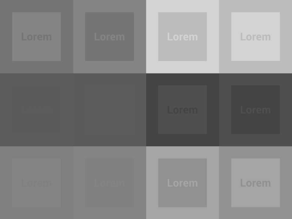
The Gold Standard of Design: Accessible web design prioritizes tonal contrast over hue. If you convert your color palette to grayscale and the elements blend into one another, your design relies entirely on hue contrast, making it highly susceptible to color vibration and poor accessibility.
Not only are vibrating colors jarring to look at for the average person, but they can also severely impede a colorblind person from using the design. See the example below. The first image is specifically selected for its vibrantly colored elements. Use the slider to the right to display what the same colors would look like to a colorblind user. For our website to be accessible to all, we really need to be careful about the colors we select. To learn more about ADA Compliance in Web Design, take a look at our article: Is Your Website ADA Compliant?
Key Takeaway
In modern web design, always separate highly saturated complementary colors with neutral borders, ample whitespace, or distinct shifts in lightness. Avoid vibrating color combinations on navigation bars, body text, and call-to-action buttons. Your visitors and your legal team will thank you!
––––
Additional Resources:
About The Author